Cool Colors – How to Use Colors on the Cool Temperature Scale
This post may contain affiliate links. We may earn a small commission from purchases made through them, at no additional cost to you.
What are cool colors vs. warm colors? What is the cool colors definition and how can you use cool colors in art? In this article about color, we will take a deep look at the cool tones of cold colors. We will explore cool color names and discover how they apply to home decor, art, and design.
What Are Cool Colors?
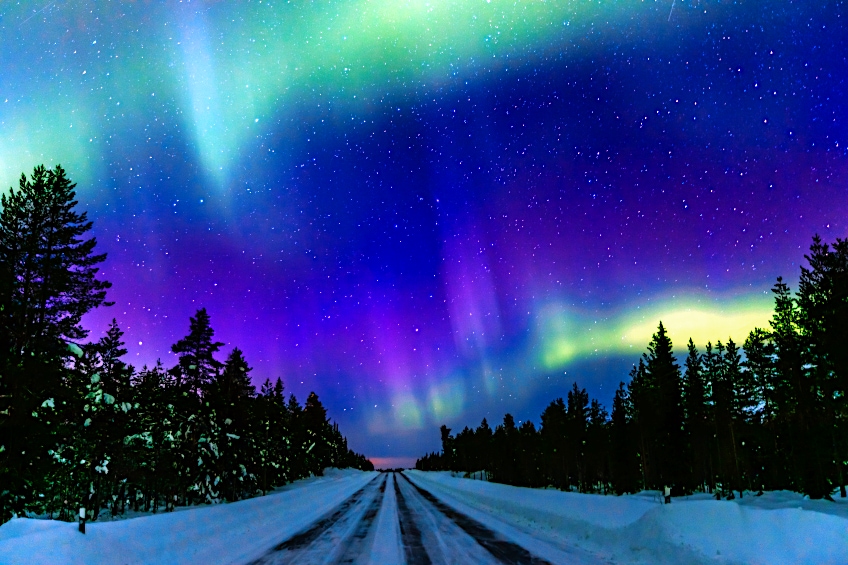
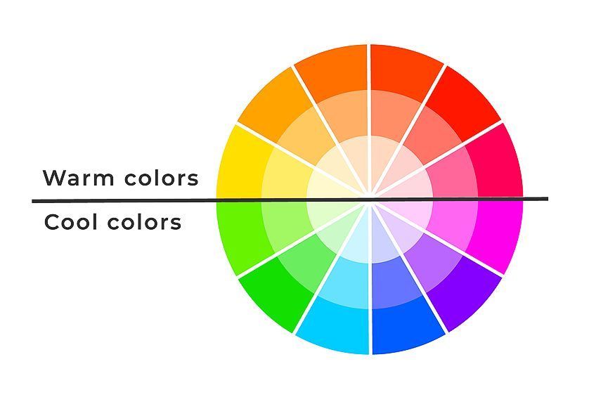
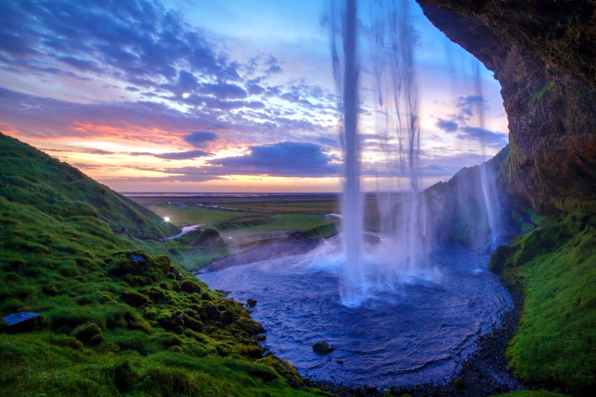
Cool Colors vs. warm colors – this phrase is frequently used to discuss color choices in a large scope of circumstances, including fashion, decor, and design. Yet, while we regularly use the terms “warm” and “cool”, do we actually understand what these terms imply and how to apply the cool colors in art and design? Cool tones cover the side of the color wheel opposite the warm tones. Purples, greens, and blues are examples of cold colors. These hues evoke memories of the ocean, sky, the wilderness, and even space.
People are somewhat indecisive as to where the exact divide between cool and warm begins and ends on the color wheel. The placement of the line changes according to the theorist’s logic. The phrases warm and cold, on the other hand, can be beneficial provided they are always used precisely, alluding to relative color.
The phrases are useful for pointing to relative places within the color wheel.
The terminology is influenced by how people perceive and respond to color. Temperature, unlike many color relationships, is not reliant on light waves. The temperature of a color is relative to its placement on the color wheel, with the coldest hue being midway between the pure blue and green center points.
| Cool Shade | Cool Hex Code | CMYK Cool Color Code (%) | RGB Cool Color Code | Cool Color |
| Violet | #ee82ee | 0, 45, 0, 7 | 237, 130, 237 | |
| Blue | #0000ff | 100, 100, 0, 0 | 0, 0, 255 | |
| Green | #008000 | 100, 0, 100, 50 | 0, 128, 0 |
Cool Colors in Art History
Due to the serene feeling that cool colors convey, they have been used to great effect in many popular artworks throughout the years. Many famous artists have captured the essence of nature and peace by embracing cool colors in their works of art. One such example is The Artist’s Garden in Giverny (1900) by Claude Monet. Because cool colors are so good for portraying the peace of nature, we can observe them used to great effect in this famous artwork. Monet was an ardent and competent gardener throughout his life.
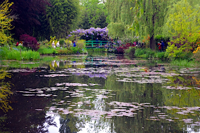
Yet, it was in Giverny, his final residence and the area where he spent the most time, that his idea for a garden had become a reality. He was diligent in the layout of the garden, which grew over the centuries to include his now-famous cool blue pond. Monet conducted significant color studies for his gardens and arranged and cultivated his flowerbeds with the cool colors of his blossoms and the timing of their blossoming in mind to achieve a consistent look throughout. Another example of cool tones in a painting is Fishing Boats, Key West (1903) by Winslow Homer.
In this watercolor, he has used blue in a manner that makes the water almost seem cool to the touch, yet the work exudes tranquility through its cool tones. Yet another famous example of a cool-toned painting is Nocturne: Blue and Silver (1871) by James Abbott McNeill Whistler. This would be the first of Whistler’s Nocturnes, completed in August 1871. Using cold colors, Whistler attempted to capture the serenity and peace of the Thames at night in these pieces.
Frederick Leyland coined the term “nocturne” to characterize Whistler’s moonlight vistas. It evokes the idea of a night setting, yet with symphonic undertones. The artist rapidly embraced the expression. Sometimes the cold colors could represent tranquility, other times the coldness of space or late night. They can equally create feelings of isolation and lack of joy or warmth, it is all dependent on the context in which they are used.
Cool Colors vs. Warm Colors
For hundreds of years, people have written on the topic of warm and cold colors. Most theories begin with the traditional color wheel, which has three primary as well as three secondary colors. When we compare blue to yellow, we can clearly conclude that yellow is warm and blue is cold. Because they are closest to each other, comparing magenta to red may be less clear. However, when the color temperatures are identified and compared, magenta (a more blueish-red) is colder than yellowish red.

The term “bias” refers to how a specific tone leans towards another secondary or primary color. For instance, a red can have a blue or yellow bias. Knowing a color’s temperature is also essential while mixing paint. Use colors with comparable color characteristics to produce clean blends. To determine color temperature, you must first understand how to recognize and differentiate warm and cold colors.

Certain colors are easy to distinguish, but color temperature can be quite tricky at times. There are warm and cold blues, greens, reds, yellows, and earth hues in the realm of paint colors. When you compare a cold red to a warm red, and then to a third hue, you should be able to tell whether it’s bluer, yellower, or somewhere in between the first two. Once you start seeing the distinctions, identifying any color becomes second nature.
What Cool Colors Signify
Colors that are cool are regarded to be tranquil, soothing, and restrained. Cool tones are calming and reassuring, and they may even be utilized as neutrals against more vibrant colors. Because blue is the sole primary color on the color wheel’s cold side, every cold hue contains some variation of blue. As a result, cool colors are frequently created by combining a cold and warm hue.
Due to this new concept of harmony, businesses frequently utilize cool hues.
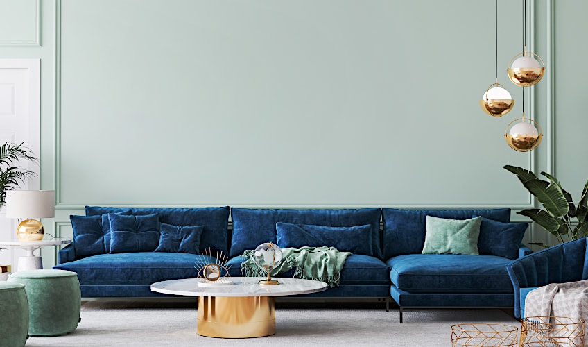
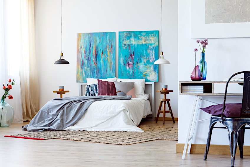
Blue, for instance, is the most popular choice among financial organizations to convey safety and dependability. Green is also associated with natural serenity. Cool hues are calming, peaceful, and refreshing. Their fading impression can even induce meditative states as if you are lost in an unending blue sky. As a result, cold colors are natural for bedrooms and bathrooms, where one goes to relax and rejuvenate.

How Cool Colors Affect our Psyches
Cool tones are most commonly associated with the vast outdoors, yet ironically, they function best in small places. Cool colors, when used in tiny spaces, make the space appear larger. Cool hues can act as illusionary factors in a variety of ways. Tension includes stress, concern, and anxiety and cool colors remove the negativity that comes with these bad emotions. Greens, blues, and violet, in other words, are soothing and calming hues that exude a sense of tranquility that no other color can match.

Being in the vicinity of these colors might seem like a breath of fresh air. Given their link with nature, it’s no wonder that cold colors have this effect on individuals. Cool hues are commonly found in houses, particularly in restrooms and bedrooms and more precisely, they are frequently used in interior design. People use these colors in their houses with the intention of creating a tranquil atmosphere.
Greens, blues, and violet are renowned to be relaxing as these colors are not abrasive, and they provide subtle yet perceptible beauty.
When utilized as an accent color, cold colors work best. Most of all, cool colors motivate us to take care of our minds and bodies. Personal trainers, dietitians, and nutritionists could increase their business by incorporating these colors into their logos and other marketing materials. When we see cold hues, it reminds us that we have control over our well-being. This concept is motivating and has the potential to greatly affect us. They motivate us to seek knowledge and enlightenment and these uplifting hues are both helpful and illuminating, making them good influences. Cool colors, like warm colors, elicit powerful responses without negatively impacting our actions or moods.
Temperature and Light
Is it possible for color to make you feel colder or warmer? Yes, just as it may make a space look darker or brighter. If you live in a warmer environment for the majority of the year, you might choose a cool-colored design style. Color’s influence on visible light may be more significant than temperature. Yet, perceived illumination is determined by the lightness of the hue rather than whether it is warm or cold. Colors that are lighter tend to reflect more light than colors that are deeper.
Employ light-reflecting hues to enhance a place that lacks natural light. When it comes to interior design, it’s crucial to remember that no area should have only one warm or cold hue. If you want your space to seem homey, use warm colors as the dominating tone and insert a few cool-colored items. As with other aspects of designing, equilibrium and contrast are essential. When selecting colors for your home décor, consider the atmosphere you want to establish as well as whether you want it to seem bright and airy or snug and personal.
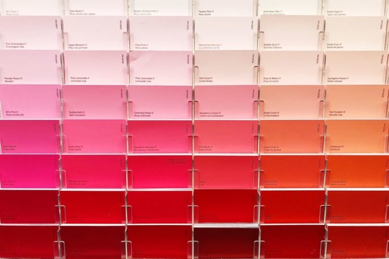
Popular Cool Shades
Choosing shades for design or a physical room can be daunting, and over time, trends change, making it harder to keep up with what is fashionable. However, when it comes to cool tones and hues, the popular shades have stood the test of time, making it much easier to utilize these in your digital or physical design project. Below we have created a table of some of the most popular and timeless cool shades.
| Cool Shade | Cool Hex Code | CMYK Cool Color Code (%) | RGB Cool Color Code | Cool Color |
| Bottle Green | #0f472c | 79, 0, 38, 72 | 15, 71, 44 | |
| Midnight Blue | #08113B | 78, 78, 0, 56 | 8, 17, 59 | |
| Blue-Violet | #194570 | 78, 38, 0, 56 | 25, 69, 112 | |
| Teal | #008080 | 100,0,42,25 | 0,124,128 | |
| Freezing Vapor | #d5f5f6 | 13, 0, 0, 4 | 213, 245, 246 | |
| Cerebellum Grey | #c8c7c9 | 0, 1, 0, 21 | 200, 199, 201 | |
| Dark Silver | #706e72 | 2, 4, 0, 55 | 112, 110, 114 | |
| Kingfisher Daisy | #2b173f | 32, 63, 0, 75 | 43, 23, 63 | |
| Tropical Violet | #c8aee2 | 200, 174, 226 | 12, 23, 0, 11 |
How to Use Cool Colors in Art and the Home
Cool tones have diverse and useful applications. They can be easy on the eyes and make studying easier. The characteristic of peace and serenity can relax the mind and make it easier to concentrate on something in these colors. Ponder some of the usual applications for blue: police uniforms, business clothing – it all conveys a sense of serenity and confidence. Cool colors, based on saturation, can frequently contain neutral aspects.
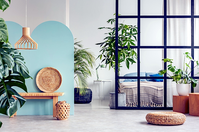
Because of their relationship to the sky and earth, very light greens and blues such as pale aquamarine and Alice blue, for instance, are frequently employed as backdrop colors and may function as well with other cold or warm hues.

| Cool Shade | Cool Hex Code | CMYK Cool Color Code (%) | RGB Cool Color Code | Cool Color |
| Alice Blue | #F0F8FF | 6, 3, 0, 0 | 240, 248, 255 | |
| Pale Aquamarine | #ACE9D4 | 26, 0, 9, 9 | 172, 233, 212 | |
| Celadon | #C3E0C6 | 13, 0, 12, 12 | 195, 224, 198 | |
| Pale Green | #98fb98 | 39, 0, 39, 2 | 152, 251, 152 |
This color balancing makes cool tones particularly easy to utilize. They signify professionalism and do not elicit tension or anxiety in the same way that warm hues do. The trick to employing cold tones is the correct use of saturation and tints. You may produce a beautiful palette with just enough color harmony to be sufficiently engaging and thrilling without over-stimulation by utilizing many varieties of similar colors.
Monotone palettes with blues, greens, or purples can offer distinct and unique moods.
Greens and blues go well with neutrals like tan, mocha, and saddle brown. When dealing with any form of color, remember the 80/20 rule: 80 percent of the surface should be neutral, and 20 percent should be strong. Use the same concept with a mix of cold and warm hues. To keep the palette cool, utilize 80 percent green, blues, violets, and 20 percent yellows, reds, or oranges. Color coolness may be determined by numerical value when it relates to practical applications and color blending.
| Cool Shade | Cool Hex Code | CMYK Cool Color Code (%) | RGB Cool Color Code | Cool Color |
| Camel | #C19A6B | 0, 20, 45, 24 | 193, 154, 107 | |
| Mocha | #967969 | 0, 20, 45, 24 | 150, 121, 105 | |
| Saddle Brown | #8B4513 | 0, 20, 45, 24 | 139, 69, 19 |
Cool hues are considered to fade, making things appear smaller or further away than they are. This color identification and emotion are related to the interaction of light waves. For instance, blue light waves are smaller than red light waves. A cold color will appear to be far away. Warmer hues, on the other hand, will make you feel closer. The term “cool color” is frequently abused in design contexts. How often have you heard someone say “make a color cooler?” While this often implies deeper or less intense, adding additional blue to the color combination will make it cooler. Gray is typically regarded as a cool tone in real-world applications.
Tips for Using Cool Colors in Your Home
Bearing all of this in mind, when designing a space, it’s ideal to settle on a style ahead of time and adhere to it, but don’t be hesitant to experiment as well. If you have a warm-colored floor, don’t color your kitchen a cold hue. Rather, use an appealing shade of white such as parchment or a yellow-orange color. If you have brown sofas and warm-colored walls, don’t lay down a cool-toned carpet in your living room. Instead, go for a lovely maroon rug. If you want your space to be intentionally unique, unusual, or classy, don’t blend warm and cold colors. When it comes to cold versus warm colors, the 80/20 rule applies: use bold colors selectively to accentuate a room, not characterize it.
Employ 80% neutral tones along with 20% bold tones as a general rule.
| Cool Shade | Cool Hex Code | CMYK Cool Color Code (%) | RGB Cool Color Code | Cool Color |
| Parchment | #FCF5E5 | 0, 3, 9, 1 | 252, 245, 229 | |
| Yellow Orange | #FFAA33 | 0, 33, 80, 0 | 255, 170, 51 | |
| Maroon | #800000 | 0, 100, 100, 50 | 128, 0, 0 |
Whether you are interested in using cool colors in your art, your home, or your fashion, they can have a great place in any design when used correctly. All one needs to know is the context in which it is going to be used to determine what is the best cool shade or hue that you would like to apply for the task at hand. Cold colors can bring a sense of openness, calm, rejuvenation, and refreshment to your wardrobe, painting, or living room.
Frequently Asked Questions
What Are the Cool Color Names?
It might be all good and well that you know that you would like to decorate your bedroom in cool colors, but it doesn’t help if you don’t know the names of the cool tones. Due to the numerous combinations of various colors available, there are many names relating to the cool color side of the spectrum. However, the only cool primary color is blue. Therefore, no matter which cool color names you come across, chances are that the color has had blue added to it. Other colors on the color wheel that are also cool tones are the secondary colors purple and green.
What Is the Cool Colors Definition?
The term cool color refers to any color that is tranquil or calming in nature. Cold colors are not dominating and tend to fade into the background. As a result, cold colors tend to make an area appear bigger. Greens, blues, and violet are instances of cool hues, such as tranquil blue seas. Cool hues are frequently used to create more neutral whites and grays. Cool colors are often regarded as natural tones and therefore can be found featured in many artworks that depict nature or wish to portray a sense of calm and tranquility. In the same way, warm colors can be used to add intensity and vibrancy to an image. A good artist will often incorporate elements of both.
Are White and Black Cool or Warm?
Although white and black are not colors in and of themselves, they do have warm and cold qualities. White has a cooling effect, whereas black has a warming impact. Consider how white might serve to cool an area down in a hot region. Keep in mind that if you have painted a room white, you might want to add bursts of vivid color or another aspect of warmth to make it physically pleasant. On the other hand, black is instantaneously warm and should be used carefully so that it does not overpower. A little black in your space may make a big difference.
Are Neutrals Considered to Be Cool or Warm?
Neutral hues are quite versatile. These paint hues are the mainstay of the industry, effectively blending into almost any environment. Neutrals span a staggeringly large terrain of browns that range from the warmer, reddish brown to the colder stone tones and eventually to the light beiges. Neutrals are rarely fascinating on their own, but when matched correctly and with a prominent hue, they can be wonderfully elegant.

Larissa Meyer is a 32-year-old mother from Michigan and creative spirit since childhood. Her passion for painting and drawing has led her to an education as an illustrator and a career as a freelance graphic designer. She has a Bachelor of Fine Arts in Illustration and a degree in Graphic Design. Larissa is a talented artist who is able to master a wide range of styles and techniques to bring her artistic vision to life. Her greatest passion is currently fluid painting and epoxy resin art. Larissa’s love for art and her knowledge and experience in illustration make her the perfect Creative Director for our fluid-painting.com team. She is the creative head of our team and shares her passion and knowledge with our community through articles and tutorials.
As a mother of a 2-year-old daughter, Larissa also understands the importance of fostering creativity in early childhood. She uses her experience and knowledge to help other parents inspire their children and develop their artistic skills as well.
Learn more about Larissa Meyer and about us.