Shades of Purple – Purple Colors and How to Mix Them
This post may contain affiliate links. We may earn a small commission from purchases made through them, at no additional cost to you.
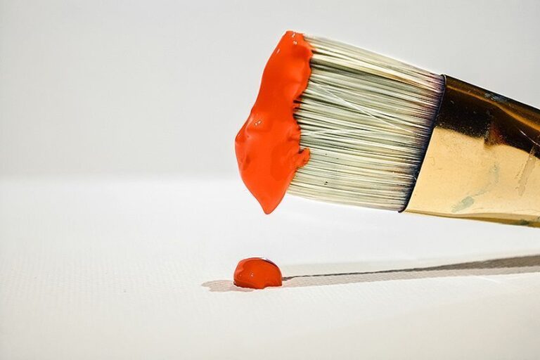
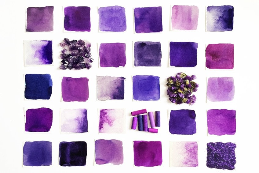
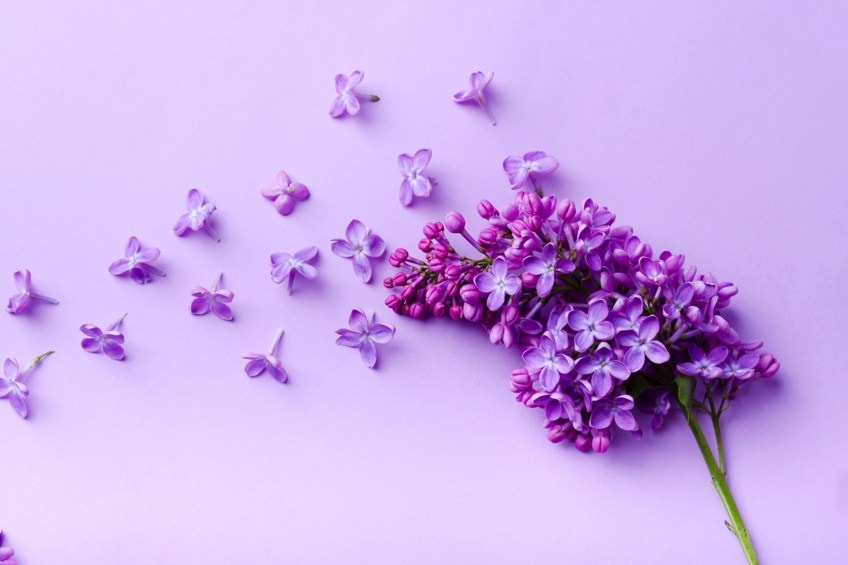
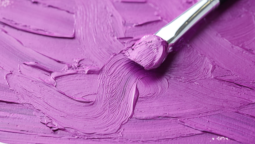
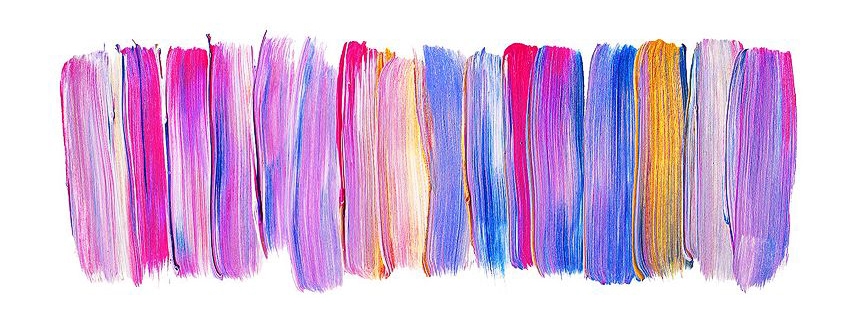
Close your eyes and think of a field of lavender shining in the sunlight. The different shades of purple, from the dark purple-violet color to the lightest lilac. Purple is a regal color, adopted by royalty across many different cultures. It strikes a feeling of importance and intensity. The color wheel would not be the same without this color, and the diversity of our culture would be lacking. This tutorial is all about the various purple shades, or purple colors. We will be describing the different types of purple and the shades of purple names. By the end of this, you will be well versed with the purple names from dark purple to bright purple. If the purple color is of interest to you, or you are keen on expanding your color knowledge, keep reading.
The History of Purple Colors
You may not think there is much to talk about in terms of the shades of purple’s history, but there you are wrong. Color pigments have a vast history of ingredients, from crushing berries and grapes for their natural light and dark purple colors. In human history, Tyrion purple, which was adopted by royalty across many cultures, was weirdly pigmented by the extraction of Mediterranean sea snails’ mucus. This would cost a pretty penny or two, so it was typically only a color fabric that nobles and royals would adorn themselves in.
Another culture that was rather fond of the purple color was that of the Chinese culture. The Terracotta Army was embellished with what was known as Han Purple, which was a synthetically made purple color. Another example of a synthetically made purple color is Royal purple, which is a blueish-purple color favored by Queen Victoria, as well as Mauvine, which was created by a man named Willian Perkin in the 1800s. England was not typically fond of using purple culturally. The first time was in the 1700s.
The types of purple most similar to violet colors are the darker purples, including red violet. This is slightly ambiguous because a violet color is typically bluer, but the name suggests it is redder.
Below is a table that we carefully made for you, as a summary of the colors HEX codes, and the various shades of purple names so you can easily identify certain purple shades.
| Purple Names | Shade of Purple | Hex Code |
| Tyrian Purple | #66023C | |
| Han Purple | #5218FA | |
| Royal Purple | #7851A9 | |
| Mauveine | #8D029B | |
| Red-Violet Color | #C71585 | |
| Electric Purple | #BF00FF |
Color Theory on Purple Shades
With the help of color theory, one can create a variety of color schemes and visual effects by using the guidelines it provides. In addition to being an excellent way of expressing emotions in your artworks, colors are also a key to creating atmospheres, depths, and dimensions in them. Luckily, there is a tool you can use to help choose colors, called a color wheel. The color wheel has primary, secondary, and tertiary colors listed in a visual wheel that helps us understand what will work and what will not.
If you are a beginner, don’t be afraid of using the color wheel. It is an invaluable tool that even professional artists refer to on a regular basis.

Cool and Warm Purple Shades
When making purple, a primary color red is combined with a primary color blue to give it its purple hue. It is entirely up to you which shades of purple you wish to make, and that relies on the various shades of red or blue. Any shade will do, but each varying shade will create a variety of purple colors.
Keep in mind that most paint colors are subject to biases in color, meaning that they sometimes appear to be cooler or warmer color than they actually are.
Lightening and Darkening Purple Shades
Dark purple is a rich and luxurious color, and it helps to create depth in your artwork, particularly so for the background. You can add black and grey to your purple colors to make them darker and muddier. This will take the vibrancy away which makes it perfect for the areas of your artwork that appear to be in the shadows. Try not to add excessive amounts of black to prevent it from becoming too muddy, and also to prevent the green base, that makes the black paint, from changing the color bias of our purple.
For the illusion of depth, to create shadows, and to make the highlight effect more noticeable, you will need to make the purple color darker or lighter. Light or bright purple is commonly made by mixing in a little white paint. Some artists even add a little yellow to make it an even more bright purple. Adding too much yellow to your purple color can also mute the color, which is why you should be cautious. It would be preferable to use a yellow that is lighter in shade, for example, cadmium lemon yellow will produce a lighter purple hue than cadmium yellow.
Contrasting Purple Complementary Colors
There are three primary, secondary, and tertiary colors on the color wheel that we discussed. Here is the visual guide to help you identify them all. It is important to note that every color on the color wheel has an opposing color, and each of these colors is signified as its complementary color. These colors help to create a keen contrast between various aspects in your artwork, and in marketing, it helps for the advertisement to stand out.
You should be able to identify the use of contrast, or complementary colors in marketing, like with logo designs made by graphic designers, in which the contrast between the colors is evident. The FireFox logo is a great reference to put our words into context. It shows the globe that is wrapped around an orange fox. The two containing colors make the logo easily identifiable and also allow you to distinguish between the two aspects.
Differences Between Purple and Violet
Purple names will vary, and so do the uses of the various purple colors. Colors might look very similar when you first look at them, but when you use the wrong one in a certain area that used the other color originally, the difference will be impossible to unsee. Imagine you are painting a big purple flower and you suddenly run out of the red you were using for the combination. The next red you use will not quite make the same aubergine purple color that you were originally using. Now one petal looks like it needs some nutrients.
Spectral color is what we refer to when we say that violet can be seen at one wavelength. This means the band of wavelengths that come together to make the color purple visible. Think of a rainbow and all of its seven colors. The color purple is only visible when you stand and look at the rainbow from a certain angle that the blue and the red colors cross over each other.
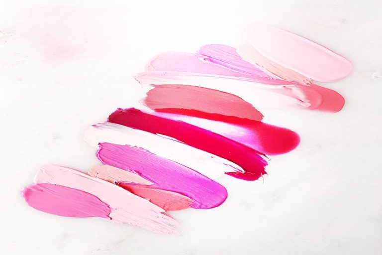
The Most Loved Shades of Purple
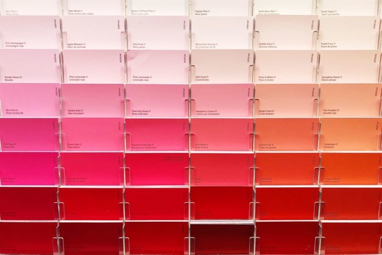
All of the purple colors have purple names that help make them identifiable. Not only that, but some people might get those names confused, so they are also labeled using a unique HEX code that is not something that can easily be confused. Some of the more favored shades of purple names are Orchid, Amethyst, Aubergine, and more. For your benefit, we have listed a few of the most popular of all the shades of purple that are used regularly by artists.
Amethyst
Most of you will be familiar with the amethyst crystal, and this color is meant to be a representation of the crystal’s purple shade. The types of purple amethyst shades can range from dark to light, and so light it could be a lilac color. The color amethyst represents the same peace and serenity that is associated with the crystal.
| Purple Names | Shades of Purple | Hex Code | RGB % | CMYK % |
| Amethyst | #562f7e | 33.7, 18.4, 49.4 | 32, 63, 0, 51 |

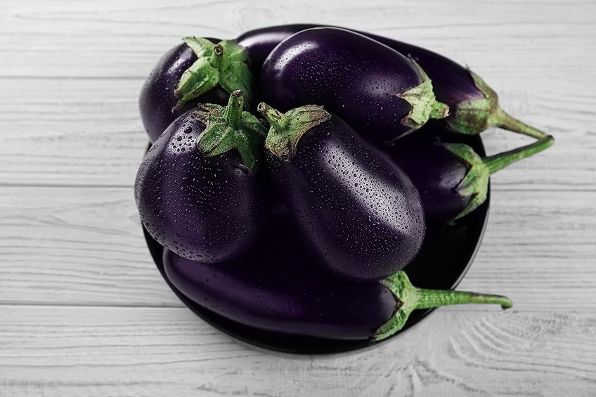
Aubergine
Eggplant might not be your most favored vegetable, but it sure can be your favored purple hue! Its name gives the color away, being so similar to the color of an aubergine that they named it after the veggie accordingly, and Crayola presented this color to the world in the late 1990s. This color is a great choice for fall décor and works well for fashion items as well as interior decorating. In addition to the warmth that the color portrays, it also gives off a feeling of calming coolness.
| Purple Names | Shades of Purple | Hex Code | RGB % | CMYK % |
| Aubergine | #693b58 | 41.2, 23.1, 34.5 | 0, 44, 16, 59 |
Dark Purple
Dark purples are often used as darkeners in colored pencils and can add black to blues and reds without creating a black background. Additionally, if you find that you are using a lot of yellows and oranges and they seem overpowering, you can add a little dark purple to soften the coloration.
Dark purple is a great option to use for the darker shades of your artwork. It can be representative of spaces where no light appears to shine.
| Purple Names | Shades of Purple | Hex Code | RGB % | CMYK % |
| Dark Purple | #301934 | 18.8, 9.8, 20.4 | 8, 52, 0, 80 |
Bright Purple
Bright purple is very lively, its purple name speaks for itself in this matter. It might be a bright color, the actual hue is a bit darker than neon, because neon colors are in their category entirely. If you were to look at the color cyan, there is more magenta in bright purple in comparison.
If you are painting a euphoric scene that seems like a fantasy world, possibly something similar to what you would find in the Avatar movies, then this color will be the star of the artwork.
| Purple Names | Shades of Purple | Hex Code | RGB % | CMYK % |
| Bright Purple | #bf40bf | 74.9, 25.1, 74.9 | 0, 66, 0, 25 |
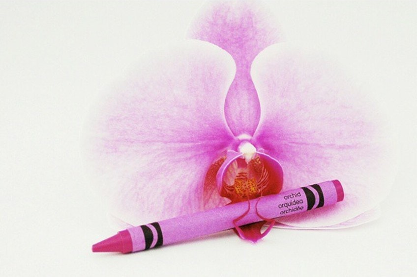
Orchid
Mother’s day might be coming up, and instead of buying your darling mother some orchids that might die because your mom is still a busy woman who never really developed a green thumb, you decided to paint her an orchid to hang on her wall for years to come. The types of purple you will use will vary between the hues, but the main color will be Orchid Purple. It is named this, because of its vibrancy, and how it resembles the color of a purple orchid beautifully.
| Purple Names | Shades of Purple | Hex Code | RGB % | CMYK % |
| Orchid | #da70d6 | 85.5, 43.9, 83.9 | 0, 49, 2, 15 |
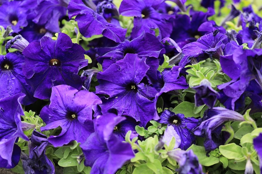
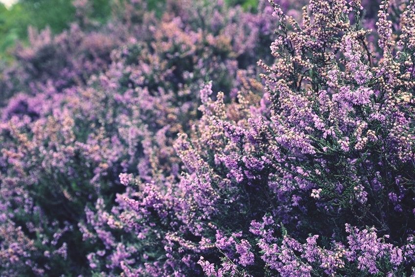
Lavender Field
Just like how orchid purple reminds you of actual purple orchids growing in nature, lavender purple does the same, but puts you right in the middle of a lavender field, as far as your eye’s senses are concerned.
This color is slightly muted, but not by much, taking on a pastel aesthetic that is slightly darker than your typical pastel. If you are an interior designer or an event coordinator planning out the decorations, this color will offer beautiful versatility, enabling you to use it for a range of themes. Even makeup and nail artists use this color regularly.
| Purple Names | Shades of Purple | Hex Code | RGB % | CMYK % |
| Lavender Field | #754C78 | 45.9, 29.8, 47.1 | 3, 37, 0, 53 |
Plum
No doubt, this color was named after a juicy plum fruit. It is a deep and luxurious color with an air of brightness. 1805 was the year that this color was named and celebrated for its romantic and mood-lifting appeal. This purple leans towards the warm color bias, having more red in the mix.
| Purple Names | Shades of Purple | Hex Code | RGB % | CMYK % |
| Plum | #580f41 | 34.5, 5.9, 25.5 | 0, 83, 26, 65 |
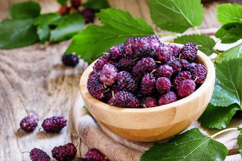
Mulberry
Have you ever gone mulberry picking in the summer months? If you have, you will be familiar with the berries that are very overly ripe, getting squished as you break them off the tree, and the purple color staining your fingers, mouths, and clothes… yikes! No matter the clothes, the purple color is unbelievably beautiful and named because of its striking resemblance to the color of mulberries. It is similar to the lavender purple color, but it is slightly darker and has more blue in the mix.
| Purple Names | Shades of Purple | Hex Code | RGB % | CMYK % |
| Mulberry | #493c62 | 28.6, 23.5, 38.4 | 26, 39, 0, 62 |
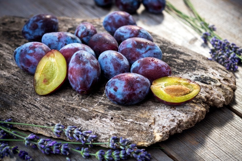
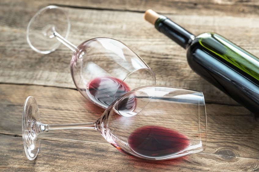
Grape
As we have been listing purple colors that are named after fruits, we surely could not leave out grapes! The iconic fruits that are used to make white and red wine are sure candidates for a deep purple color. Even though you get white and green grapes, this color was named after the deeper grapes, so the color has a more amethyst purple look about it.
| Purple Names | Shades of Purple | Hex Code | RGB % | CMYK % |
| Grape | #5d1451 | 36.5, 7.8, 31.8 | 0, 78, 13, 64 |
Pure Purple
Purple comes under the violet color category and is often said to be similar to darker magenta or darker purple. There is even a hair dye that bears the name, and even Hugo Boss found inspiration from the name for one of his perfumes. In acrylic paint, this color is often used for painting walls inside homes, and many other interior design aspects.
| Purple Names | Shades of Purple | Hex Code | RGB % | CMYK % |
| Pure Purple | #751973 | 45.9, 9.8, 45.1 | 0, 79, 2, 54 |
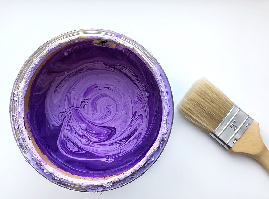
Making Specific Purple Colors
Dioxazine purple is a good option to keep around when it comes to mixing purples to get a specific hue. You can change up the color variation by mixing in other blues and reds, and you can make them darker and lighter by simply adding in either black or white. You might be working with blue color and not a purple, but the purple colors can still be helpful when manipulating the hue of the blue you are working with. The same principle can be applied to red, and other colors.
Mixing Shades of Purple with Acrylics
Primary colors play an important role in your color mixes. Without blue and without red, you will not get a purple color. The more red you use in your purple mixture, the warmer your purple’s color bias will be, and the bluer, the cooler the bias will be. There can be even more influence over the color bias if, let’s say your blue that you are mixing with is a blue that already has more yellow in the mix, well, then your purple will be more muddied because the combination of all three primary colors makes a mud color.
When purchasing your color set, make sure that the primary colors are not influenced by each other too much. Some of the blues have yellow mixed in, making it a more green-blue, but only slightly, and almost unnoticeable. Your primary colors should be pure colors so that when you are mixing you do not have any issues with the color bias.
Acrylic paints have the same colors as oil paints and other paints, but even still, this medium is a great way to mix paint. If you want to create a lively purple that is bright and full of life, we suggest that you mix in a warm blue, and a cool red, which are odd colors to imagine because red is usually warm, and blue is typically cool. But, these combinations work the best for the brightest purple shade like Magenta.
Mixing Shades of Purple with Watercolors
When you are mixing colors together, the same theory and practice that you use when you are mixing acrylic paints together. This means that the various shades of purple you make will rely on how much blue and how much red you add to the mix. The only major difference when mixing with watercolors is that the consistency is much thinner, in fact, it is basically like water in comparison to the acrylic’s texture being much thicker and easier to work with.
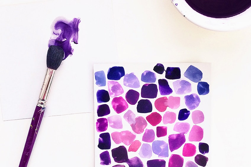
Another big difference is that watercolor paint is quite clear when you paint it, so the color will not be as vibrant or opaque, because you will see the paper through the paint. Colors sometimes tend to separate when combined, particularly when the colors have opposing color biases. Another thing you should do is to read the label on the paint you want to mix, as some may contain more than one pigment, which can cause this separation issue. The easiest way to achieve seamless blending is to choose paints that only contain one pigment.
With watercolor paint, some of the colors have stronger pigments than the other colors and it will color the paper you are painting faster and more efficiently than other colors. Sometimes the natural reaction for some newbie artists is to go over certain areas in multiple layers until the color is vibrant enough, but this might saturate the paper. To prevent this, rather paint on flat surface material, and also wait for the layers to dry. You could also purchase a higher quality watercolor set that has a high pigment amount.
For your benefit, we have listed a few examples of the reds and blues that are perfect for mixing purples. The first batch of color names are a few of the most popular cool-red colors, and the second batch is the warm-blue colors.
Cooler Reds
- Scarlet Lake red
- Crimson Lake red
- Quinacridone magenta
- Rhodamine red
- Alizarin Red
- Opera red
- Carmine red
Warmer Blues
- Cobalt Blue
- Victorian blue
- Indigo
- Mountain blue
- Ultramarine blue
- Brilliant blue
- Cyanine blue
You are not limited when it comes to already mixed shades of purple, and they are available at most art supply stores nationwide. A few of the popular choices that are regularly bought by a lot of artists are quinacridone violet. Yes, it can be helpful to buy the color already mixed, but there is an art to creating your colors, and once you master it, you can make any color that you so desire. Of course, you can still buy the already mixed paints and then manipulate them further by adding in additional reds and blues.
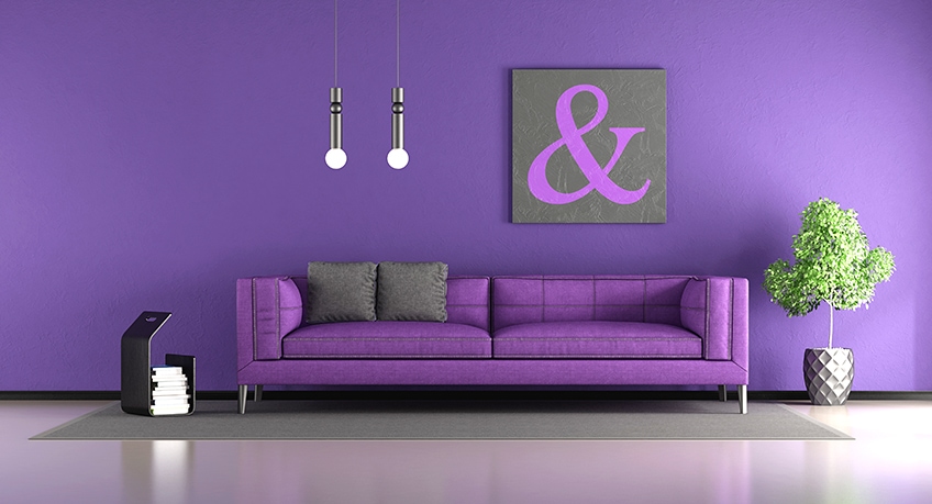
Purple in Decor
If you think about it, purple is not often found in the interior design of homes, because it is such a specific color, that not everyone enjoys being surrounded by it constantly. There are stereotypes that make purple a beautiful color to paint your daughter’s bedroom, especially the lighter purples like lilac and indigo. The darker colors are much more prominent and filling every wall in a room might make it feel a bit gothic. but, if that is your style, then, by all means, paint away.
Interior design is not the only form of decorating, you might be an event coordinator who is creating an “under the sea” theme, in which you will use purple for making octopus or coral reef backdrops. Or, you might be hosting a gender-neutral party for your baby shower. You are not limited to the themes and inspirations that the color purple can be used with, you just need to find the right shade.
A great contrast can be created by combining complementary colors together. Citron yellow is a little darker than your typical yellow, and this will make a muted purple color which is great for the neutral home that prefers to leave out all bright colors.
As with all forms of art or creative work that involves colors, we can get a large amount of help when deciding on the colors to combine together for the artworks or designs, by making use of the color wheel. This is a helpful tool that helps you to understand complementary colors and contrasting colors. This will help when you are redesigning a bedroom or a kitchen, and you will better understand what is the best color combination. To make things a little easier, we have listed a few of the best combinations that we recommend below.
- Neutral hues combined with a light mauve color
- A lavender hue combined with an amethyst color
- Grays that are either dark or light, combined with a deep purple
- White combined with any of the bright purple colors
Here are a few and final tips and suggestions for you to read so that you can spend less time mixing and more time enjoying the art or painting or creating: If you want your purple to stand out above the other colors, pair it with a complementary color. Remember that mixing cool red and warm blue might sound strange, but it makes a beautiful and bright purple. The shade of your purple will change according to the ratio of blue and red that you decide on mixing with. The name is not what you can expect from the paint, but rather pay attention to the HEX code. Do not forget that the purple colors might dry different shades, depending on what paint medium you are using. Should you want your purple to be less vibrant and more muted, you can always add in some yellow.
Now you are fully equipped with some extensive and detailed knowledge on the color purple you will be able to manipulate the color into all forms of your art because you know how to mix the perfect purple shades!
Frequently Asked Questions
How Do You Make a Bright Purple Color?
Initially, you might think to mix in yellow to make a bright purple, but you will be left with the opposite of what you want. Yellow mixed with purple creates the chromatic grey that would be used for a shadow on a purple surface. To make a bright purple, you should mix in some white paint.
What is the Difference Between Violet and Purple?
Some artists do not place violet within the purple category of colors, and this is because it is more of a spectral color, meaning it can only be seen if red and blue are together. On the color wheel, violet is also between blue and red, but it is on the blue side of the wheel, where purple is on the red side.
What Colors Contrast Well with Purple?
If you want to create a vibrant visual effect or to create a significant contrast, using colors that are complementary to one another is a great idea. They are colors that oppose each other on the color wheel. The complementary colors for purple are yellow and green.
Can You Make Purple with Blue and Red?
You make purple by mixing the primary colors blue and red together, so yes you can. The only thing that will change is if you choose to add blue, the purple you make will be cooler, and if you add more red, the purple will be warmer.

Larissa Meyer is a 32-year-old mother from Michigan and creative spirit since childhood. Her passion for painting and drawing has led her to an education as an illustrator and a career as a freelance graphic designer. She has a Bachelor of Fine Arts in Illustration and a degree in Graphic Design. Larissa is a talented artist who is able to master a wide range of styles and techniques to bring her artistic vision to life. Her greatest passion is currently fluid painting and epoxy resin art. Larissa’s love for art and her knowledge and experience in illustration make her the perfect Creative Director for our fluid-painting.com team. She is the creative head of our team and shares her passion and knowledge with our community through articles and tutorials.
As a mother of a 2-year-old daughter, Larissa also understands the importance of fostering creativity in early childhood. She uses her experience and knowledge to help other parents inspire their children and develop their artistic skills as well.
Learn more about Larissa Meyer and about us.