What Colors Make Red? – How to Make Red Shades from Scratch Easily
This post may contain affiliate links. We may earn a small commission from purchases made through them, at no additional cost to you.
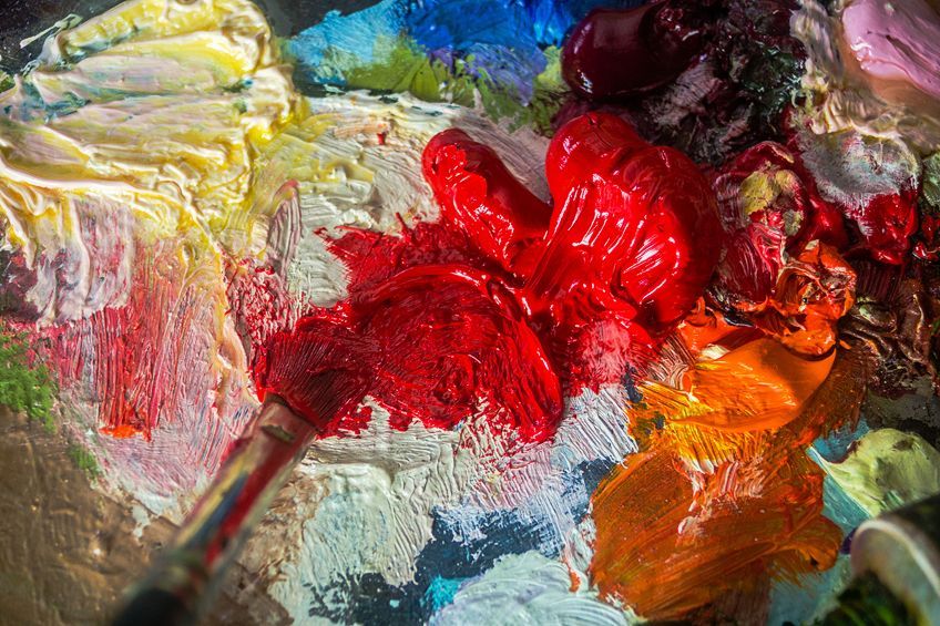
The color red is a very popular color, especially amongst artists who use red and various shades of red in nearly every type of artwork. This also includes the DIY artist who uses different shades of red paint on walls and other surfaces in their homes. The color red is popular because of its bright, vibrant, exciting, and bold color, which always gives emphasis and highlights whatever surface it is applied to. In this article, we will be guiding you through the many different shades of red and showing you how to make red.
Table of Contents
What Colors Make Red?
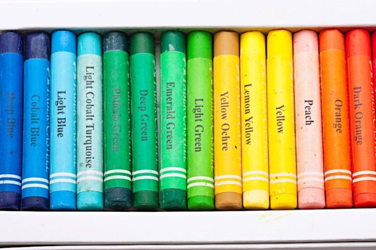
When you were a child, I am sure you were taught how to mix watercolor paints to get different colors. You most probably also learned that red is a primary color, and that yellow and blue also fall into this category. Red, therefore, cannot be mixed with any other color to make true red. You can learn how to make red by mixing other colors with red, this will make different shades or hues of red.
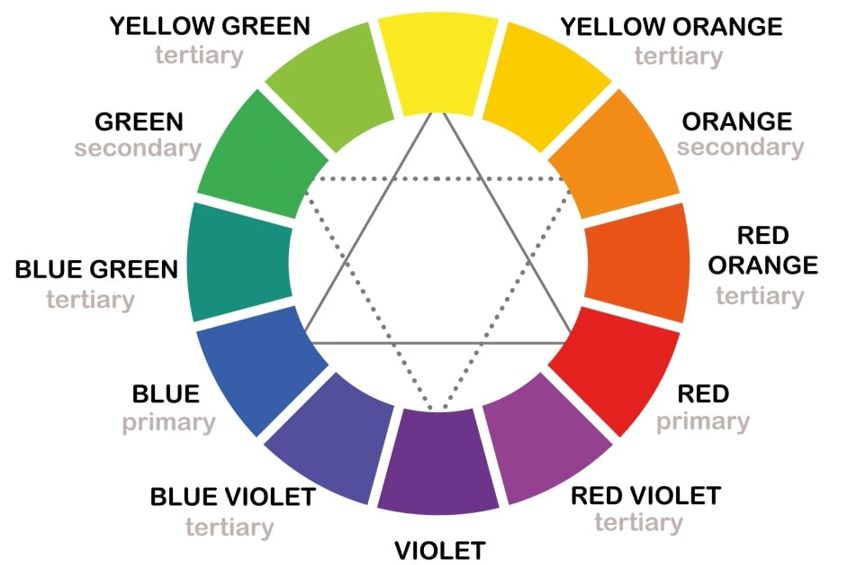
Understanding the Color Theory
We now need to understand the color theory before we start mixing different shades of red. Thich means understanding the color wheel and the different color temperatures. The color wheel displays the various primary, secondary, as well as tertiary color shades, which provide a true family of colors. There are three primary colors, six secondary colors, and twelve tertiary colors.
You will notice that by using the three primary colors in various combinations, you create all the secondary and tertiary colors.
If you combine or mix all the primary colors, you will end up with a shade of brown. So, when you mix tertiary shades, you should combine one of the primary hues that are found in the secondary shades, which will give you a crisp and bright color mix. On the color wheel, you will also notice that some of the colors are situated opposite each other, like red and green. These are called complementary colors. When using these colors and placing them next to each other, each color will appear brighter and bolder.
Understanding the Color Bias
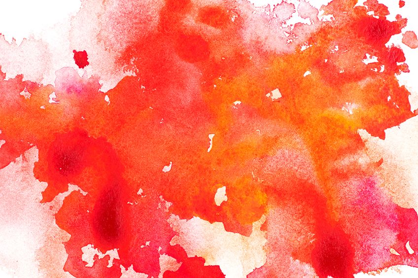
How does the color bias affect shades of red? You will notice a color bias with all of the secondary and tertiary shades, the color is either cool or warm. For example, bright red is a very warm color. The temperature of colors can be adjusted by adding more cooler or warmer hues. If you are looking for a hot fiery red color, the mix must lean more towards orange, so you need to mix a warm red with a warm yellow. These warm tones of red can be used for painting a brilliant sunset or glowing embers of a fire.
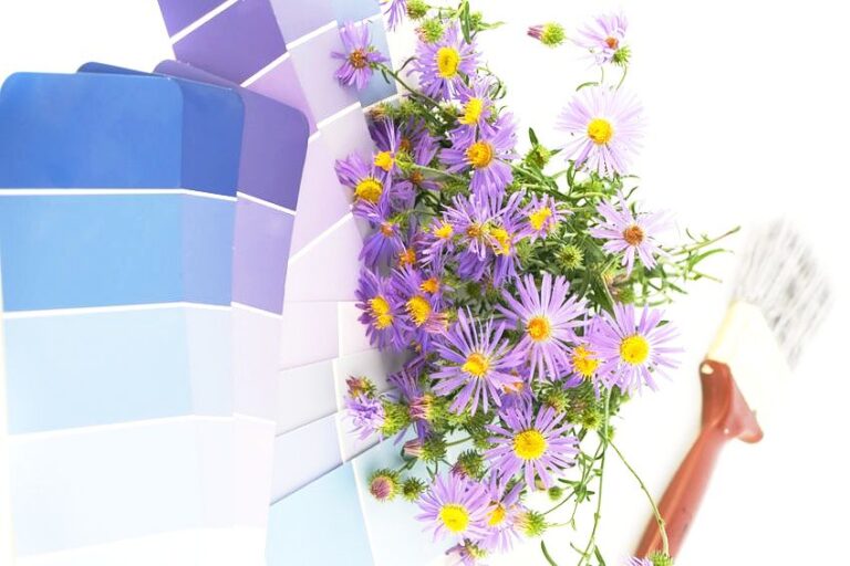
Alternatively, if you need a cooler red color, you will need to mix it with a small amount of blue, which leans more towards purple. This is because blue is a very cool color, and you can create a cool red like maroon or aubergine that are both cool. These cooler shades of red are used for painting the slightly red hue of an autumn leaf. To create more realistic artwork, you need to understand the importance and impact that temperature plays on your color hues.
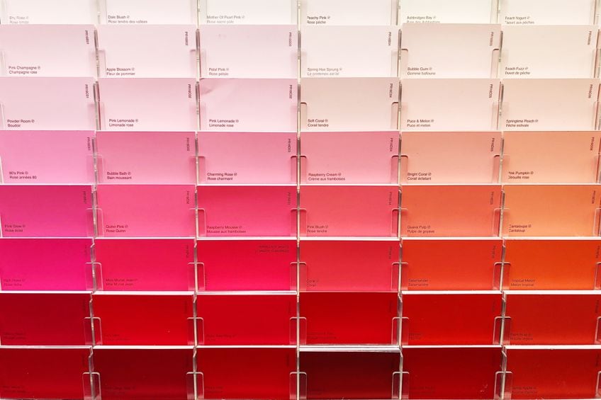
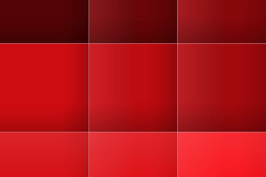
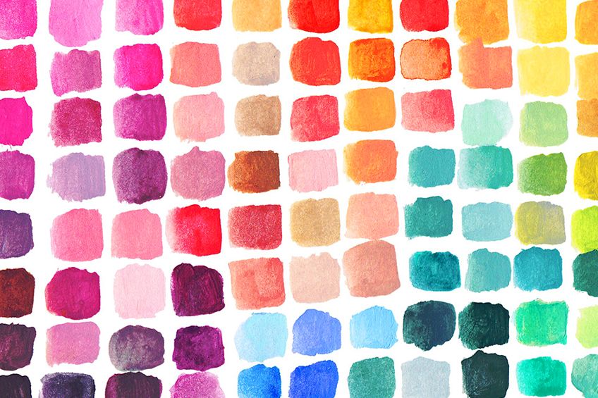
Creating Shades of Red From Color Coding
We have created a color-coding table below, which should help you find the different shades of red on your computer. In the table, you will find that each of the colors we have selected is defined by using their hex codes, as well as their traditional ratio of red, green, and blue (RGB) for each color.
We have also included cyan, magenta, yellow and black (CMYK) percentages for printing.
| Color Type | Red Shade | Hex Code | RGB% | CMYK% |
| Chili Red | #e23d28 | 88.6, 23.9, 15.7 | 0, 73, 82, 11 | |
| Chocolate Cosmos | #58111a | 34.5, 6.7, 10.2 | 0, 81, 70, 65 | |
| Dark Red | #8b0000 | 54.5, 0, 0 | 0, 100, 100, 45 | |
| Coral Pink | #f88379 | 97.3, 51.4, 47.5 | 0, 47, 51, 3 | |
| RBG Red | #ff0000 | 100, 0, 0 | 0, 100, 100, 0 | |
| Scarlet | #ff2400 | 100, 14.1, 0 | 0, 86, 100, 0 | |
| Cardinal Red | #c41e3a | 76.9, 11.8, 22.7 | 0, 85, 70, 23 | |
| Crimson Red | #dc143c | 86.3, 7.8, 23.5 | 0, 91, 73, 14 | |
| Light Red | #FF7F7F | 100, 49.8, 49.8 | 0, 50, 50, 0 | |
| Pale Red | #db7093 | 85.9, 43.9, 57.6 | 0, 49, 33, 14 |
The colors in the table above are but a few of the many different shades of red that you can create, and all of them have different uses. For example, chili red is a warm bright shade of red that has strong undertones of orange and is ideal for creating an amazing sunset sky or a roaring fire.
Below are a few shades of red with their names and what they illustrate.
| Shade of Red | Red Shade | Color Description | Illustration Uses |
| Chocolate Cosmos | Full-bodied dark plum color. | Brings to mind chocolate, wine, and dark-colored berries. | |
| Dark Red | Dark red. | Associated with passion, roses, love. | |
| Coral Pink | A light peachy shade of red, closer to pink than red. | Warm, happy tropical, and fun color. Can be used in fruits, flowers, and sunsets. | |
| RBG Red | A bold and bright shade of red. | Closest to true red. | |
| Scarlet | Bright and vibrant orange-red. | Common color included for the center of a fire. | |
| Cardinal Red | Cooler red, lighter than maroon, and the chocolate cosmos. | Popular as beautiful bird feathers. | |
| Crimson Red | Rich, warm, and bright red. | The color is often used to paint the color of blood, a beautiful sunset, or a blushing cheek. | |
| Pale Red | Rare color saturated with white. | It is referred to as rare red, as colors mixed using red and white are usually pink. It is used to denote the color of wood, bricks, or stone and also for salmon. | |
| Light Red | The color stems from the primary color red and is made up of red and pink. | Shade is around 50 percent lighter than the primary color red. |
Creating Various Degrees of Red
You now have a basic understanding of color theory, color bias, and how temperature can affect your colors. We can now discuss how to mix your colors to create warmer and cooler shades of red. This will be dependent on whether you want to mix a light red, a pale red, or a crimson red, and if the color you need should be warmer or a cooler shade of red.
Creating Warmer Shades of Red
To create a warmer shade of red, you need to mix red with yellow and make sure your yellow does not contain any blue in it. If the yellow you use contains any blue, it will lean more towards green and you will end up with a muddy color red. By using cadmium yellow, which is a light yellow color, it will make the red hue lighter, making it a warmer color red.
By using yellow ochre, which is a much darker color yellow, it will deepen the red hue making a stunning warm color red.
Creating Cooler Shades of Red
When creating a cooler shade of red, you need to add some blue that has no yellow in it. To do this, you have two options, one is to mix your red with ultramarine blue that already has a little red in it, but you need to make sure no yellow is added to it.
Ultramarine blue has a dark blue hue, so it will create a deep cool red shade. You can also try cerulean blue that will create a cool lighter shade of red. Experiment by adding different quantities, which will give you the cool red hue you want.
Creating Muted Shades of Red
At times when you are painting red, maybe it is a little too bright and bold and you then need a red hue that will give more depth to your piece of artwork. This may be particularly true when painting a rose as you need the bright red shade to start with, but then you will also need to have a light red hue for certain highlights and muted red hues for the shadows.
Green is the complementary color for red, and every specific red hue has a specific complementary color of green. It will depend on how dark or light you want your muted red shade, and this will determine what shade of green you must use. This means that when you mute red using green, you end up with a mixture that contains all three primary colors. This means the red color will be less bright and may appear slightly brownish.
Muted Shades of Red Using Forest Green
If you want to mute your red hue to make it much lighter, then we recommend a very small amount of forest green. This will give you an amazing lighter shade of red.
However, if you combine forest green and cadmium red, it creates a less bright red that has a slight brown tinge.
Muted Shades of Red Using Phthalo Green
By making use of phthalo green to create a more subdued red color, you will end up with a darker subtle red hue because phthalo green is a cool color with a dark green hue.
The color you have created will be a dark brownish-purple, which is great to use when painting shadows.
How to Make Shades of Red
According to statistics, there are more than 400 different shades or tints of red. Here are a very few of these shades of red; ruby red, mahogany, apple red, crimson, Indian red, cherry red, strawberry red, raspberry red, and hibiscus. Now let us show you how you can create all of these shades of red for yourself.
- Ruby red: Mix red with a hint of black
- Mahogany: Mix two parts of red with one part of the blue
- Candy apple red: Mix red with a hint of orange
- Crimson: Mix red with a tiny amount of blue
- Indian red: Mix red with blue and a hint of white
- Cherry red: Mix light red with heavy black
- Strawberry red: Mix red with white and a tiny amount of orange
- Raspberry red: Mix red with a hint of magenta
- Hibiscus: Mix red with a tiny amount of violet
These are just a few examples of just how easy it is to create different shades of red. Remember, whenever you add white to the mix, you are making a tint of red which is usually pink. For example, hot pink contains more red paint, and pale pink contains less red.
By using red as your base color, the sky is your limit as to how many different types of red tints or shades you can create.
Mixing Red Paint
When you are starting a painting project, you will probably require several different shades or tints of red, which you can create yourself by adding other colors. Try not to gather too many colors, but keep it simple and have colors like red, black, orange, green, yellow, white, blue, and violet. Let selected paints be as close to a pure color as you can get.
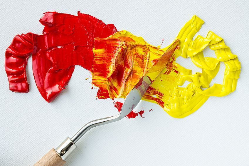
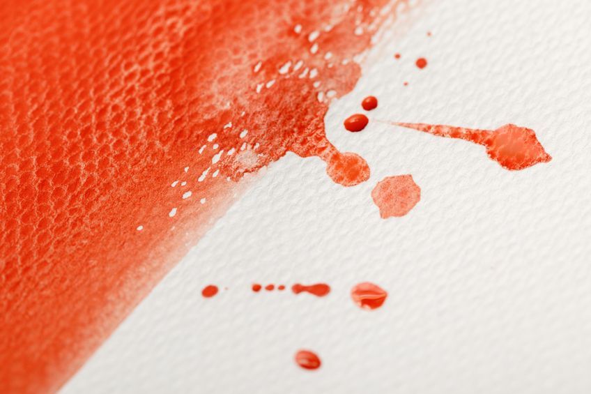
Squeeze a tiny amount of red paint onto some paper or a palette. Now take your paintbrush and transfer some of the red paint onto a clean piece of paper and paint a line with it. This line of red paint is going to be your sample for the rest of the project. You can then compare any other red shade or hue you create with it. You can now separate the red paint on your palette into two equal portions and add a small amount of yellow to the one red portion and a small amount of blue to the other and mix them well together. You will observe that the red paint changes color.
Where you used the yellow paint with the red paint, you will have created an orange-red, and with the blue mix, you have created a violet-red.
Take your paintbrush and transfer some of the orange-red to the paper next to the red and do the same with the violet-red color. You can now compare the differences you created with your original sample. Next, start with two fresh portions of red paint on your palette and add some orange paint to one portion and violet paint to the other red portion and mix them well. If you used an equal amount of both colors, you have created a new red hue. Transfer some of the new paint batches to the paper and paint a line next to the previous lines and compare the differences.
You can now repeat this process by using some of your other colors like green. You will then have created a reddish-brown hue but be careful not to add too much green or you will end up with brown paint. You can also try mixing some black and white with your red paint, which will create a red-brown hue.
As you have been doing, you can then compare it to the other samples on your piece of paper.
Colors, Emotions, and Artwork
Colors play an important part in our emotions, even though we might not be aware of how they affect our emotions. Therefore, as an artist, we need to be aware of the emotions associated with certain colors so that we can incorporate it into our artwork. The color red is linked with many emotions including passion and love or to heat and fire.
Dominance and Strength
Red is a bright color that shows a level of authority, and this can be used in your artwork conveying strength. The color red is also linked to strong and dominant feelings of anger as the well-known phrase states “seeing red”.
Warmth and Heat
When you think of warmth, heat, or fire, the color red is dominant, which only proves the theory that red is the warmest color there is. This is very true in your artwork when the color red leans more to orange.
By using various shades of red, you will be able to add heat, passion, and movement to your artwork.
Passion and Love
Passion and love have always been associated with the color red, mainly due to it being a very warm color. The color associated with Valentine’s day is always a warm and hot red like in the roses and the décor so that when everyone sees the color red, they will automatically think of love and passion.
Danger and Warning
Have you ever wondered why traffic lights and signs portray the color red? Red is a color for danger and warning. The color red shows the strongest reaction to danger more than all the other shades of red, such as orange. A red flag was used in warfare to declare the war is on and none were to be spared. A red flag is raised during a car race, warning the driver of danger ahead. When a football player commits a serious violation, he is shown a red card.

Sacrifice and Courage
The color red has always been associated with bravery and courage and was often used on warrior’s shields or national flags. For example, the soldiers in the first crusade carried a banner that showed a red cross on a white background. Red is also a color used to depict sacrifice, as red was a symbol of sacrifice and martyrdom, which is why the Cardinals of the Roman Catholic Church wore red robes to depict the blood of Christ.
Attracts Attention
The color red is the one color that attracts a lot of attention and is often associated with activity, dynamism, visibility, and extroverts. In the fashion industry, red is used to attract people’s attention. Someone dressed in red seems to stand out and appears to be closer than others dressed in different colors, even though they are all the same distance away. Therefore, the color red is a tool to use in your paintings to attract the attention of anyone viewing the painting.
Red is an essential and beautiful part of any color palette. While you can buy a range of red hues in stores, you can get much more depth and subtlety when you mix your own red shades. We hope you feel inspired to explore this world of red yourself and see what exciting things you can create.
Frequently Asked Questions
Can you Produce Red Paint by Mixing White Paint With Red Food Coloring?
Yes, if you use only a small amount, to begin with, to see if it works. You can then go ahead because food coloring is a dye and should work.
Can You Make a Light Grey Paint By Mixing In Red Paint?
You can make grey paint by mixing black with white, but if you want to make the grey paint warmer, you can then add some red paint.
Can You Make White Paint Red?
No, the only colors you can use to make red paint are yellow or magenta. However, if you want red paint, it is far easier to go out and buy some.
If I Mix Yellow And Orange, Will I Make Red Paint?
No, if you mix some red paint with yellow paint, you can make orange paint or green but not red.
What Two Colors Can Make The Color Red?
As red is a primary color, there are no colors that you can mix to make true red. However, by using almost all of the colors you will be able to make a shade or tint of red. Magenta and yellow mixed together can produce a shade of red that is closest to true red.

Larissa Meyer is a 32-year-old mother from Michigan and creative spirit since childhood. Her passion for painting and drawing has led her to an education as an illustrator and a career as a freelance graphic designer. She has a Bachelor of Fine Arts in Illustration and a degree in Graphic Design. Larissa is a talented artist who is able to master a wide range of styles and techniques to bring her artistic vision to life. Her greatest passion is currently fluid painting and epoxy resin art. Larissa’s love for art and her knowledge and experience in illustration make her the perfect Creative Director for our fluid-painting.com team. She is the creative head of our team and shares her passion and knowledge with our community through articles and tutorials.
As a mother of a 2-year-old daughter, Larissa also understands the importance of fostering creativity in early childhood. She uses her experience and knowledge to help other parents inspire their children and develop their artistic skills as well.
Learn more about Larissa Meyer and about us.