Warm Colors – A Warm Temperature Palette Guide
This post may contain affiliate links. We may earn a commission from purchases made through them, at no additional cost to you.
When you look at a painting of a farm landscape during the winter, you will see a lot more of those muted colors we have spoken about previously, as well as more of the cool colors than you will see warm colors. This is because the sun is typically shining less in winter so the colors will be cooler from the cloud cover and possibly rain. This will also apply to a painting of the ocean because blue and green are the main colors you will find there. Warm colors that you will find on a warm color palette are seen in the summer scenes of artwork, imagine red and yellow flowers blooming, or maybe a fire dancer, dancing on a beach at night. So, what are warm colors? Is pink a warm color? What about green? Is this a warm or cool color? We will discuss all of these confusions of warm or cool colors in detail, including a few of the most basic warm color examples. We will also discuss the gray area of warm and cool colors, and we will talk about how to use them within your art.
What Are Warm Colors?
What are warm colors? To answer that, we ask you to close your eyes and imagine your favorite painting, it can be done by anyone. What colors are involved in the swirls and patterns and shapes that make up the painting? What feelings do they invoke in you? Are they feelings of tranquility and healing, or longing and sadness?

Warm and cool colors both play a part in conveying the message and meaning of the artwork set by the artist, but it would be up to you and your experiences that would determine how you perceive the colors. Some colors can be stress relieving and can promote completing your REM cycle when you are sleeping.
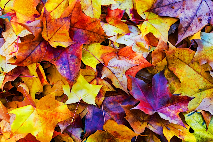
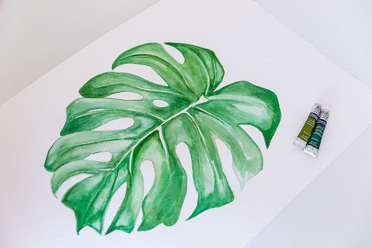
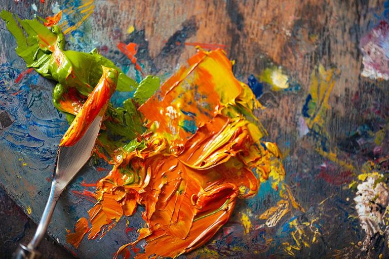
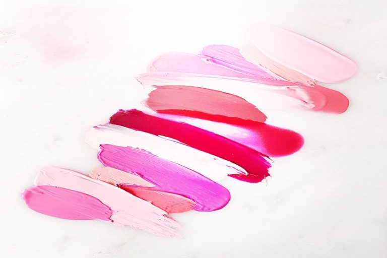
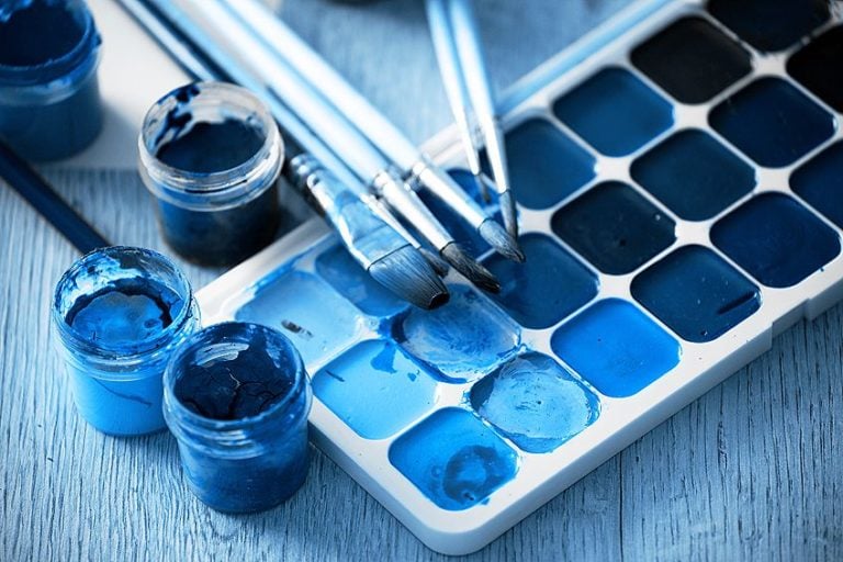
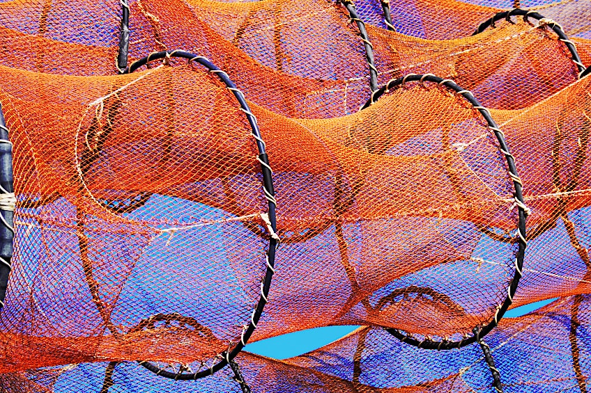
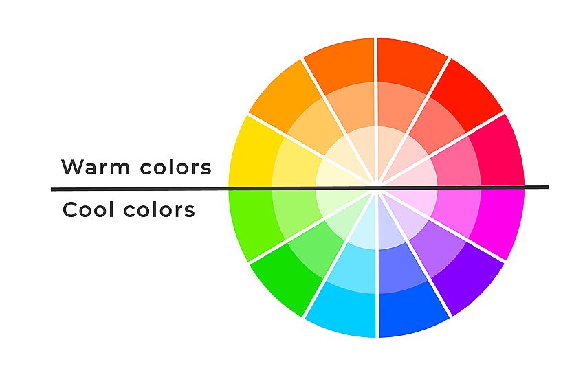
Some of the most basic warm colors on the color wheel are yellow, orange, and red. Many would immediately think of a fire, and that is how warm colors get their name. Everything that invokes warmth or heat is a warm color. This does not exclude all of the various shades of these three colors like burnt umber or sienna, it includes every color in between until you reach the cool color palette. So, is pink a warm color? The answer is yes because pink is a mixture of red and white. Is green a warm or cool color? Typically green will be a cool color, but you can tone down the color by adding in some red or even orange and you will be left with a warmer olive green.
Yellow
For most of us, yellow is an extremely bright color and one that is not often missed. Think of a yellow highlighter and how it is the most commonly used because you can see clearly through it and it stands out the brightest amongst the other highlighters. This is a good way to understand how yellow is the best way to draw your attention to certain areas of the painting, creating highlights.

Yellow is also the color that will lift any mood in the room. If you are lying in hospital and someone brings you a bunch of yellow sunflowers, they are sure to bring you some joy, no matter how big or small. It has even been said to help relieve a child who has asthma or any form of chest infection causing breathing issues.
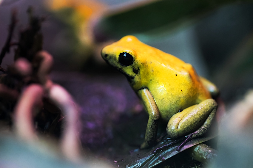
As such a vibrant color, that attracts so much attention, it is not surprising that even in nature yellow serves as a warning. The brightest insects, amphibians, and plants that are yellow as well, are colored that way as a warning of danger, possible poison, so that other animals who are wise enough to notice, will steer clear.
Red
In the same way that yellow is a natural warning sign, red is a color that draws in the most attention or warnings of danger. It affects the depth perception of your artwork because most aspects that are painted red will stand out so much, they will seem to be in the front, even if they are meant to be in the background. The color red is an interesting ability to make our heart rate go up, and raise our blood pressure.

Triggering feelings of excitement and love, but also anger, and pain. It can give a sense of strength and power which is why it is used during sports games. In addition to being an active color that inspires action, red is also a color that stimulates emotions, making you face your demons and work through them.
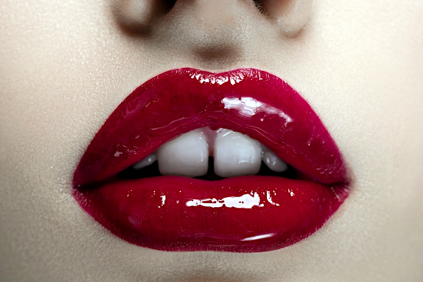
When used excessively, this energy can lead to a sense of uneasiness, anxiousness, and frustration. Due to this reason, this is not a color that is suitable for walls in a classroom at a school, or in a counselor’s or psychologist’s room.
Orange
The warm color palette also includes orange which is one of the most motivating colors on the color wheel in general. It can inspire so much within us, sparking us to revitalize our thoughts and behaviors.
Orange is often used when conveying optimism because it can boost your morale to another level of positivity. Most children love this color for its brightness and ability to liven up any artwork.
Hex Coding for Warm Colors
Now that we have established the difference between warm and cool colors, we can begin to talk about something called color bias. So if you have been asking yourself, is pink a warm color? Or, is green a warm or cool color? This is where you will find out.
Color bias is a phenomenon that occurs when you get a color that is warm-cool, or cool-warm. They can be either warm or cool, depending on the group you are pairing them with. Pink is made by mixing one warm color, red, and the neutral color, white, but you can make it cooler by adding in some blue or purple. Green is made by mixing one warm color, yellow, with a cool color, blue. Yellow can also be made into a cool yellow, or a cool-warm color by mixing a bit more green into the mix. Or green can be made warmer by adding in a little orange or red.
To properly identify colors, we make use of the designated Hex code rather than relying entirely on the name of the color. We all have our perceptions, which means we might perceive a certain color differently from someone else. The Hex code allows us to easily talk about colors and everyone knows which one we mean without confusion.
| Color Name | Warm Color | Hex Code | RGB % | CMYK % |
| Red | #ff0000 | 100,0,0 | 0,100,100,0 | |
| Orange | #ff7f00 | 100,49.8,0 | 0,50,100,0 | |
| Peach | #fef0db | 99.6,94.1,85.9 | 0,6,14,0 | |
| Gold | #ffd700 | 100,84.3,0 | 0,16,100,0 | |
| Beige | #d8bcab | 84.7,73.7,67.1 | 0,13,21,15 | |
| Bright Pink | #ff007f | 100,0,49.8 | 0,100,50,0 | |
| Yellow | #fff000 | 100,94.1,0 | 0,6,100,0 | |
| Maroon | #800000 | 50.2, 0, 0 | 0,100,100,50 | |
| Ultramarine Blue | #4166f5 | 25.5,40,96.1 | 73,58,0,4 | |
| Pistachio | #93c572 | 57.6,77.3,44.7 | 25,0,42,23 |
Art With Warm Colors
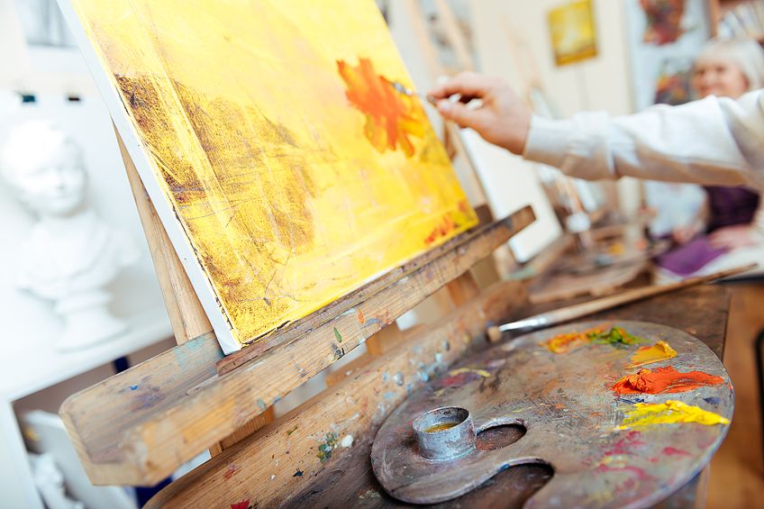
As we have mentioned before, working with paints takes a lot of mixing, and sometimes using a warm red or a warm yellow is just not going to work for the artwork you are creating. Sometimes you will need a cool yellow to show the highlights on a blue-colored fish in the ocean, or possibly a cool red by mixing in a little blue. It is up to you and your mixing experiments to find the right color for your blending.
How Important is Color Temperature in Art?
Choosing a color temperature should come with careful consideration. It can be the mood definer and the message conveyer. If you use a color that is too warm when it needs to be a cooler color to suit the scene or the subject matter, it will not feel right for the viewer. If you are a keen explorer, you might want to try out some of the following techniques that come with controlling your color temperature.
- To convey depth into your artwork you can use cool colors that have a slight muddy feel to them. Warmer colors or cool-warm colors can be used for the objects in the forefront.
- The mood is influenced by the color choice you paint with, and you can always change it up if you want to change the mood.
- You can show where the light is imaginatively coming from in your painting, or give light to the highlights or where the light hits each object.
Spatial Illusions and Color Temperature
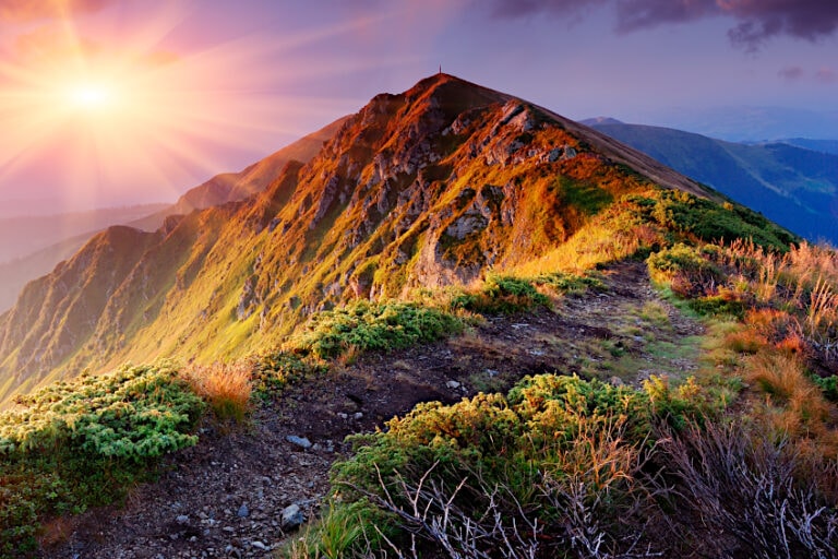
If you are an expert landscaper, you will be well versed with the concept of creating illusions in terms of space. This is basically when you create depth by painting the cooler colors at the back of your artwork. You might be painting the same mountain range, but the mountain at the front will be of a warmer color than the mountains at the back. Even though the mountains are right next to each other, they seem to be miles apart because of the colors you chose, creating a figurative depth perception.
Jean-Baptiste-Camille Corot’s A Bridge at Narni (1826)
In this painting, Jean-Baptiste makes great use of color temperature to manipulate the appearance of depth. You might see that he has made the colors that are near to the front with the warmer colors, and the ones that are much further away range into much cooler colors. Jean even used a warm-cool color for the green that is near the front. He mixed it with a selection of colors to make it a more olive green that gives off a warmer feel than your typical green.
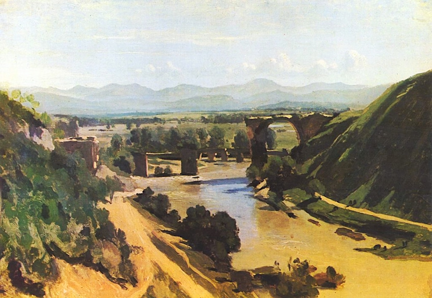
Jean-Baptiste-Camille Corot’s A Bridge at Narni (1826)
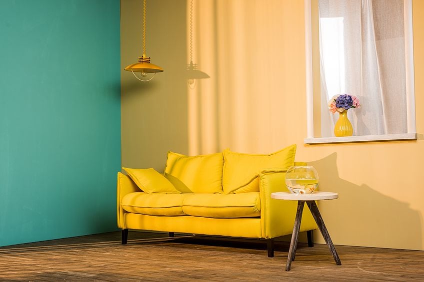
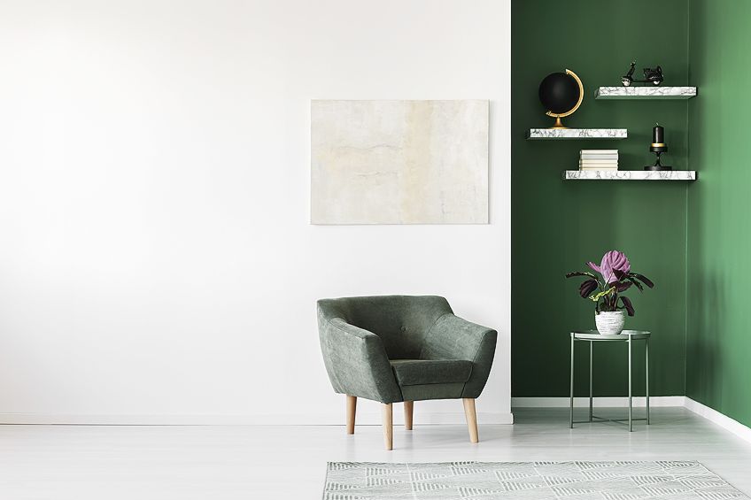
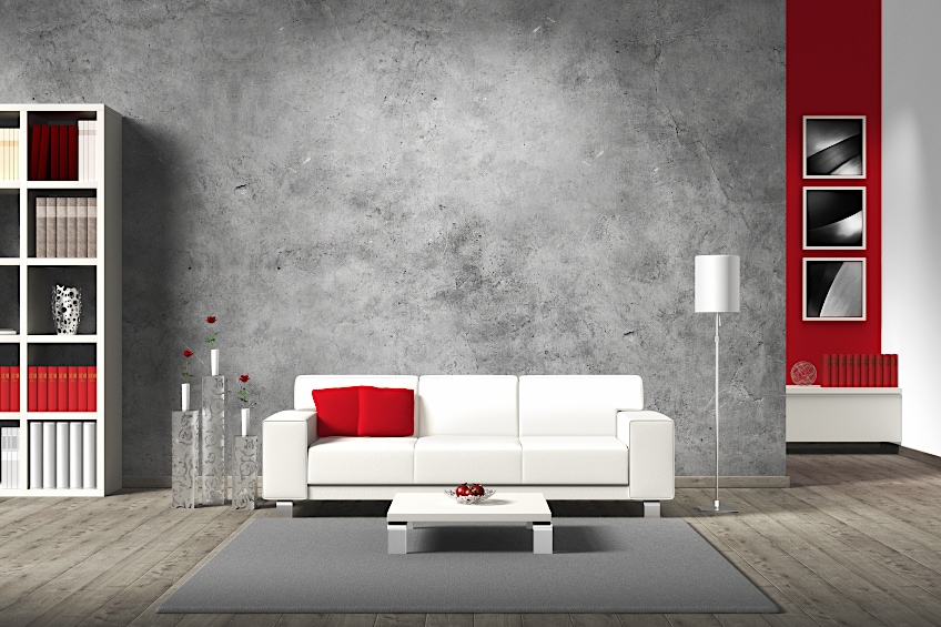
Warm Colors and Interior Design
Interior design for your office or for your home is very reliant on the temperature color palettes. Cool colors provide a sense of tranquility and harmony in the room. Warm colors have a different effect, bringing positivity and mood-enhancing qualities. Neutral colors like beige are also a part of the warm color wheel, and they help to make a room feel peaceful. Using warm colors has many benefits, some of which we have listed below.
- Make a large room more inviting or accommodating by painting it a warm shade
- Colors that are lighter and brighter tend to have a more happy and peaceful feel to them
- If you paint a bedroom a subtle pink, you will be relaxed whenever you are in there
- The intimacy of a room can be increased by using deep warm colors
Certain rooms are more suited for certain colors. Your bedroom or bathroom would be better off tainted in a cool color like green, brown, or blue. But, your living room and kitchen areas will be much happier places if painted with warm colors. The social areas of the home should be warm, and the places where you spend more time alone or resting should be a cool color.
Temperature Color Palettes
Do you remember us mentioning the color bias earlier? This is when your subject matter is a red color but you need a cool-red which is typically a warm color. This can be done by adding a small amount of green to the red to bring down the intensity of the tone. This will help to mute the color so that you can use it alongside cool colors without it looking shocking. The same concept applies to adding a greenish-yellow color to a greenish-blue color, in the end, you will have a very luminous green color.
Over mixing is a problem, so we should all avoid trying to add too many colors at once. Try to mix with a maximum of two colors at first, and add a little bit of an additional color if you feel it is needed. This means that you can start with a limited palette when you are a beginner so you can become accustomed to mixing the various colors and temperatures. Here is a summary of the various benefits you can appreciate when you make use of the temperature color palettes.
- You will be able to paint paintings in less time
- The composition of the painting, as well as the tone, must be considered more and this will become a habit
- Your artworks will have more balance between the colors, making them more harmonious
- You will be able to paint anything because you have adapted to using the various temperatures
- Colors will be more coordinated
- Your artworks will be of a professional value
- The temperature palette principles are the same for the various paint mediums
So, that brings our article on warm colors to a close! In conclusion, we can see from this tutorial just how important warm colors are to our artworks and our lives in general! These colors are of anything that evokes a feeling of warmth within you, inspires or motivates you, or provides natural warning signs that come as a package deal with nature’s finest predators in the form of insects, amphibians, and more.
Frequently Asked Questions
Is Pink Part of the Warm Temperature Palette?
Pink is made by mixing the colors white and red, the brightness or lightness of the color will depend on the amount of each that you add. Pink is a cool color if you place it beside purple or magenta. But, pink is a warm color if you place it beside an orange or a yellow.
What Temperature Palette Does Green Belong To?
Green is a warm color if it is on a cool temperature palette like jade green or teal green, but it can also be a warm color like apple green or lime green. The more blue you add, the cooler the color will be, and the more yellow or orange you add, the water it will be.
Is Gray Part of the Warm Temperature Palette?
Everybody regards gray as a cool color, as it appears to be cloudy and dull. However, once again, you also have warm gray colors. A cool gray color will have more of a blue undertone, whereas a warm gray color will have more yellow or brown undertones.
What is the Most Eye-Catching Color?
Yellow has been widely accepted in the creative and marketing industries as the most eye-catching color, and it is often used to depict extreme highlights, or used to draw your eyes to the right places of your artwork, or campaign. Traffic officers wear orange vests on the roads so that they are seen better, but it has been said that green is far brighter, especially as a luminous vest.

Larissa Meyer is a 32-year-old mother from Michigan and creative spirit since childhood. Her passion for painting and drawing has led her to an education as an illustrator and a career as a freelance graphic designer. She has a Bachelor of Fine Arts in Illustration and a degree in Graphic Design. Larissa is a talented artist who is able to master a wide range of styles and techniques to bring her artistic vision to life. Her greatest passion is currently fluid painting and epoxy resin art. As a mom of two kids, Larissa also understands the importance of fostering creativity in early childhood. She uses her experience and knowledge to help other parents inspire their children and develop their artistic skills as well.
Learn all about Larissa Meyer and Fluid Painting.