Shades of Green – A Complete Guide to the Green Palette
This post may contain affiliate links. We may earn a small commission from purchases made through them, at no additional cost to you.
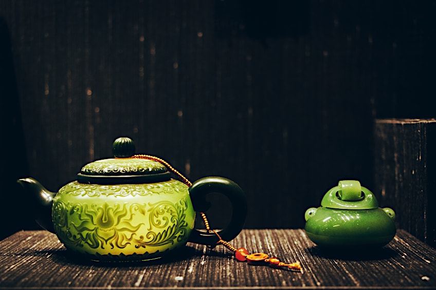
Shades of green are inescapable. Wherever you are, some shade of green will be present. Even in big cities, green colors can be found everywhere, from the leaves of trees to the clothes we choose to wear, plastic items, wallpaper, construction tools, and so many more things. This makes green a necessary color to use when creating art. It symbolizes healing and self-growth, so the message it conveys and the feelings it inspires are deemed worthy by all artists and even graphic designers. Today we shall be discussing the green color in detail. We will cover the different types of green from light to dark green, as well as inform you of the names of some green shades like forest green and Ming green. We will even introduce the green hex codes of the various colors that we talk about, and give reasons for why those are important. If you are keen to learn more about the green color so you can start mixing your own shades of green, or pair them with the best colors, then keep reading this tutorial on the green color palette.
Table of Contents
The History of Green
Shades of green are intriguing to human beings. They stir up homey feelings – the kind that heals you from the soul, symbolizing optimal health, refreshing energy, and revival, but can also suggest death and decay. This duality is not accidental, because many of the pigments used to create the green colors from way back in the day were actually frighteningly toxic, and many people were nervous of green colored objects, for good reason too! Luckily with the progression of science and technology, other natural pigments were found to replace those poisonous ones, and synthetic pigments have been created making them much safer, and the perception of the color changed.
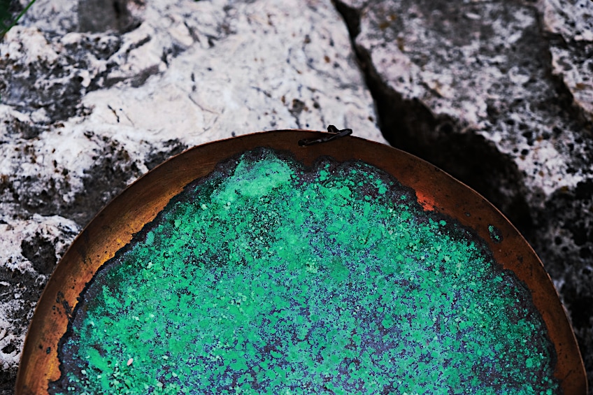
Ancient Romans would soak copper plates and cups in wine, so that the oxidation would turn these items various beautiful shades of patina green. From there, the love of the green shades grew, and they began to incorporate different types of green into their mosaics and stained-glass art.
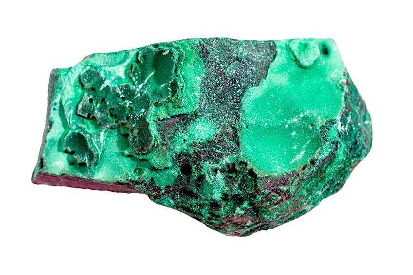
In ancient Egypt (because what is a history lesson without including the teachings and discoveries from the ancient Egyptian era?), The color green features strongly in their religious beliefs. For them, it symbolized rebirth, rejuvenation, and renewal. They used the mineral stone called Malachite (containing copper) as face paint which they painted around their eyes. They also use the same mineral to make paint that they painted on the walls of the tombs. Due to the fact that there is copper in malachite, the paint would eventually oxidize and fade to black color. It was also quite expensive, so it was rarely used.
We should all know by now how important the Renaissance period was for the development of European culture, and specifically their ability to express themselves through art with more freedom. During this period, the color green was how you determined someone’s stature in society, or what kind of profession they worked as. This means that green was not a color worn by the upper, more noble class, but rather the middle class like merchants or bankers. It was during this time that plants were the main source of pigment for the green colors, and the green color palette started growing exponentially. Colors like forest green, Ming green, and emerald green became known and incorporated into the various forms of art.
Even though green as a color was growing in popularity, the pigment used to create Scheele’s Green (also known as Schloss Green) created in 1775 turned out to be extremely toxic. It contained sodium arsenite, which was not known to be toxic at the time. It has long been blamed for many unexplainable deaths or illnesses that occurred during this period, given that this pigment was used to dye a variety of everyday objects including clothes, candles, and even desserts such as green blancmange. Napoleon Bonaparte’s death has even been linked to the green wallpaper in the house where he was imprisoned on the island of St. Helena, and the artist Monet supposedly went blind because of it. Scheele’s green was eventually replaced by cobalt or zinc green which is not only far less toxic, but also more stable and less prone to discoloration.
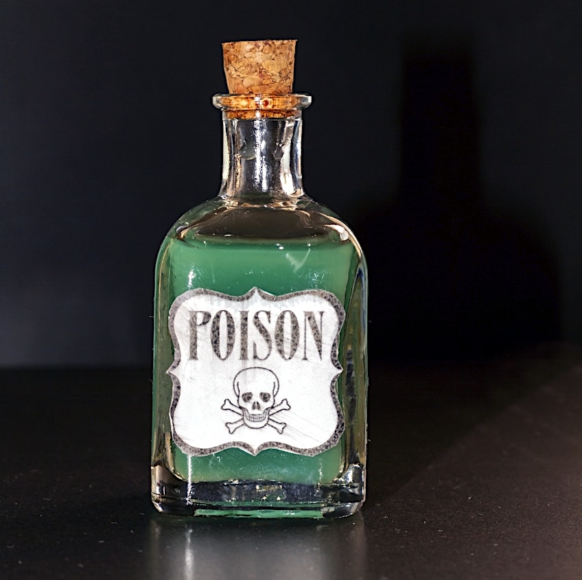
These days, some of the most pressing matters on our planet center around the natural world, so the color green has become associated with being environmentally conscious, which means partaking in actions to keep humanity from destroying our own habitat. Even with all the development of technology, the discontinuation of the toxic pigment arsenic, and the discovery of synthetic pigments, there are types of green that are still toxic, and possibly fatal if ingested. These are the pigments Green 7, 36, and 50.
The Psychology and Symbolism of Green
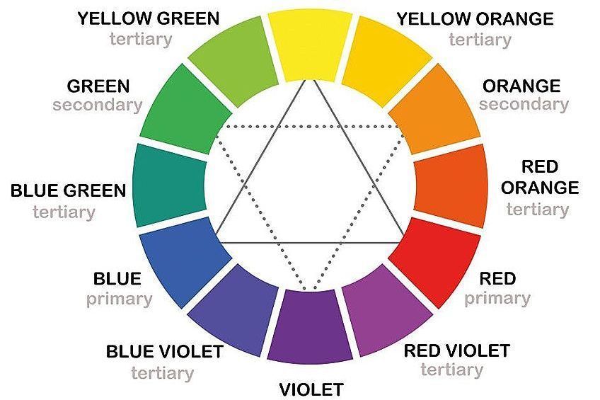
As you may know, every color on the color wheel has a set of meanings ascribed to it. They all convey certain messages and inspire feelings, each unique to the color they are linked with. The green color palette is largely associated with growth, healing, and health, but also unpleasant feelings like jealousy, and nausea. But generally, the feelings that predominate when people see the color green are positive ones. Green can be very calming, but it can also make you feel refreshed and rejuvenated. You might also feel motivated or driven towards wealth. Both associations that are great for marketing campaigns.
When considering how we perceive the color green, it is a color that we see more easily than others because it has a shorter wavelength, so our eyes do not need to adjust all that much to see it. Other connections to green include wealth, health, good luck, jealousy, calmness, peacefulness, creativity, fertility, and nature. Green is also considered optimistic and motivating.
If you have ever heard someone referencing “the green monster” you might have known they were referring to someone who is jealous or envious. This idea originated with the ancient Greek poet Sappho, who used it to describe the complexion of someone who has fallen ill with longing for someone. Green is here associated with a diminished flow of blood and an overproduction of green bile which the Greeks believed accompanied feelings of jealousy. At the same time, the color green is so calming that it has sedative qualities. This is why you will often see hospitals painted this color or on the walls in classrooms.

Green Shades in High Demand
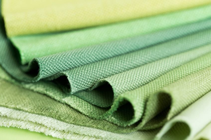
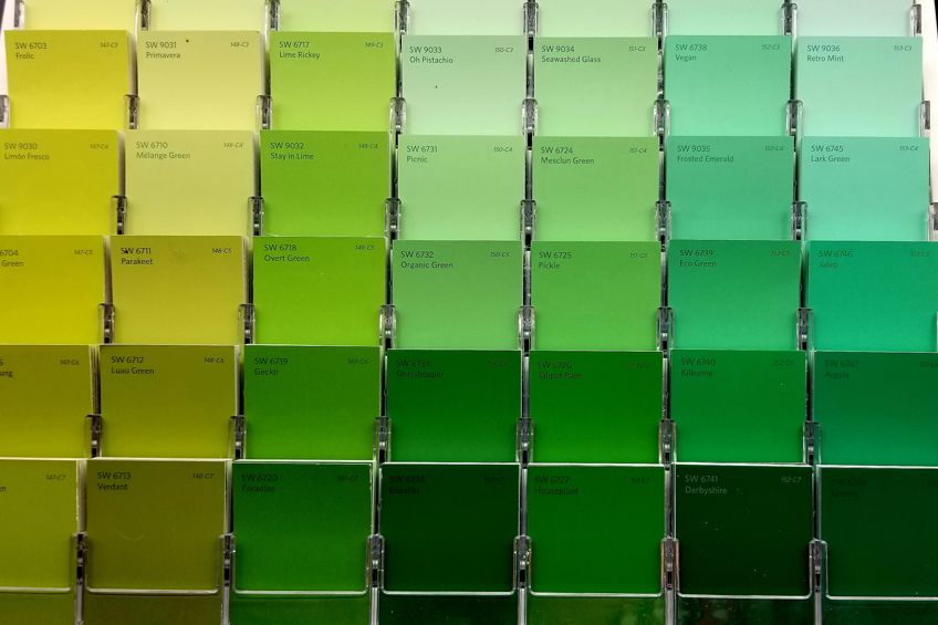
Learning the names of the various types of green colors, like Forest Green, Ming green, or even Emerald or Olive green, is not going to make it easy when identifying the color off-hand. Most will need another reference to make sure they use the right color, since we all have our own perceptions of what the colors look like, it might be a little complicated. The Hex codes are what help us identify colors easily, without making a mistake and using the wrong shade of green accidentally. In this next section, we shall highlight some green hex code examples, so you can get an idea for yourself.
Green
This color is not quite a dark green, but rather the shade that falls in the middle-ground of light and dark. The name of this color is simply put, “green” color, but you might also know the color as Office Green. It is a vibrant shade of green that resembles the color that a leprechaun might wear.
| Shade | Green Hex Code | CMYK Green Color Code | RGB Green Color Code | Green Color |
| Green | #008000 | 100, 0, 100, 50 | 0, 128, 0 |

Forest Green
Forest green color is a shade of green that is not much lighter than the green color we spoke of above. It is a jolly green that has a festive feel to it, which is most likely because it has a similar color to a sprig of a Holly that we are ever so fond of during Christmas time.
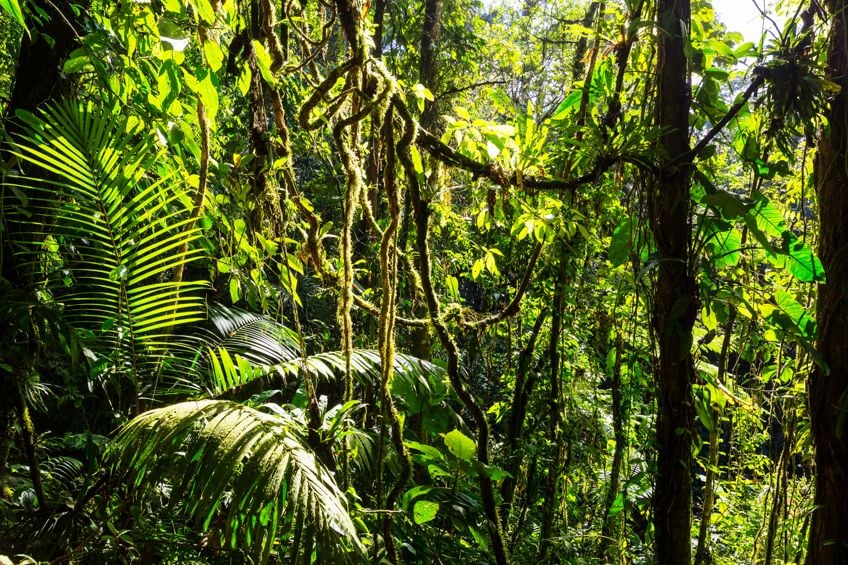
This color has the ability to tune us into the natural world, having such a jungle-like green vibrant to it, the feeling is uncanny.
| Shade | Green Hex Code | CMYK Green Color Code | RGB Green Color Code | Green Color |
| Forest Green | #228b22 | 76, 0, 76, 45 | 34, 139, 34 |
Olive Green
It is said that the name of this color was first used between the late 11th century and the early 15th century. It is not uncommon to perceive olive green as more of a neutral brown tinge. However, this color is situated between green and yellow on the color wheel, so it is more of a green color than brown. IT is commonly used in camouflage and many militaries use “olive drab” colored combat uniforms. The more red you add to your mix, the browner the color will appear. The color used for plain tobacco packaging to make cigarettes appear as unappetizing as possible, was originally called “olive green”. It’s official name is Pantone 448 C and it is often called the ugliest color in the world.

Olive Green can be very beautiful when used correctly though. There is something about olive green in a home that makes it feel elegant, or sophisticated, particularly when it is combined with tan, beige, or even grey colors. Adding a touch of olive to a room can easily provide a little warmth to the room. Olive green is actually a complimentary color to the green color or office green, and it can change the feeling from cold to warm in an instant.
| Shade | Green Hex Code | CMYK Green Color Code | RGB Green Color Code | Green Color |
| Olive Green | #708238 | 14, 0, 57, 49 | 112, 130, 56 |
Jungle Green
As you can see, Jungle green has a few variations. This is why we use hex codes to make it easier to identify the colors that you wish to use. Imagine you give a brief to the person who is designing your logo to use a certain color by referencing “Medium Jungle Green ”, but they use “Deep Jungle green” instead – the result would have a huge impact, and not always for the better.
The jungle green shades are cooler shades of green, so the green hex codes are even more helpful there because there is no color bias to help separate the colors.
| Shade | Green Hex Code | CMYK Green Color Code | RGB Green Color Code | Green Color |
| Jungle Green | #29ab87 | 76, 0, 21, 33 | 41, 171, 135 | |
| Dark Jungle Green | #1a2421 | 28, 0, 8, 86 | 26, 36, 33 | |
| Medium Jungle Green | #1c352d | 47, 0, 15, 79 | 28, 53, 45 | |
| Deep Jungle Green | #004b49 | 100, 0, 3, 71 | 0, 75, 73 | |
| Tropical Rainforest | #00755e | 100, 0, 20, 54 | 0, 117, 94 | |
| Amazon | #3b7a57 | 52, 0, 29, 52 | 59, 122, 87 |
Emerald Green
Emerald green is a highly popular green color. To understand what the color looks like if you have never seen an emerald, the first thing that comes to mind as a mental reference is the Wizard of Oz and the Emerald City. Other than the name Emerald green, this shade has also been known as Veronese green, Imperial green, and Paris green.
| Shade | Green Hex Code | CMYK Green Color Code | RGB Green Color Code | Green Color |
| Emerald Green | #50c878 | 60, 0, 40, 22 | 80, 200, 120 |
Pairing Emerald green with other colors might be quite tricky because it is such a deep tone that is bright and vibrant at the same time. But, if you are looking for a good color combination for emerald or Imperial green, you could try out one of the following colors.
| Shade | Hex Code | CMYK Color Code | RGB Color Code | Color |
| Pink | #ffc0cb | 0, 25, 20, 0 | 255, 192, 203 | |
| Peach | #ffe5b4 | 0, 10, 29, 0 | 255, 229, 180 | |
| Aubergine | #693b58 | 0, 44, 16, 59 | 105, 59, 88 | |
| Ruby Red | #9b111e | 0, 89, 81, 39 | 155, 17, 30 | |
| Rose | #ff007f | 0, 100, 50, 0 | 255, 0, 127 |
Of course, Emerald green is made with a mixture of blue and yellow, but this ratio will determine the shade of green you end up with. The more yellow you add to the mix, the bright and more vibrant the shade will be. For Emerald green, there is definitely a hint bluer than there is yellow, even though the shade is still vibrant.
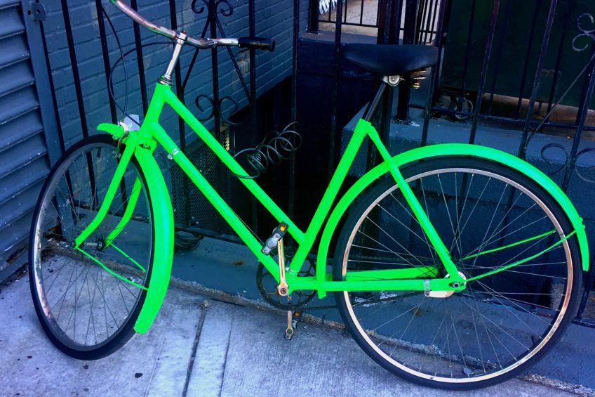
Neon Green
The green color that is known as Neon is an extremely bright color. It is very popular amongst music festival attendees who like to wear colors that will stand out even at night. This color is very eye-catching so it needs to be used sparingly. It should lead the eyes to certain areas of your artwork with intention, and without overwhelming the eyes of the viewer. The feeling it conveys is excitement and energy.
| Shade | Green Hex Code | CMYK Green Color Code | RGB Green Color Code | Green Color |
| Neon Green | #39ff14 | 78, 0, 92, 0 | 57, 255, 20 |
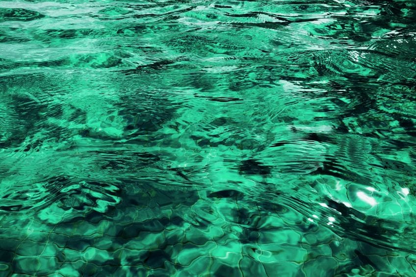
Sea Green
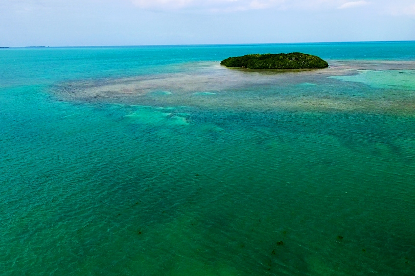
If you are an ocean lover, you might already have identified this color as your favorite. When we say it has an ocean color, we mean the color is similar to what is reflected on the surface of the ocean, or the hues that you see when you are snorkeling in a tropical climate. This color leaves you feeling invigorated, yet at ease, so it is a great choice for a lounge accent wall.
| Shade | Green Hex Code | CMYK Green Color Code | RGB Green Color Code | Green Color |
| Sea Green | #2e8b57 | 67, 0, 37, 45 | 46, 139, 87 |
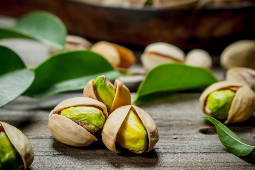
Pistachio Green
When you remove the pistachio from the shell, do you not find that beautifully soft shade of green mesmerizing? This color could be somewhere in between olive green and emerald green. It is soft enough to be paired nicely with any warm color and bright enough to lift the mood of any room. It is pigmented naturally with the use of cucumbers and peas, so there are no toxicity issues either.
| Shade | Green Hex Code | CMYK Green Color Code | RGB Green Color Code | Green Color |
| Pistachio | #93c572 | 25, 0, 42, 23 | 147, 197, 114 |
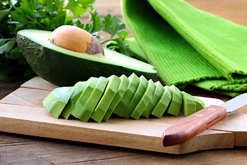
Avocado Green
When you manage to get your hands on an avocado at its perfectly ripe stage, the color of the flesh inside the skin is quite something. The energy this fruit correlates with is all about harmony, balance, and tranquility. Towards the end of the last century, avocado green had a reputation as an outdated color, because from the 1950’s onwards, entire bathroom suites used to come in this color, and these became the first things home renovators ripped out. So, some manufacturers now prefer to name their version of this shade as guacamole green. Depending on the manufacturer, some versions are lighter or darker than standard avocado.
| Shade | Green Hex Code | CMYK Green Color Code | RGB Green Color Code | Green Color |
| Avocado | #568203 | 34, 0, 98, 49 | 86, 130, 3 |
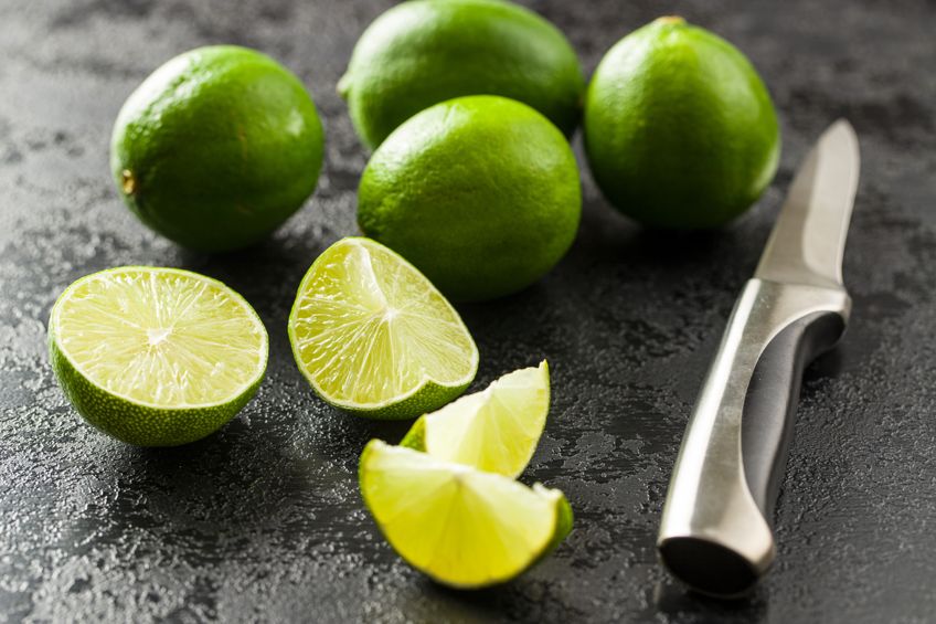
Lime Green
Lime green is an intense color. Think of the brightest lime in the store, the one that shines out above the rest and your eyes just cannot miss it. That is lime green. This shade of green is mixed with a considerable amount of yellow which is what gives it its brightness. If you wish to mix your very own shade of lime green you will need blue paint one part and then yellow paint two parts, so the ratio is 1:3.
The reason why lime green is so popular is that it exudes a feeling of energetic youthfulness. In addition to attracting attention when used in art, fashion design, and marketing, lime green is quite versatile when it comes to the message it conveys. Whether it is a poisonous potion made by an evil witch in a movie or a forest sprite spreading joy in your painting.

Lime green not only enhances positive feelings, but also promotes harmony, balance, and a favorable sense of well-being. If you are planning to use lime as an accent color, then it will blend beautifully with neutral colors like tan, whites, and grays as well. A word to the wise, try not to use too much of this color. Use it instead as an accent color. You don’t want to overwhelm your viewer or guests in your home with too much of such a bright color.
The lime green color in question is actually one of two different shades. There are two colors that are named the same, yet the green hex code for each will differ. Here are the two different shades of the color, and what their hex codes are so you can get an idea for yourself.
| Shade | Green Hex Code | CMYK Green Color Code | RGB Green Color Code | Green Color |
| Lime Green 1 | #00ff00 | 100, 0, 100, 0 | 0, 255, 0 | |
| Lime Green 2 | #32CD32 | 76, 0, 76, 20 | 50, 205, 50 |
Most people would say that this color is very hard to pair with any other color on the color wheel besides black, grey, white, or neutral tans. Contrary to this belief, there are several other colors that are great companions and they can all spruce up the lime green color amazingly. Here are a few of the examples:
| Shade | Hex Code | CMYK Color Code | RGB Color Code | Color |
| Fuchsia | #ff00ff | 0, 100, 0, 0 | 255, 0, 255 | |
| Orange | #ffa500 | 0, 35, 100, 0 | 255, 165, 0 | |
| Yellow | #ffff00 | 0, 0, 100, 0 | 255, 255, 0 | |
| Violet | #7f00ff | 50, 100, 0, 0 | 127, 0, 255 | |
| Hot Pink | #ff69b4 | 0, 59, 29, 0 | 255, 105, 180 | |
| Tangerine | #f28500 | 0, 45, 100, 5 | 242, 133, 0 | |
| Black | #000000 | 0, 0, 0, 100 | 0, 0, 0 | |
| White | #ffffff | 0, 0, 0, 0 | 255, 255, 255 |
Mint Green
Mint green is a very popular color. It has taken over the fashion industry, and most designers have had this color churning in and out for a few years now. Understandably so, because the color is phenomenally soft, yet striking. Some people refer to this color as Spring green, but either way, it is a color that falls somewhere in between the green color we mentioned earlier and cyan. If you would like a reference for this color so you can imagine it in your mind, think of the perfectly minted ice cream flavor. Color companions for Mint green are violet, beige, white, and royal blue.
| Shade | Green Hex Code | CMYK Green Color Code | RGB Green Color Code | Green Color |
| Mint green | #98fb98 | 39, 0, 39, 2 | 152, 251, 152 |
Ming Green Color
Ming green has an interesting name and not one that is often referenced. The typical name for this color is Jade green, particularly in America. Ming, or jade, green was quite popular for marketing during the early 1900s. It was also used in the kitchens of suburban homes, like on the kitchen cabinets.
| Shade | Green Hex Code | CMYK Green Color Code | RGB Green Color Code | Green Color |
| Ming Green Color | #3aa278 | 64, 0, 26, 36 | 58, 162, 120 |
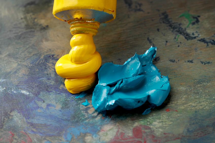
Mixing Green With Acrylics
Making green is as simple as combining blue and yellow in such a way that the final color is green. Seeing that the color wheel is a vast selection of endless shades of each color we can safely assume that the blues and yellows will also be varied. Depending on which shades you use, the green you make will be brighter, darker, or duller. Pay attention to the color bias of each color, because some contain traces of both warm and cool color biases.
Ultramarine blue is not only blue but there are traces of cadmium red. However, cadmium yellow has hints of green, meaning there is some blue in the mix making it more of a cool yellow. From this reference, we can understand that the green that you mix will not only be a cool color base, but it can have a warmer feel to it as well. Olive green is an example of a warmer green color. The more you start mixing color with intention, the more you will learn which colors will work most effectively to create the one you desire.
You might have noticed when you were just getting started, or maybe have ignored the color bias lesson for too long, that too many contrasting color biases can produce a muddy color quite quickly. This is not the most terrible thing in the world if you are painting a rainy or muddy scene, where those colors are expected to be there. But, if you need a bright and vibrant color, you will need to start paying attention to the different colors and how to mix them accurately.
| Shade | Hex Code | CMYK Color Code | RGB Color Code | Color |
| Cadmium Yellow Light | #f8eb00 | 0, 5, 100, 3 | 248, 235, 0 | |
| Manganese Blue | #242d36 | 33, 17, 0, 79 | 36, 45, 54 |
Mixing Green Colors
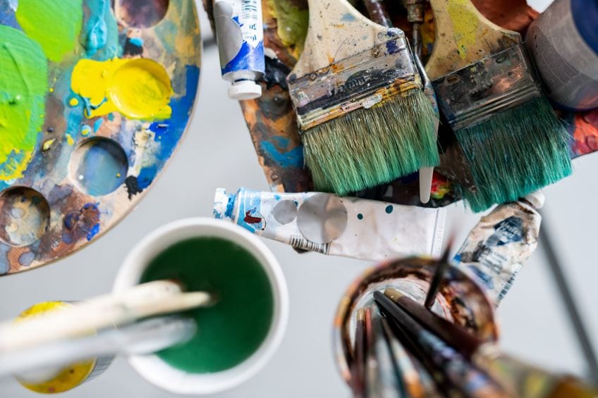
Painting is a peaceful thing and one should find a work area conducive to that feeling. As soon as all of your paints are set up and your brushes are waiting, you can begin mixing the colors of your choice. Make sure that you have a few containers or old cups filled with water at arm’s reach, and that you have a water source nearby. For mixing the color, you will need a palette, but if you do not have one, you can use any board or even an ice-cube tray. Make sure that you have laid down newspaper on the table surface you are working on. This will eliminate most of the cleaning time because you can simply fold the paper up with the leftover paints and throw it away in the garbage.
The next thing you need to do is to place a small amount of yellow and blue paint onto your mixing palette next to each other, a coin-sized amount for both. If you use an equal quantity of both colors, the result will be a basic green, but make sure you blend them nicely, and the shade will seem natural. If you are working with thick-based paint, such as acrylic, you may find that using a popsicle stick or a palette knife can come in handy where mixing is concerned. Before you paint, we do advise making a note, and even a swatch so that you remember how you created this particular shade in the first place.
A helpful tip from us is to only mix in small amounts each time. You know the phrase, you can always add more, but you cannot add less! The safer method of mixing is a slow process. Small amounts at a time allow more control over the shade you are creating.
If you want a more muted green that has a warmer feel to it like olive green, then we suggest adding in some red. This might come as a surprise, but the effect of the red works wonders for a warm green shade.
| Shade | Green Hex Code | CMYK Green Color Code | RGB Green Color Code | Green Color |
| Permanent Green | #009669 | 100, 0, 30, 41 | 0, 150, 105 | |
| Phthalo Green | #123524 | 66, 0, 32, 79 | 18, 53, 36 |
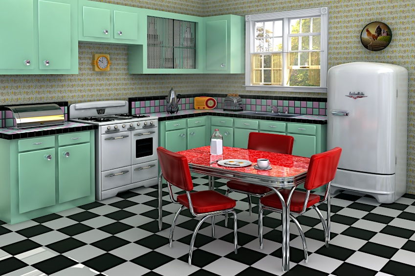
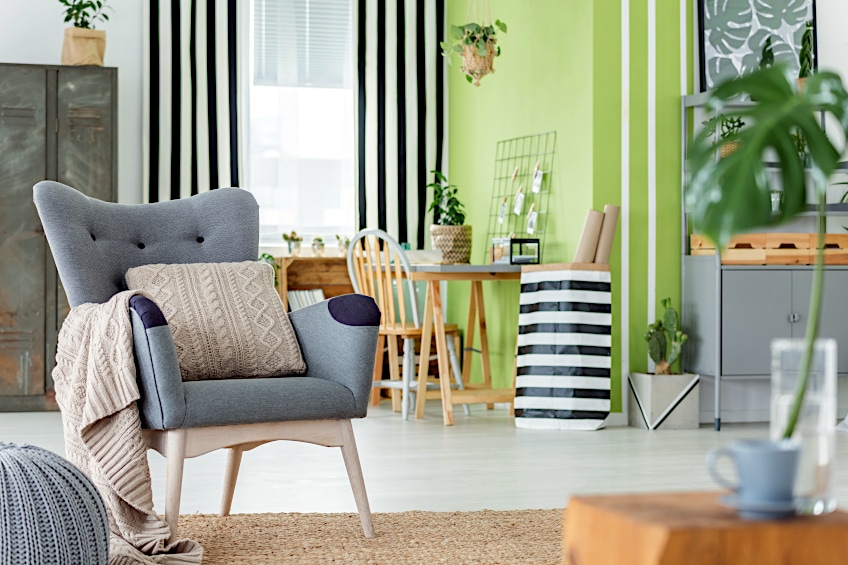
Decorating With Green
We have spoken about how the color green has evolved in perception from being seen as something evil or poisonous. Instead, it is seen currently as a color that embodies health, rejuvenation, harmony, and, of course, balance. If you use this color in your home, your guests will feel at ease and welcome within the comfort of this harmonious color. Have you ever wondered why classrooms or hospital walls are painted green? This is because of the healing that is facilitated psychologically by the color green.
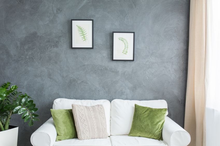
If you are redecorating, and want to bring some green into your home, you could paint an accent wall that matches the color of your sofa in your living room. You might also incorporate some green-colored tiles onto the splash-back in your kitchen. Neutral colors like beige or tan are great combinations for this color. They give off a professional feel or a homey one, so there is much versatility to appreciate with green, and neutral color combinations.
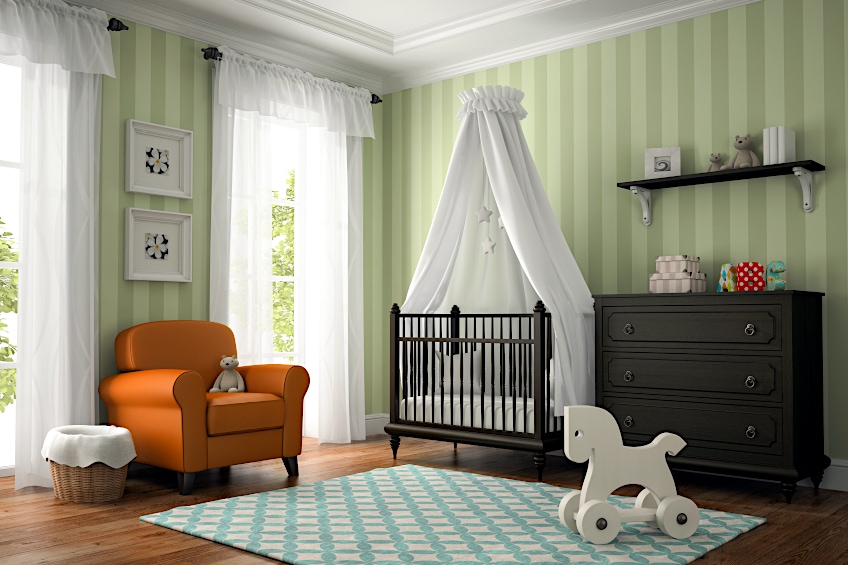
There are some people who are fortunate enough to have a study or sunroom in their home (particularly those in colder climates) and adding mint green can liven up dreary rooms. A bedroom is also a suitable place for the color green, specifically various shades of olive green. This can give a warm feel to the room, and allow you to feel warmer, even when the weather is old and rainy outside.
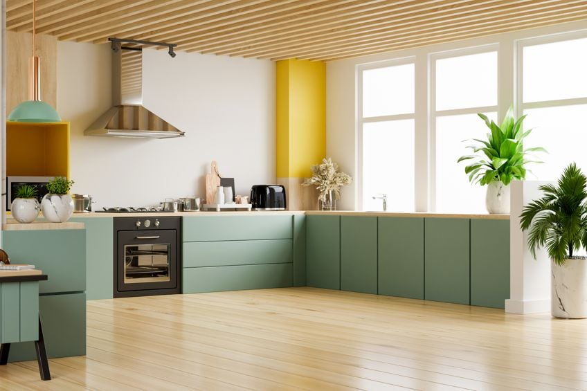
Green in the kitchen works wonders for inspiration when you are trying to think of what meal to cook. Interestingly, it activates the feeling of hunger and inspires cravings for delicious food. Using yellow with the green in your kitchen will give it an even more homey feel, that almost makes you think you have stepped into a countryside cottage. Below we have referenced a few color combinations that work beautifully together, and some examples of where you might use them in your home.
Pale Green and Orange
Small spaces can be created by using relaxing and welcoming colors such as fern green and pale orange. The two are perfect complementary colors for each other, and they lift the mood in every room. You might want to use this in your living room, or if you are lucky, your reading room. A child’s bedroom might also suit this color.
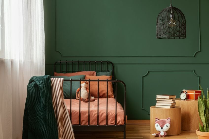
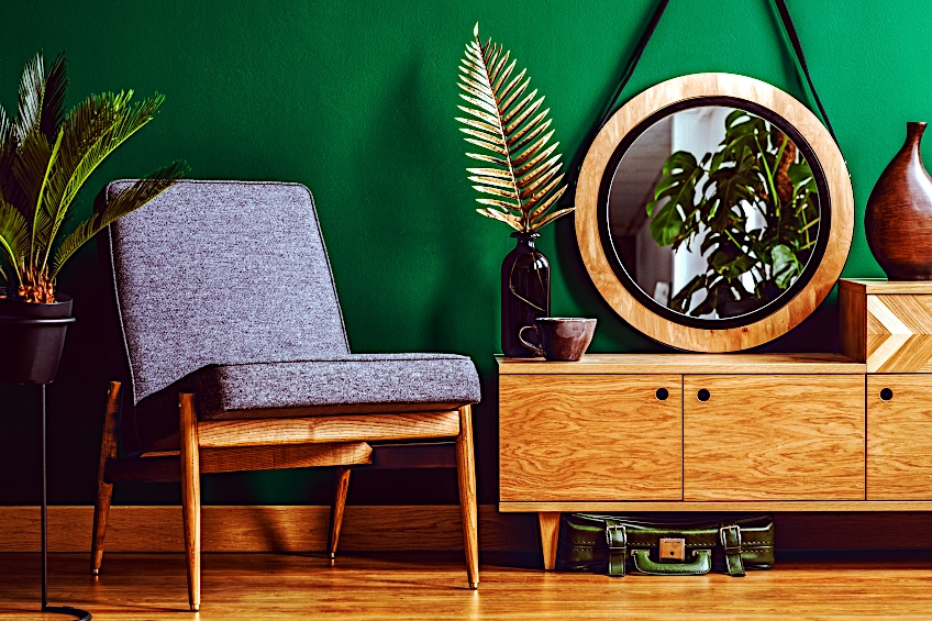
Forest Green and Brown
This is a beautiful combination that works together beautifully in your office at work, or in your home. You could also use this combination to theme your living room, along with matching sofa suites. The energy felt when exposed to this combination is something similar to what you feel when you are walking in a forest.
Lime Green and Pink
This is a fun and lively combination of colors. It will resemble a rose bush in the distance, and the lime green will not seem as bright and overpowering if the pink you use is soft enough. You can make it a bit bolder by using a pink that is also bright. Kindergartens would see the benefits of using this color in their art rooms because it can seriously inspire creativity.
Pastel Green and Tan
In contrast to the above combination, this mellow color combination creates tranquil energy and chills out any room making it a pleasant place for relaxation. You might paint this combination into your living room at home, your bedroom, or even your office or study.
Ming Green and White
The colors, Ming green, and white, can be combined to create a more lively or refreshed feel. This is often a color combination you can see inside spas because it does have a sense of luxury and refinement to it. Adding a bit of pale grey can also work, and it can give a room that corporate feeling you might be looking for, rather than the relaxing spa feel.
Accenting Light Green
If you wish to use green as an accent wall, it is recommended that you use a lighter shade of green. The other colors that you combine them with should either be the complementary color of the specific shade of light green you are accenting with, or a neutral color.
| Shade | Hex Code | CMYK Color Code | RGB Color Code | Color |
| Fuchsia/Magenta | #ff00ff | 0, 100, 0, 0 | 255, 0, 255 | |
| Violet | #7f00ff | 50, 100, 0, 0 | 127, 0, 255 | |
| Lavender | #e6e6fa | 8, 8, 0, 2 | 230, 230, 250 | |
| Grape | #6f2da8 | 34, 73, 0, 34 | 111, 45, 168 |
The color green can add so much beauty and freshness to your space, and it is easy to see why! Green as a wall color has made quite a comeback recently, as well as the perfect color for decor and accent pieces. Whatever shade you prefer, there is definitely a green to match your lifestyle and home! Happy painting and happy decorating!
Frequently Asked Questions
How Do You Make Green Acrylic Paint?
Painting with acrylics can be a relaxing and fun experience since the medium is relatively easy to work with. You need two of the three primary colors to make green, blue, and yellow. Scoop the same amount of each color onto your palette, and then mix them thoroughly. You can change up the ratio of blue to yellow, and this will change the brightness of your green shade. Adding some red can also make the color warmer, and more muted.
How Many Kinds of Green Are There?
The green palette is vast color with many variations. Thus far, over 200 different shades of green have been recorded, hex codes and all. These shades range from light to dark and vary over the color biases as well.
What Does Green Symbolize?
This color is quite ambiguous in its psychology. It all depends on the context that this color is applied. It can either be seen as something evil or poisonous, or it can be used to embody health, rejuvenation, and refreshing energies.
What Color Is Forest Green?
This color is a darker shade of green that leans towards the cooler color bias. It has a natural feel, like being in the middle of a forest. This color has an ideal name because it looks exactly as it is described and as it is named.
What Colors Pair Well With Green?
No matter what shade of green you prefer, whether it is olive green or pale green will provide a refreshing and welcoming feeling. White, brown, and other neutral colors are great colors that you can pair with green.
What Is Sage Green Like as an Interior Decor Color?
Sage green is a very popular color at this moment in time. It is versatile, so you can use this color in just about any setting and it will suit the feel of the room, whilst lifting the mood, and inspiring relaxation. This color will enhance whatever you are doing, so if you are chilling, your mind will feel relaxed, and if you are creating art, you will feel inspired that way as well.
Why Do We See a Lot of Green?
Green can be seen easily, no matter how bright or dark it is outside, or even inside, for that matter. The rods or cones of your eye are stimulated by wavelengths of light, which translate into different colors. Compared to other colors, green stimulates more of the cones and because of the wavelength of the color, the color is more readily available to the eye.

Larissa Meyer is a 32-year-old mother from Michigan and creative spirit since childhood. Her passion for painting and drawing has led her to an education as an illustrator and a career as a freelance graphic designer. She has a Bachelor of Fine Arts in Illustration and a degree in Graphic Design. Larissa is a talented artist who is able to master a wide range of styles and techniques to bring her artistic vision to life. Her greatest passion is currently fluid painting and epoxy resin art. Larissa’s love for art and her knowledge and experience in illustration make her the perfect Creative Director for our fluid-painting.com team. She is the creative head of our team and shares her passion and knowledge with our community through articles and tutorials.
As a mother of a 2-year-old daughter, Larissa also understands the importance of fostering creativity in early childhood. She uses her experience and knowledge to help other parents inspire their children and develop their artistic skills as well.
Learn more about Larissa Meyer and about us.