Muted Colors – How to Mix and Use Desaturated Color Tones
This post may contain affiliate links. We may earn a commission from purchases made through them, at no additional cost to you.
Bright colors are wonderful, bringing life to your artwork, catching eyes, and drawing our gaze to all the right places. Imagine a painting that is only painted with bright colors, what does it invoke within you? Most people might find it too overwhelming to look at for too long, making us feel dizzy. The only genres of art that might benefit from this are Pop Art, or possibly the new-age psychedelic or geometric art, but even those have a few hues that seem to sit in the background, softening the image to the eye. Those hues are called muted colors, and they will be our topic for the day. This tutorial will cover all the muted tones in a muted color palette. We will discuss the reason these desaturated color palettes, otherwise referred to as a dull color palette, are useful and also necessary with all forms of art.
Muted Colors Explained
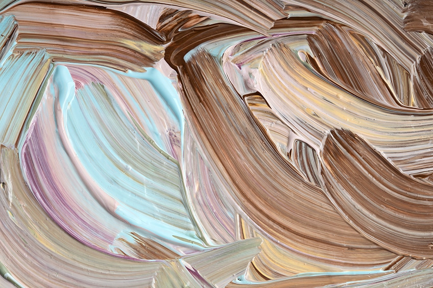
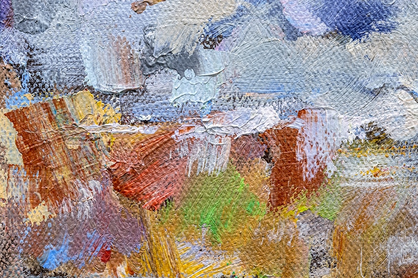
What is a muted color, you might ask? Let us use a little analogy to fully grasp this concept of muted colors. If you think of a painting that depicts a beautiful Summer’s day, the colors would be brighter and particularly intense. If you were to compare that painting to a painting of the same scenery, but on an overcast and Wintery day, the colors would be a lot duller than the one where the sun is shining. Those colors from the Winter painting are painted using muted tones, from a muted color palette, which is also called desaturated color palettes or dull color palettes.
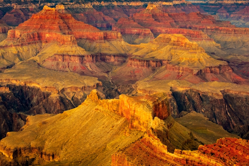
Light will bring out the color of your painting, so wherever you are painting highlights or something that picks up the light, you will use bright and vibrant colors, and you will use the muted tones for the shadowy areas. Your desaturated color palette will also be used to paint the scenery in the background, which helps to give your artwork depth.
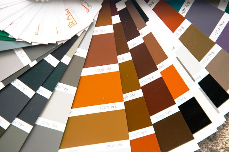
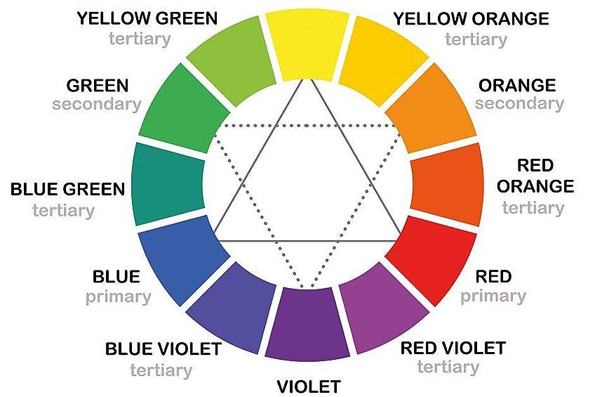
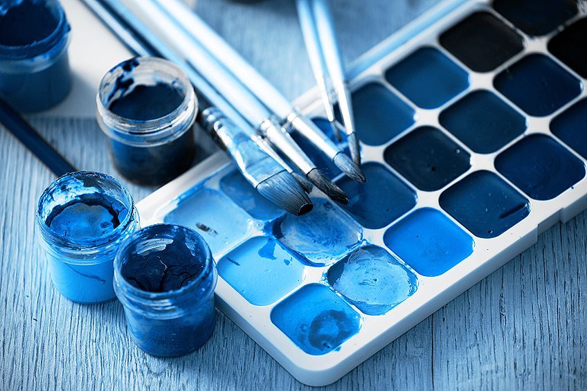
Saturated colors are described using a purity rating. A bright and pure color will measure up to one hundred percent purity rating, and as the color fades and becomes more muted, the rating goes down to zero. Grayscale colors are then part of the muted color palette.
Making a bright color into a muted tone is not as tricky as you might think. All you need to do is take the bright color and mix in some white or even some black. Additionally, you can also desaturate your color by mixing in the complementary color, like mixing yellow with purple, or green with red. Be wary of changing the temperature of the color, because red is a warm color, but adding too much green can make it too cool.
Making Muted Colors
Especially if you’re just starting in the art world, you might find that you’re using more vibrant colors and have trouble effectively incorporating muted color palettes into your work. You can easily create muted colors by following the steps below.
- If you want a darker muted color, add in some black paint
- If you want a lighter muted tone, add in some white paint
- You can add in some gray paint if you need something in the middle of the white and black mixtures
- Mix in the complementary color of the color that you are busy painting with and combine them. As an example, yellow to purple, or orange to blue
- To make a bright color and earthy tone, you can add some brown paint
Often when painting, you want to use contrasting colors – black and white are good examples. If there is too much of the same color in an artwork, it may make it difficult to distinguish between different aspects of it. To increase the amount of contrast created, you either make something lighter or darker by adding black or white. You can experiment with all the color mixtures we listed above to see what colors you get, however you will always end up with a color palette that is desaturated.
Making Use of Muted Tones
Balance is always needed in your artwork, particularly so for the choice of colors. You do not want to stand the risk of creating a masterpiece that is too painful for the eye to look at for too long, would you? Not only that, but sometimes the main part of the painting only takes up a small amount of space on the canvas, and if you paint using only highlighted colors, the pinnacle of the painting might get lost behind all of the bright tones.
If you are making use of a vibrant yellow in your painting, you can tone it down by mixing in some purple. This will create muddier yellow, which is great for shading or making a background. The point of these colors is not to catch your eye, and to ideally be as subtle as possible.
Muted tones are what bring the colors together, they are the essence of blending, and without them, art would not be the same. These colors are the hidden guides within the swirls of paint, the help to lead the eye towards the part that should be seen, the highlighted subject matter. They also help to show where the light is coming from because they will form the shadows that are cast by the light.
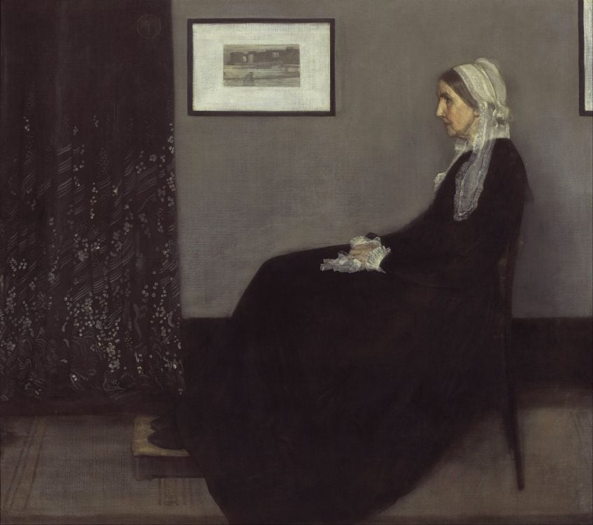
Well-known Artworks Using Muted Colors
As we are all unique human beings, even Vincent Van Gogh could not argue that his style is better, because there is no one way that is the right way to paint. There are so many techniques and personal art styles, that any form of expression has become an art form. That being said, there are some well-known or even famous artworks created by celebrated artists that have used both bright and vibrant colors, or even just the dull and muted tones.
Speaking of Vincent Van Gogh, his painting, Fishing Boats On The Beach At Saintes-Maries-de-la-Mer, painted in 1888, is one that is predominantly painted with bright and lively colors like yellow, blue, and orange.
An example of a painting that is mostly painted with a dull color palette is The Kiss, which was painted in 1908, by Gustav Klimt. The low hues employed in this painting allows it to exude an intense and intimate feeling.
In terms of the techniques that you can learn by painting with muted colors, there is the art of dulling out the background with dull tones like gray or brown, and then painting the main subject matter with vibrant and bright colors, like in the River Landscape By Moonlight, which was painted in 1887, by George Henry. Another technique would be to use a combination of both bright and muted tones. This creates an amazing contrast that is mesmerizingly eye-catching. An example would be the painting, Girl with a Pearl Earring, which was painted in 1665, by Johannes Vermeer.
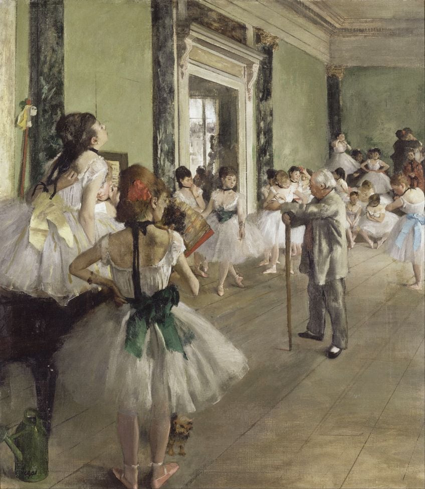
| Artist | Artwork | Year |
| Edgar Degas | L’Etoile (The Star) | 1878 |
| George Inness | Home At Montclair | 1892 |
| Vilhelm Hammershoi | Interior from Strandgade with Sunlight on the Floor | 1901 |
| Childe Hassam | Late Afternoon, New York, Winter | 1900 |
Popular Muted Colors
What is a muted color? As a recap from the previous section, a muted color is the less vibrant tones that we use in between the brighter colors to soften the painting and make it more aesthetically pleasing. Most marketing professionals will confirm this, the muted colors are easier on the eye, and the bright tones are more eye-catching. Here are a few examples of the more favorable muted colors available.
Warm Reds
Red is often depicted as the color of love, passion, and romance, and the darker muted red tones only enhance the essence of intimacy and the lighter pinks are more there to represent peace, happiness, and the kind of love that would be described as cute.
| Color Name | Muted Color | Hex Code | RGB % | CMYK % |
| Fire Opal | #E96245 | 91.4, 38.4, 27.1 | 0, 58, 70, 9 | |
| Vivid Tangerine | #F4AC90 | 95.7, 67.5, 56.5 | 0, 30, 41, 4 | |
| Champagne | #F1E6CD | 94.5, 90.2, 80.4 | 0, 5, 15, 5 |
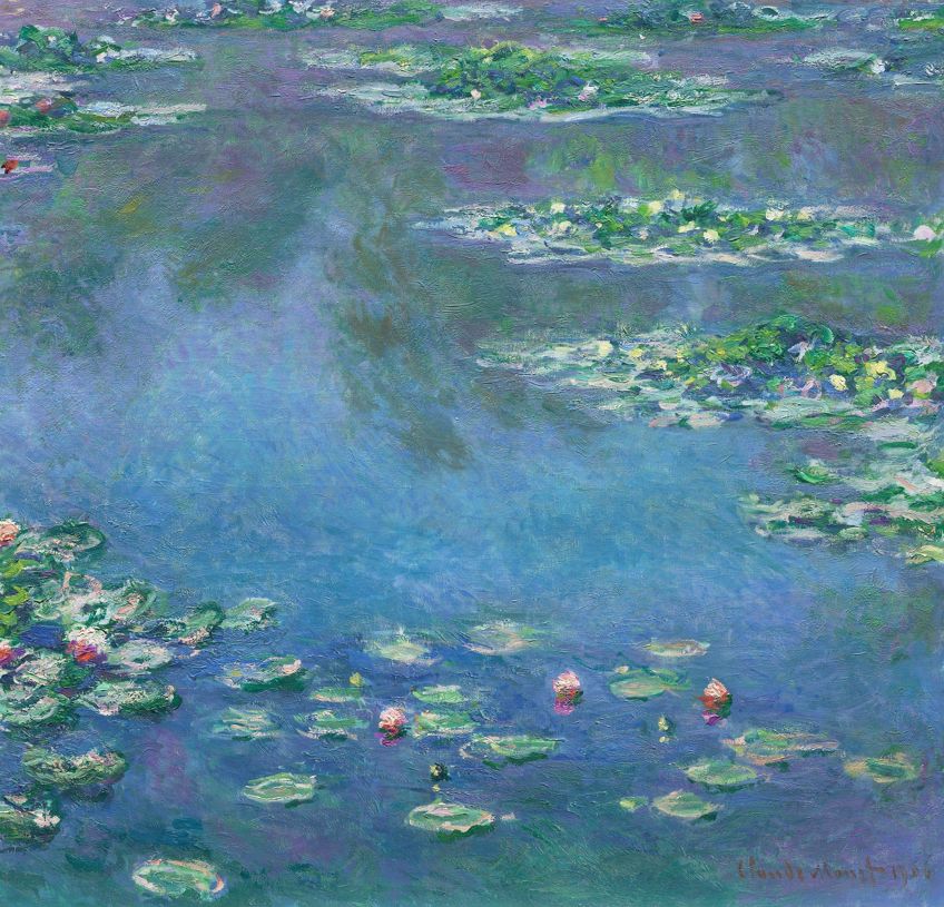
Muted or Minty Green
Green has always had an earthy and healing feel to it, reminding us of our herb gardens, or the leafy green jungles and forest. The muted green color imbues a calming and serene feel to your artwork, not to mention boasting an olive green which is one of those colors that will forever be fashionable.
| Color Name | Muted Color | Hex Code | RGB % | CMYK % |
| Sherwood Green | #035229 | 1.2, 32.2, 16.1 | 96, 0, 50, 68 | |
| Lime Green | #08CE67 | 3.1, 80.8, 40.4 | 96, 0, 50, 19 | |
| Soft lime Green | #6AFAAF | 41.6, 98, 68.6 | 58, 0, 30, 2 |
Dull Gray Colors
Gray is an underrated color. It is a barrel even considered a color, but it is one of the most important hues that your painting can benefit from. Gray is the one color that you can add to any color to make it a muted tone. Ultimately, without gray, you will not have a complete color palette.
| Color Name | Muted Color | Hex Code | RGB % | CMYK % |
| Charcoal | #232023 | 13.7, 12.5, 13.7 | 0, 9, 0, 86 | |
| Dark Gray | #808080 | 50.2, 50.2, 50.2 | 0, 0, 0, 50 | |
| Gray | #A9A9A9 | 66.3, 66.3, 66.3 | 0, 0, 0, 34 |
Muted and Muddy Brown
If you are intending to paint a landscape scene of a farm, there is bound to be a lot of brown present in the painting because of all the mud you find on a farm. Make use of brown to not only paint the mud but also blend in the green tones of the crops.
| Color Name | Muted Color | Hex Code | RGB % | CMYK % |
| Raw Umber | #826644 | 51, 40, 26.7 | 0, 22, 48, 49 | |
| Toast | #997864 | 60, 47.1, 39.2 | 0, 22, 35, 40 | |
| Pastel Brown | #836953 | 51.4, 41.2, 32.5 | 0, 20, 37, 49 |
Muted Blue Colors
If you are painting a bird flying in the sky, you will be using a lot of blue. But the muted blue colors will help to highlight the bird that is flying, by using a less vibrant version of the blue you are using for a portion of the sky.
| Color Name | Muted Color | Hex Code | RGB % | CMYK % |
| Dark moderate blue | #436E91 | 26.3, 43.1, 56.9 | 4, 24, 0, 43 | |
| Muted Blue | #3B719F | 23.1, 44.3, 62.4 | 63, 29, 0, 38 | |
| Light Slate Blue | #5889B1 | 53.7, 53.7, 100 | 46, 46, 0, 0 |
Underpainting With Acrylics
You can explore the concept of muted colors by trying out your choices of colors to use for your underpainting. Experiment, and enjoy yourself whilst you are trying out all the options. This technique can be used on canvas, watercolor paper, or canvas paper.
Working out whether underpainting is a necessity is entirely up to you and your explorations. Some artists say it is not possible to create depth without it, and some deem it a waste of time.
Underpaintings help cover the white canvas and serve as a foundation for the layers that come after. Also, you can create depth and dimension, and use it as a foundation that you can add lighter and darker parts. Instead of using highly saturated colors such as bright oranges for your painting. Rather, consider muted, more subtle colors that will be able to add even more beauty to your painting.
If you are unsure of what color to use as the base of your underpainting, then all you need to do is look at the most used and highlighted color within your artwork. That color made into a muted tone should be the underpainting color you choose.
Color Wash
This involves covering the surface of the canvas from top to bottom, using paint that has been diluted for optimal subtlety. Typically, this combination is anywhere between thirty and sixty percent diluted paint, and if you are using acrylic paint you need only add some water, but you must add paint thinners to the oil paint.
Grisaille Underpainting
The concept of a grisaille painting is an underpainting that makes use of gray tones. For areas that will be shadowed, apply a darker gray tone and apply lighter grey shades for the highlighted areas that the light shines on.
Creating Darker and Lighter Areas
The tone value is created by the underpainting because it creates a warm or cool feel within your artwork. You can give yourself clues to where the objects of your subject matter will be placed in your painting by roughly blocking in colors where the shadows will be and generally tracing a light outline. There is the option to use multiple muted tones for the underpainting, like browns and greens, or muted blues and grays.
Muted Colors in Design
Muted colors are not limited to practical art like painting or drawing, but they extend to all forms of creativity. Design is an aspect of many genres from interior design to product and services marketing. Let us take a look at how muted colors play a role in some design genres.
Designing Websites
Not all websites are as appealing as the most popular sites that get scrolled through by hundreds of people every day. There is a special style that websites are designed with to make them alluring, and also to make sure that all the buttons are visible so that people can see where to click for the external links. The advertisements will be bright and bold, whilst the website background will use muted colors.
In recent years, there has been a trend for flat designs, which is said to have caught on with website design, meaning images with no shading or gradient, thus eliminating any sense of dimension, creating a tidy aesthetic.

People today are beginning to realize how colors have an impact on their everyday lives, and how colors impact a website’s content and usability. In addition to being more functional and appealing, muted tones have the effect of making a website feel modern and imbued with a sense of restraint and calm
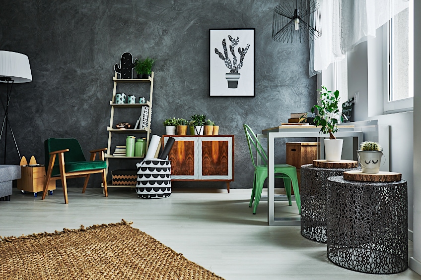
Designing Interior Décor
Interior design in the modern world is a huge fan of muted colors. During the 1970s and 1980s, interior design was loud and boastful, being predominantly bright and vibrant colors with the prints on the wallpaper and the fabric on the lounge suites. These days the ideal home uses a variety of muted colors.
Soft olive green is very popular, particularly for the kitchen, accompanying some hanging plants or succulents. This green will end up enhancing the natural feel of the room because of all the leafy plants, and will not appear so dull. If you are a fan of an accent wall, you can either paint it in muted colors, making the accent a muted and earthy orange, and the rest of the walls in a light beige color.
Muted colors also help to highlight the furniture which is often the signature of the room. If your lounge suite is a light beige or white color, your walls can be painted with either a warm or a cool muted tone. You can even enhance the color scheme of your room by buying matching color throws for the couch or a vase that matches the wallpaper.
So, what is a muted color? In conclusion, a muted color is a bright color that has been mixed with white, black, gray, brown, or the complementary color of the original bright color in question. Now that you are fully equipped with the knowledge of how to use them, and also, how to make them yourself, you can begin to paint masterpieces that most only dream of.
Frequently Asked Questions
What Is a Muted Color?
A muted tone is the dull version of bright and vibrant colors. They can either be cool, warm or a weird mixture of both temperatures. They help to showcase the subject matter by enhancing the background with muted colors.
What Makes a Color Muted?
Muted colors are normally created by adding a few shades of white, black, or gray to the color to reduce its intensity. Another method that some choose is by adding the complementary color of the color you are muting and you will have a richer muted color.
Can Muted Tones be Warm and Cool?
Muted colors can be either warm or cool, it just depends on what you add to it. If you add a bit of red to your green, you might end up with a warmer green than you intended, or possibly adding more blue to your orange will bring the temperature down.
Why Does Art Have Muted Colors?
Art has muted colors to help showcase the shadows and non highlighted aspects of your paintings. They provide good background colors to accentuate depth.

Larissa Meyer is a 32-year-old mother from Michigan and creative spirit since childhood. Her passion for painting and drawing has led her to an education as an illustrator and a career as a freelance graphic designer. She has a Bachelor of Fine Arts in Illustration and a degree in Graphic Design. Larissa is a talented artist who is able to master a wide range of styles and techniques to bring her artistic vision to life. Her greatest passion is currently fluid painting and epoxy resin art. As a mom of two kids, Larissa also understands the importance of fostering creativity in early childhood. She uses her experience and knowledge to help other parents inspire their children and develop their artistic skills as well.
Learn all about Larissa Meyer and Fluid Painting.