Tertiary Colors – How to Use Browns, Greys, and Intermediate Shades
This post may contain affiliate links. We may earn a small commission from purchases made through them, at no additional cost to you.
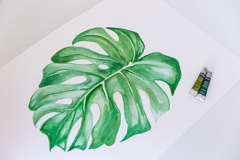
Whether you have been working with paint or making art for a long time, or if you are just starting to venture into painting, a good place to start would be understanding the color wheel. Understanding color theory may seem like a daunting task, but it is so important if you want your art to really thrive. Knowing how to use color is the basis of any good art! This article will cover everything you should know about tertiary colors, or where tertiary color sits on the color wheel. We will explain what the definition of a tertiary color is, and how tertiary colors differ from primary, secondary, and intermediate colors. Keep reading for a descriptive explanation of what tertiary colors are and soon you will have a deeper understanding of color that will improve your art ten-fold!
Table of Contents
Tertiary Colors Explained
Most of us have no idea what tertiary, secondary or even primary colors actually are. So, if the concept of tertiary colors is new to you, the best way to grasp it fully would be to start at the very beginning! This will lead us to begin with primary colors, which are yellow, and red, and blue. These colors are unique because they cannot be made out of mixing other colors, this is exactly why they are called primary colors. There are three primary colors used in the world of digital art, which are red, green, and blue, and these colors are known as RGB, or red, green, and blue. From this point on, you will be able to use any number of colors as your base from which to work, then you can create any number of wonderfully amazing pieces of art. Your secondary colors are the colors you create when you mix the primary colors. As an example, blue and yellow will create a green color, and red and yellow will make an orange color.
Intermediate Colors
Now that you understand what primary colors are, we can learn about intermediate colors. These are the hues that fall in the slot between the secondary and primary colors. You can achieve an intermediate color when mixing paint, by combining primary and secondary colors that are conjoined on the color wheel, or combining two primary colors but in uneven proportions.
In essence, the color of the intermediate is a consequence of how much primary color you use. Whenever an intermediate color is being named, the primary color is placed at the front followed by the secondary color. Listed below are some examples of intermediate colors:
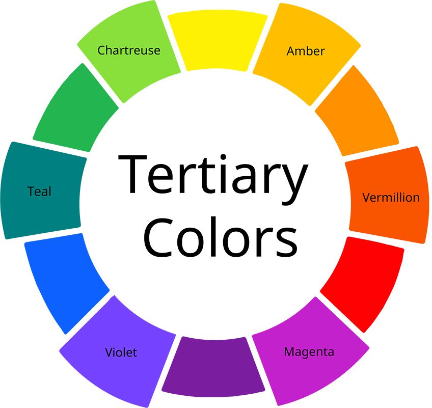
- Chartreuse (yellow-green)
- Vermillion (orange-red)
- Amber (orange-yellow)
- Teal (green-blue)
- Violet (orange-red)
- Magenta (purple-red)
Tertiary Colors
Our final group of colors is tertiary colors. These colors are created by combining two secondary colors, a primary color, and its complementary color, or all three primary colors. Tertiary colors are not to be confused with intermediate colors, as they often are. They are not the same because intermediate colors are made by combining a primary color and a secondary color that are next to each other on the color wheel or by adding two primary colors in uneven amounts. If you mix, for example, purple with green, both secondary colors, what do you get? The color that comes to mind is a bit muddy. This happens because you are mixing too many colors. After all, purple is blue and red combined.
In other words, a tertiary color contains some of all three primary colors. While secondary colors are the result of two primary colors mixed together, tertiary colors are the result of either combining a primary with a secondary color, or mixing all three primary colors. It is very important to understand how colors work together when blending because if you fail to understand how colors work together you will have a long and frustrating journey ahead of you.
On the color wheel, each of the primary colors is located with the colors that derive from them to either side. The complementary color is located on the opposite side of a primary color’s position on the color wheel. The complementary color for a primary is always the secondary color that is mixed with the two other primary colors. So for yellow (primary), that color will be purple (secondary), for red it is green, and for blue it is orange. When a primary color is mixed with its complementary color, the result is a neutral color ranging from brownish to greyish. These are your tertiary colors. The combination of all of the three primary colors will produce a similar outcome. In the case of creating art pieces, it is of the utmost importance to comprehend how these colors are created when you want to tone down more vivid colors.
Changing the temperature of a color, i.e., a color bias, or a color’s temperature is possible with the knowledge of what colors can be combined. In addition to toning colors down, or making them brighter or lighter, different shades can also be created with a bit of experimentation. To achieve a gray or a brown hue, you can combine two different secondary colors and you can tone down the intensity of your secondary colors by using other secondary colors.
You can reduce the intensity of orange by pairing it with purple, or you can blend purple with green or green with purple. Adding a few drops of orange to your green will give it a richer, warmer appearance. To make this color variant more eye-catching, add a little bit of yellow.
Most Loved Tertiary Colors
The understanding of how color works does not change much between the physical art world and the digital art world. Primary and secondary colors still exist digitally, as well as tertiary colors, and the various combinations will provide different color results. To create your color palettes when using pigments and paint, you will need to do a little bit of experimentation, whereas digital artists should be able to produce even more precise color variations. Here are two tables that list a few of the intermediate and tertiary colors by their hex codes and by their proportions of the total color space.
| Tertiary Color | Tertiary Color Shade | Hex Code | RGB % | CMYK % |
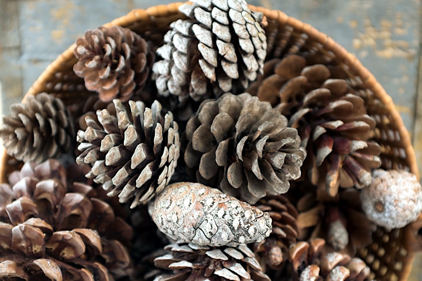
| Pine Cone | #736357 | 45.1, 38.8, 34.1 | 0, 14, 24, 55 | |
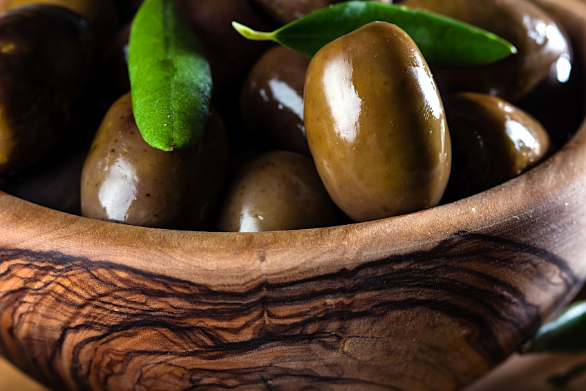
| Olive Brown | #645403 | 39.2, 32.9, 1.2 | 0, 16, 97, 61 | |
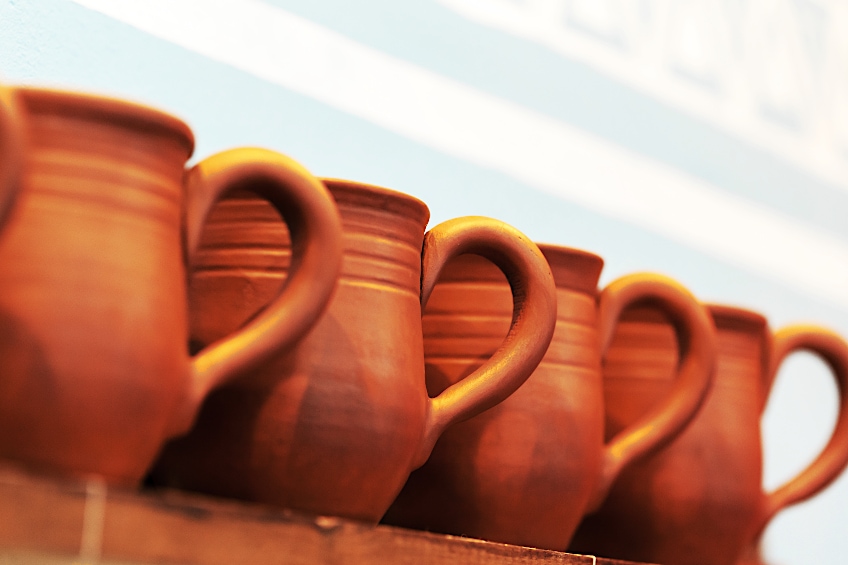
| Burnt Sienna | #af480a | 68.6, 28.2, 3.9 | 0, 59, 94, 31 |
| Intermediate Color | Intermediate Color Shade | Hex Code | RGB % | CMYK % |
| Amber | #ffbf00 | 100, 74.9, 0 | 0, 25, 100, 0 | |
| Vermillion | #e34234 | 89, 25.9, 20.4 | 0, 71, 77, 11 | |
| Magenta | #ff00ff | 100, 0, 100 | 0, 100, 0, 0 | |
| Violet | #8f00ff | 56.1, 0, 100 | 44, 100, 0, 0 | |
| Teal | #008080 | 0, 50.2, 50.2 | 100, 0, 0, 50 | |
| Chartreuse | #7fff00 | 49.8, 100, 0 | 50, 0, 100, 0 |
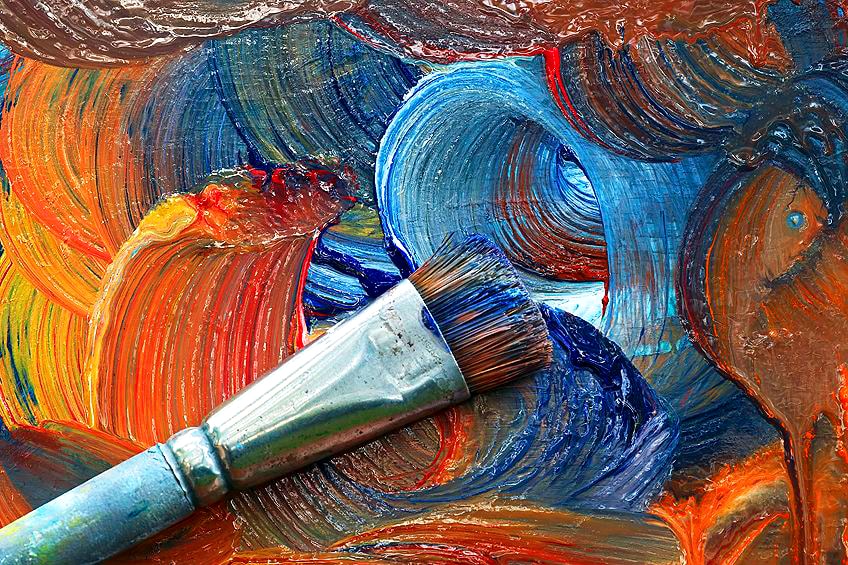
Mixing Tertiary Colors
The tertiary color wheel is not spoken about much, because it forms a part of the bigger color wheel of all colors. Now that you can answer the question of “What are tertiary colors?”, let’s begin by discussing the combination of tertiary colors from the tertiary color wheel.
Combining Burnt Sienna Using Tertiary Acrylic Colors
As we have mentioned previously, a lot of people, particularly non-professional artists, tend to confuse the two types of colors, tertiary and intermediate, as being one, when they are two different color types and should be celebrated as such.
It is, however, important to note that these terms are two different things. Thus, we are referring to tertiary colors when we talk about combining secondary colors. As an artist, you have to experiment to see what happens when you mix the colors, so seeing the colors that you can create is a fun experience. Combining these types of colors, with an equal amount of each, will produce dark colors such as shades of black or dark grays. Make sure you experiment with different amounts of the colors and think about using different tints or shades when mixing them, and be mindful of mixing them in a lighter to darker order, so add a little bit of your darker color to your lighter one.
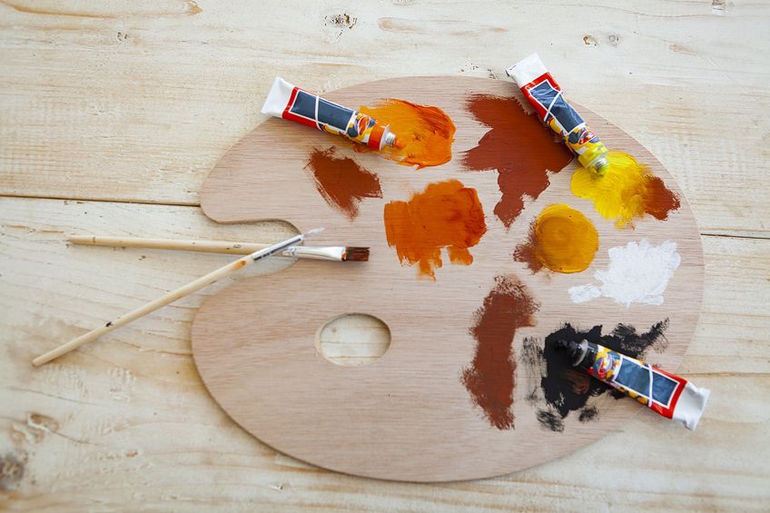
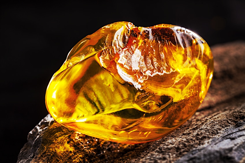
The color known as burnt sienna is an earthy tone that is loved and used by many artists and often. It is pretty easy to find them in a tube or tube at almost every art supply shop, so you won’t have to worry about mixing your version. But, if you prefer to mix your colors so that you get the exact hue that you need you can make a sienna easily by combining orange and purple, and play around with the ratios until you are satisfied with your sienna result.
Making a Bright Brown Color
People need to understand how color works with one another and this can be visualized by using a color wheel. There are many colors on the color wheel, including the primary colors, secondary colors, and everything else. If you blend two primary colors, say red and yellow, you get orange, which is the result of the combination of both, and the result of mixing blue and yellow is green, which is a secondary color.
A neutral brown color will then result from combining those two secondary colors, but it will vary according to the ratio of the orange and green that you mix. It would have been better if you used a darker red or a light yellow when blending your primary colors.
Mixing Intermediate Colors: Amber
The color Amber is an orange-yellow color, and it is an intermediate color. Amber is a yellow-orange and is one of the intermediate colors. It is not a very difficult process since you only need yellow and red paint to complete it. By squirting some yellow paint on top of the red paint, you can see what the paint looks like, after it has dried, and at the same time it will help you decide what your painting will look like once it is completed. There is also some orange in the cadmium yellow, so this is likely to make a vibrant amber color.
If you are working from light to dark, then you may add a small amount of red to the yellow and mix with a palette knife. Keep playing around with the yellow and red colors to achieve the right Amber shade that your artwork requires.
How to Use Neutral Colors in Art
When you want to use neutral tones in your artwork, they will help bring life into your work. This is because bright or light colors are the eye-catchers when it comes to paintings, or pretty much anything for us to look at because they stand out amongst all of the darker, shadowy colors. Even though these colors are so attractive, one should avoid using too many bright colors to prevent the artwork from being too overwhelming for the eyes.
Remember, you can choose from a variety of browns and grays using both your secondary and complementary colors to create them. Color has an important role to play in any painting, but you should not undervalue the importance and the effect of neutral colors in your painting. The neutral colors are actually what lead your eyes to the bright and attractive colors. They help to soften the impact and also help to bring that bright color out like a highlight from the sun.
Color is what captures your attention when observing anything because it’s so vibrant and saturated. It’s almost like when you go to do your driving test, you must pick the brightest color in the eye test. This is also the basic marketing strategy because they will highlight the part that they want you to buy, or participate in.
A neutral color can change a painting’s depth or strength, or even intensity, and can also create something that has a more balanced look to it. It can also bring about a sense of shadow and volume that may not have been easily distinguishable.
Suggestions for Mixing Colors
Studying the fundamentals of color theory is the best and easiest way to master the art of color mixing. It is essential to understand the various types of colors and how they influence each other and enjoy the process whilst you are at it.
- When you place darker tones next to lighter ones, they create a good contrast that can be seen in the photograph
- You can learn from experience how colors work together, and you can create new colors by experimenting and having fun
- If secondary colors are added in equal amounts, the result will be muddiness. Instead, use different proportions of color, tints, and hues for a wider range of neutral colors
- To darken a color, it is better to add a blue or raw umber than black
- To make bright colors even more vibrant and stand out, pair them with neutral colors when using them as design elements
- You should begin with acrylic paints because they require less effort, they are easier to learn the various techniques with, and are more affordable than other paints and mediums.
- It is suggested to mix your color by starting with the lighter one and adding the darker one in small amounts.
Now that you are officially clued up on what tertiary and intermediate colors are, you can start to mix your colors like an experienced artist on a professional level! We hope you have fun with the experimentation, it is what makes the joy of art! Happy mixing and we hope you discovered something new today!
Frequently Asked Questions
What Is a Tertiary Color?
Tertiary colors are the colors that result from combining even amounts of a primary with a secondary color (such as one part yellow and one part purple), or uneven amounts of two secondary colors (such as one part green and two parts orange). The name tertiary color refers to the third color tier. The primary colors are the first tier, the secondary colors are mixed from two primary colors, so they are the second tier, tertiary colors are the result of mixing a primary with a secondary color (or every primary color) so they occupy the third color tier.
What Makes Intermediate Colors?
An intermediate color is created when a primary color and a secondary color are blended close to each other. If the name of the color is double-barreled, it is a dead giveaway that it is an intermediate color.

Larissa Meyer is a 32-year-old mother from Michigan and creative spirit since childhood. Her passion for painting and drawing has led her to an education as an illustrator and a career as a freelance graphic designer. She has a Bachelor of Fine Arts in Illustration and a degree in Graphic Design. Larissa is a talented artist who is able to master a wide range of styles and techniques to bring her artistic vision to life. Her greatest passion is currently fluid painting and epoxy resin art. Larissa’s love for art and her knowledge and experience in illustration make her the perfect Creative Director for our fluid-painting.com team. She is the creative head of our team and shares her passion and knowledge with our community through articles and tutorials.
As a mother of a 2-year-old daughter, Larissa also understands the importance of fostering creativity in early childhood. She uses her experience and knowledge to help other parents inspire their children and develop their artistic skills as well.
Learn more about Larissa Meyer and about us.