Mixing Colors – A Comprehensive Color-Mixing Guide
This post may contain affiliate links. We may earn a small commission from purchases made through them, at no additional cost to you.
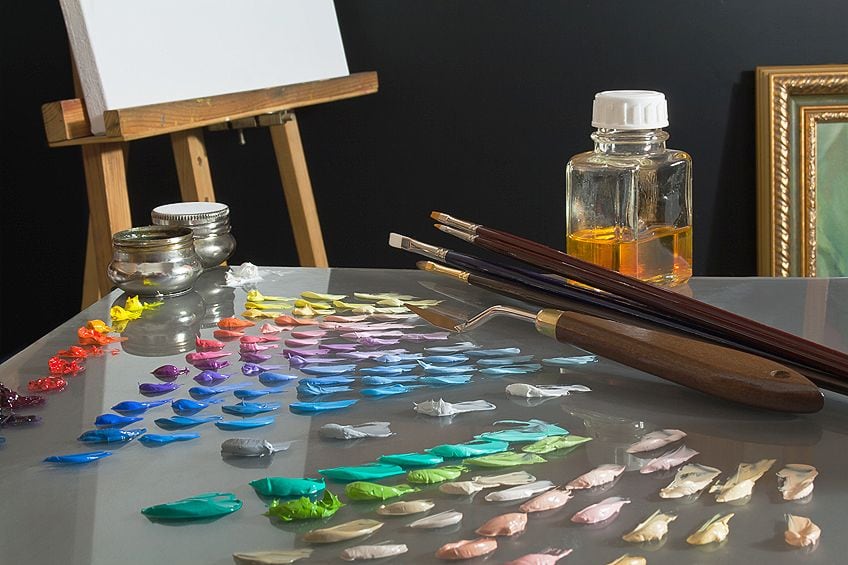
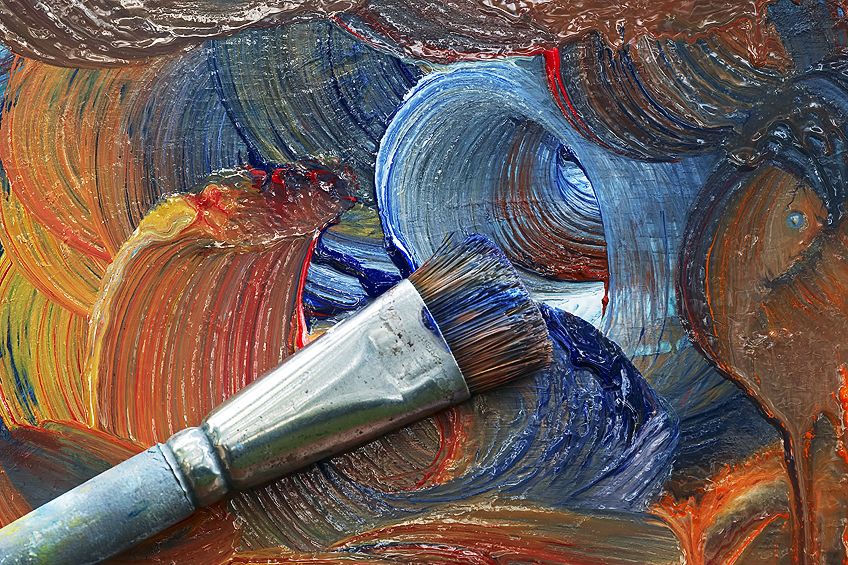
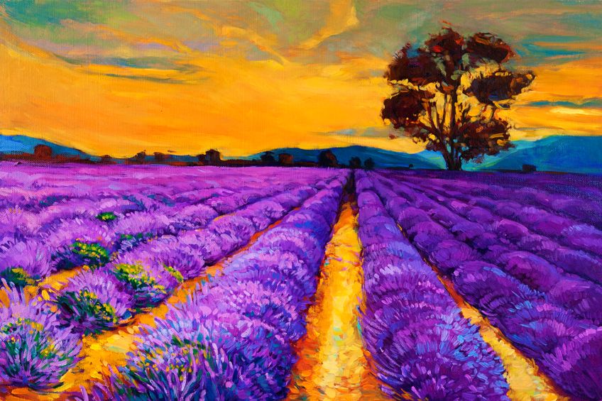
Bold and bright colors are the foundation of any beautiful work of art, but it can be daunting to mix your own colors from scratch when you are beginning to paint. With just three primary colors, you can unlock a psychedelic world of color and bring any dream of your imagination to life on the canvas. In this article, we will lead you through the basics of color theory, teach you how to mix colors, and give you a solid foundation so that you can explore the wonders of mixing colors.
Table of Contents
- 1 Why You Should Get Involved in Mixing Your Own Colors
- 2 Getting to Know the Basics of Color Theory
- 3 The Color Wheel: A Helpful Color Chart
- 4 Mixing the Tricky Colors
- 5 Exercises in Color-Mixing
- 6 Our Top Tips and Tricks for Color-Mixing: A Color-Mixing Guide
- 7 Frequently Asked Questions
- 7.1 What Are the Most Important Shades for Mixing Paint Colors?
- 7.2 Can You Use Any Paints to Mix Different Colors?
- 7.3 Is White a Color?
- 7.4 What Colors Make Black?
- 7.5 What Colors Make Yellow?
- 7.6 What Colors Make Orange?
- 7.7 What Colors Make Purple?
- 7.8 What Colors Make Blue?
- 7.9 What Colors Make Green?
- 7.10 What Colors Make Red?
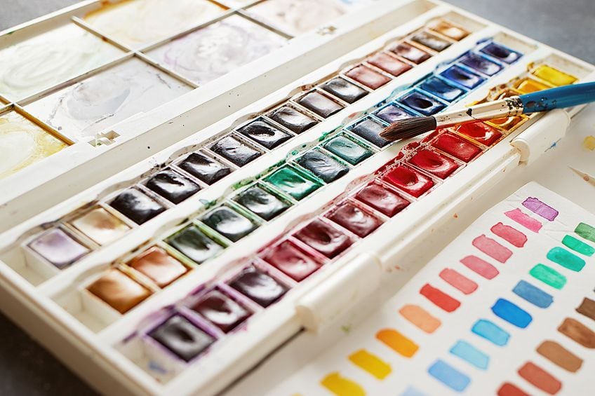
- 7.11 What is a Color-Mixing Chart?
Why You Should Get Involved in Mixing Your Own Colors
There are several important aspects to a painting, including design and paint application. The hues of colors that you use to bring your painting to life are also essential to consider. Choosing the right colors for your painting is essential because much of the emotion in a painting is communicated by the colors.
A common example is the Blue Period of Picasso. The paintings within this period would not have been nearly as impactful if they were in red or yellow tones.
If you are just beginning to paint, you will likely have only a few different tubes of color. This is good as long as you have the three primary colors (red, yellow, and blue), which will allow you to mix your way to any color you desire.
Many paints straight from the tube can also be slightly oversaturated or not quite the hue you want, so knowing how to mix colors is very helpful. Mixing your colors is also cheaper in the long run, as you will learn that you do not have to go out and purchase a tube of every color on the color wheel in order to produce beautiful and nuanced paintings.
Getting to Know the Basics of Color Theory
You will likely have learned about the three primary colors at primary school. If you did art at school you may also have a more in-depth knowledge of the complexities of color theory, but here is a little refresher!
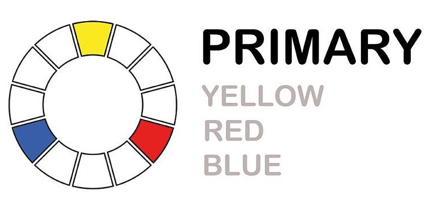
The Three Primary Colors: The Building Blocks of Your Artistry
As we have mentioned already, the three primary colors are blue, red, and yellow. Simple enough! Things never remain simple for long, however, as you can have different shades of each of these three colors. When you are first beginning to mix your own colors, we suggest that you have both a warm and a cool shade of each primary color. These are the ones that we suggest:
- Cadmium Yellow (warm yellow containing a little red)
- Lemon Yellow (cool yellow containing a little blue)
- Cadmium Red (warm red containing a little yellow)
- Alizarin Crimson (cool red containing a little blue)
- Ultramarine Blue (warm blue containing a little red)
- Phthalo Blue (cool blue containing a little yellow)
We suggest having a warm and cool shade of each of your primary colors because it will make the mixing of your secondary and tertiary colors much easier. If, for example, you want to mix a light green, using the warm Cadmium Yellow and the warm Ultramarine Blue may leave contaminants of red in your green, or heaven forbid, make it a little brown! By using the cool shades of yellow and blue, you can mix a crisp and bright green.
Another thing to mention about primary colors is that you cannot mix them yourself.
Secondary Colors: The Next Step Up
Now that you have your primary colors on lock, you can begin to experiment with secondary colors. You can make secondary colors by combining two primary colors to create green, purple, and orange. To achieve these secondary colors, you can combine the following primary colors:
- Purple: Mix red and blue (preferably the warm shade of each)
- Orange: Mix red and yellow (once again, preferably the warm shades)
- Green: Mix blue and yellow (this time, the cool shades are ideal)

The exact shade of your secondary color depends on the amount of each base color you use. If you use more yellow than red, you will create a lighter and more fiery shade of orange. You can make a lighter green by using less blue and more yellow. Of course, the warmth and coolness of your primary colors will also play a determining role in your final color. As with all things in painting, experimentation is key!
Tertiary Colors: Time to Show Off
Tertiary colors, on the surface, are not that different from secondary colors, but rather, they represent the different colors you can get by changing up the ratios of your primary colors. By combining a secondary color with a little more of one primary color, you can achieve a wide range of varying tertiary colors.
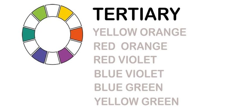
These colors are necessary when you are trying to create a natural-looking image as they can be used to transition between distinct colors. There are six tertiary colors, each of which can be tweaked by adding a little more or a little less of their composite colors:
- Blue-green
- Yellow-orange
- Red-purple
- Yellow-green
- Blue-purple
- Red-orange
Hopefully, you have seen by now that colors are all intricately related. You can see a visual representation of all of these relationships in the color wheel.
The Color Wheel: A Helpful Color Chart
You are sure to have heard of the color wheel throughout your life, and it really is the be-all and end-all when it comes to color-mixing. Using the color wheel as a guide can help you to quickly determine the different relationships between colors and let you create beautiful and dynamic paintings.
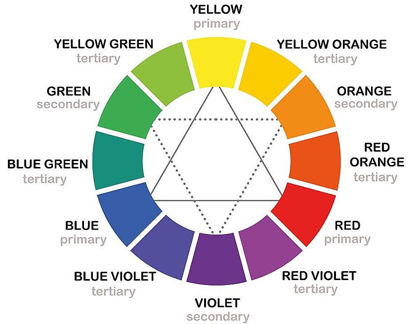
Complementary Colors
These colors are opposite to each other on the color wheel. Placing complementary colors side by side can make them both seem brighter. Green goes with red, yellow with purple, and orange with blue.
There is also a color scheme known as split-complementary colors that work similarly. Rather than using the color directly opposite your chosen one, use the ones which surround it. Using split-complementary colors will produce the same effect as complimentary ones, but it is slightly more nuanced.
Analogous Colors
Rather than reaching across to the opposite side of the color wheel like complementary colors, analogous color schemes use three colors that lay right next to each other. Using an analogous color arrangement produces a harmonious effect because the colors are closely related to each other. Using red, orange, and yellow to paint a bouquet is an example of an analogous color arrangement.
Triadic Colors
If you want a vibrant and eye-catching combination of colors in your painting, we suggest using a triadic arrangement of colors. Triadic arrangements consist of colors that are evenly spaced on the color wheel like purple, green, and orange.
Mixing the Tricky Colors
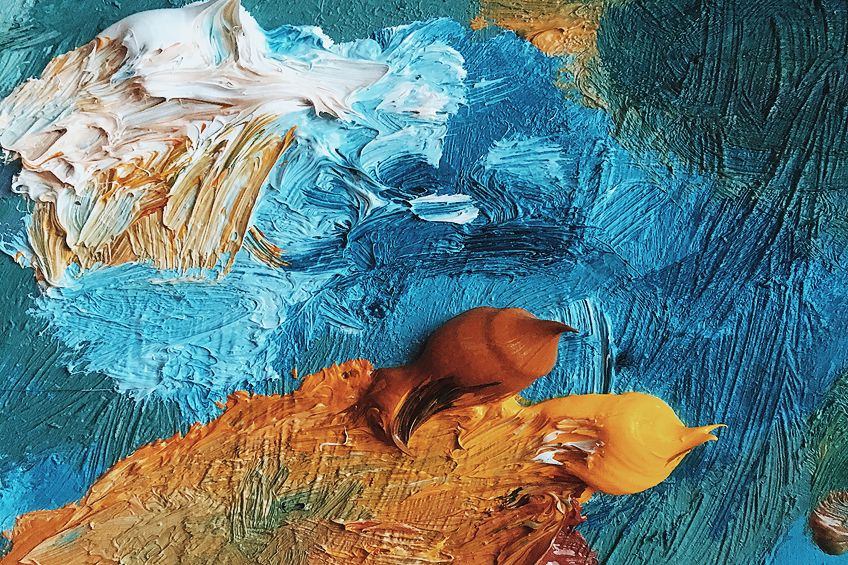
If you have experimented with color-mixing at all, you may know that some colors are difficult to get perfect, particularly brown and grey. Both are compound tertiary colors. You can make them by combining all primary colors. The difference lies in the proportions of each primary color.
What Colors Make Brown?
The color combination for making an earthy brown is red and green. Once again, the ratio of colors will determine the exact shade of your brown. Here are some of the more common shades of brown and how to achieve them.
Warm Brown
Warm brown shades are ideal for painting wooden tones, bricks, or trees in the sunlight. You will need a warmer green made out of a warm yellow (that includes some red) and a warm blue (also has some red pigmentation) in order to create a warm brown.
The beauty of color-mixing is that you can adjust your color to get the perfect shade. You can add more red or yellow to make the brown to make it warmer, and you can cool the brown down by adding a little blue.
Cool Brown
On the other end of the spectrum, we have a cool brown which, as you may guess, is made in the opposite way to the warm brown. Use a cool blue and yellow to create your green, and then use a cool red to make your brown. Again, you can warm it up with reds and yellows or cool it down even further with more blue. Cool browns are ideal for painting dark hair or wintery trees.
Light vs. Dark Brown
You can lighten up your warm or cool brown shade by adding a touch of white. As with all things, add a little at a time. You can always add more white, but if you add too much, you will need to adjust the ratio of all the other colors too. To darken your brown, we never suggest using black as this can make your color very muddy. Instead, try to add a little more of your dark blue or dark red, depending on the warmth of your color.
Grey: How to Achieve a Full-Bodied Grey
You may think that it is simple to create a grey color by mixing white and black. Unfortunately, it is not this simple. Black pigments are typically made from a mix of all the primary color pigments, so when you add white to black paint, a little purple or even green can show through!
To create a beautiful grey color, we suggest using a fair amount of blue and adding a little orange and white until you have your desired shade. If you want a more delicate grey, you can use a lot of white and add a little red and green. Purple, yellow, and white can make a lovely warm grey when mixed. Experiment and see what you like the most!
Exercises in Color-Mixing
We are sure you are sick of being told to practice and experiment when you are first learning how to paint, but the point cannot be stressed enough, especially with mixing colors. With practice, you will be able to whip up any color you need. We have collated four of the best exercises that we recommend for practicing color-mixing. Each one is intended to help you with different aspects of the color-mixing process, including saturation, tones, gradation, contrast, and color matching.
Practicing Color Gradation
The color wheel consists of saturated colors that are either primary or secondary colors. The compound colors of browns, earthy tones, and khakis are a mixture of three primary colors and lay between complementary colors. This exercise is to work your way from one complementary color to another via the compound colors.
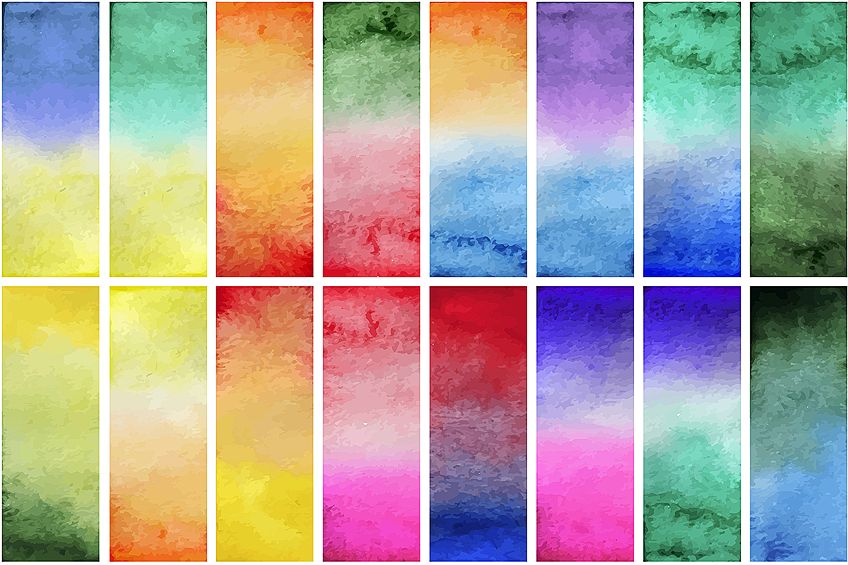
To begin the exercise, draw out a line of seven squares. The aim is to start with a red-orange in the left-most square and work your way via the compound colors to a green-blue color in the right-most square.
You can make the red-orange shade with an Indian Yellow and Alizarin Crimson, and you can use Phthalo Blue. Be sure to mix enough of your colors before you start the exercise.
Gradually begin to darken the red-orange with a little blue in the next square and continue until you have a smooth gradient. The colors on the left should be warm, and those on the right cool, with the middle square being as neutral as possible.
Do not panic if you do not get it right the first time, because as we have said already, practice makes perfect and this is not an easy exercise.
Experimenting with Tones
Tones represent the lightness-darkness value of a color. For this exercise, we suggest you start with a gradation from black to white, as the tonal steps are easier to see with these colors. You can then go on to practicing tonal steps with any other color you please.
Changing the tone with watercolor paints is very simple, you only need to add water to lighten the color. If you are using acrylic, gouache, or oil paints, you can add white to any color to lighten the tone.
Just as you did with the color gradation exercise, draw out seven squares and start with your color in its darkest form in the left square. It is important to note here quickly that you should wait for each square to dry fully before moving onto the next as the color will become lighter as it dries. When each square is dry, you can add a little more white to your paint, and complete the next.
Again, creating an even gradation between light and dark is not as simple as it seems, and you may need to practice this exercise a few times before you get a smooth transition.
Try Color Matching
Color matching is a fun and tricky exercise that will help you to learn how to mix colors according to an exisiting shade. Start by cutting out six (or as many as you like, really) squares of different colors from a magazine and sticking them onto a page in your sketchbook or piece of paper. Draw six squares opposite each of your chosen colors and then in each one, try to match the exact color of your magazine snippet.
Do this exercise several times, with different colors, and you will be able to mix any color you need.
Playing with Contrast and Saturation
To create depth and perspective within your paintings, you need to know how to use your colors to establish the central features.
For this exercise, draw up a large grid of squares and use various shades of two complementary colors to create a design. Use warmer and more saturated colors to pick out the central feature of your design. Practice using tonal contrast and complementary colors to give your design depth and excitement. You can use cooler and less saturated colors to add depth and dimension.
Typically, it is a good idea to choose one of your complementary colors to dominate the design and use the other to add pops of emphasis and interest. Adding a bright yellow square next to a dark purple one, for example, will immediately draw your attention to this part of the design. Have fun with it!
Our Top Tips and Tricks for Color-Mixing: A Color-Mixing Guide
Mixing colors is not easy and takes a fair amount of practice. We have compiled a few of our top tips and tricks to help you with your color-mixing journey.
It is Easier to Darken Your Colors
It takes much less paint to darken a color than it does to lighten one. A perfect example is creating a pink shade. Rather than adding a truckload of white to your red, try adding just a touch of red to your white paint. You will save a lot of time, paint, and money.
Be Aware of the Drying Color
Depending on the type and brand of paint you use, the mixed colors may be lighter when dry than wet. We suggest that you mix your colors to be a little darker than you want them to be so that they are perfect when they dry. Do some experimentation before you put brush to canvas if you do not know how your specific paint will dry.
Only Use Black for Black’s Sake
Black can be a tricky color to use because it is typically made by mixing many different pigments. Rather than using black to darken a color, we suggest using a dark blue (like Ultramarine) or red (like Burnt Umber), as adding black can make your color look a little muddy.
If you want to skip out on using store-bought black altogether, you can easily use these two dark colors to make a beautiful black shade. Adding white to this mixture will also make a lovely grey.
Mix Colors with Single Pigments
To get bold and bright colors, we suggest using paints with only one color pigment. Colors that include several different pigments can result in muddy and unwanted mixed colors. You can generally find the information about color pigmentation on the manufacturer’s website.
Experiment with Not Mixing Your Colors Completely
Try not to mix your final color too much. Leaving a small amount of variation in your mixed colors can produce a more natural effect on your canvas. It can also help tie together the different colors in your composition, creating a more harmonious impression.
Tinting Down a Strong Color
If one of your colors is a little more intense than you would like, you can tone it down by adding either a little brown or a small amount of its complementary color. You can make a yellow a little softer, for example, by adding a small amount of purple. It may seem a bit wacky but give it a go!
Frequently Asked Questions
What Are the Most Important Shades for Mixing Paint Colors?
The three primary colors, as well as white, are all you need in order to mix any color you can imagine. If you have blue, yellow, and red, you can mix any color.
Can You Use Any Paints to Mix Different Colors?
It is best to use paints of the same brand to mix your colors. Different brands use different amounts of pigments in their colors, which can result in inconsistencies in your color-mixing results.
Is White a Color?
Some people consider white to be a color because it is a combination of all hues on the light spectrum, where others think it is just a shade that you use to lighten another color. Many people also believe that white is the absence of color because it cannot be created by mixing other colors.
What Colors Make Black?
You can mix black very easily by using a dark red like Burnt Umber and a dark blue shade like Ultramarine Blue. Alternatively, you can make black by combining all three of the primary colors, but this color can be less consistent according on the brand you choose. Depending on your preferences, you can make your own black, or buy it from the shop.
What Colors Make Yellow?
You cannot make yellow because it is one of the basic colors. You may also ask what colors make red, and what colors make blue? The answer is exactly the same. These are the most fundamental colors and you need to buy them.
What Colors Make Orange?
You can mix red and a little bit of yellow to make any shade of orange. The exact shade of orange depends on the amount of red and yellow you use.
What Colors Make Purple?
You can mix red and blue together to make purple. As with all color-mixing, the shade you get depends on the amount of red or blue you use.
What Colors Make Blue?
Blue is a primary color, so you cannot make it. You can make different shades of blue by using white.
What Colors Make Green?
Try using yellow with a bit of blue to make a bright green color. If you use a light yellow and a light blue, you will get a light green.
What Colors Make Red?
Red, like blue and yellow, cannot be made from other colors.
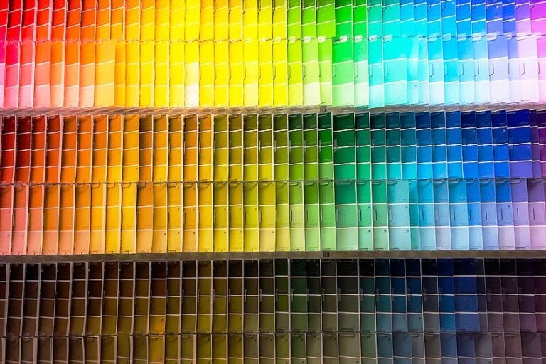
What is a Color-Mixing Chart?
A color-mixing chart is a helpful tool for beginner painters. It presents all possible color combinations so that you can easily determine which colors to mix together.

Larissa Meyer is a 32-year-old mother from Michigan and creative spirit since childhood. Her passion for painting and drawing has led her to an education as an illustrator and a career as a freelance graphic designer. She has a Bachelor of Fine Arts in Illustration and a degree in Graphic Design. Larissa is a talented artist who is able to master a wide range of styles and techniques to bring her artistic vision to life. Her greatest passion is currently fluid painting and epoxy resin art. Larissa’s love for art and her knowledge and experience in illustration make her the perfect Creative Director for our fluid-painting.com team. She is the creative head of our team and shares her passion and knowledge with our community through articles and tutorials.
As a mother of a 2-year-old daughter, Larissa also understands the importance of fostering creativity in early childhood. She uses her experience and knowledge to help other parents inspire their children and develop their artistic skills as well.
Learn more about Larissa Meyer and about us.