Ugliest Colors in the World – Leaning About the Ugliest Colors
This post may contain affiliate links. We may earn a small commission from purchases made through them, at no additional cost to you.
It goes without saying that it is entirely up to each individual’s subjective opinion whether or not any color, in particular, could be deemed ugly. However, we do find that there is some general consensus that some colors are indeed uglier than others. This could be on account of the semiotic connotations that these colors bear based on how they appear in nature or life in general. Whatever the case may be, allow us to escort you through a study of these ugly colors. In this article, we will be discussing some of the most unappealing and unpopular colors, as well as why they are so vilified.
Table of Contents
What Is the Ugliest Color?
First things first, what is the ugliest color known to man? This would be a color called opaque couché, also known by its technical name Pantone 448 C. This color is of a drab dark brown shade that contemporary color research and surveys have singled out as being the most disliked color in the known light spectrum.
The Ugliest Colors in the World
As we have covered, the degree to which any color appeals to you would be based on your own subjective opinion, not unlike many other things and senses. One’s sentiments towards any particular color may be guided by culture, semiotics, and even personal experience. One might come to like a typically unpopular color simply because it reminds them of pleasant experiences. One might also come to dislike a popular color for the exact opposite reason. Then again, there are some colors that remain unpopular simply because of a set of intrinsic qualities that simply do not appeal to the human eye.
While on the topic, did you know that the colors of the clothing you wear may have some bearing on how others perceive you? You read that correctly; some colors, when worn, might actually make you look less appealing to others.
Several contemporary colors on the science of colors, combined with a vastly growing comprehension of color theory and psychology in general, have taught us that certain (if not all) colors are processed by the human brain in a way that produces different relevancies, denotations, and implications. Developing a better understanding of the relationship between human psyches and how they are affected by different colors may better guide our usage of color in our day-to-day lives.

This is not to say that there is only merit in understanding what colors appeal the most to the human eye. It is also well worth knowing what colors are perceived as being the ugliest by the human subconscious. By developing a base of understanding around these principles, we can better know how to avoid making use of unappealing colors in our artworks, home décor, and in the clothing that we choose to wear. Also, as we will soon be covering, there are colors such as Pantone 448 C that are simply so despised by the human eye in terms of their aesthetics that they have come to find a role within the theory of defensive design.
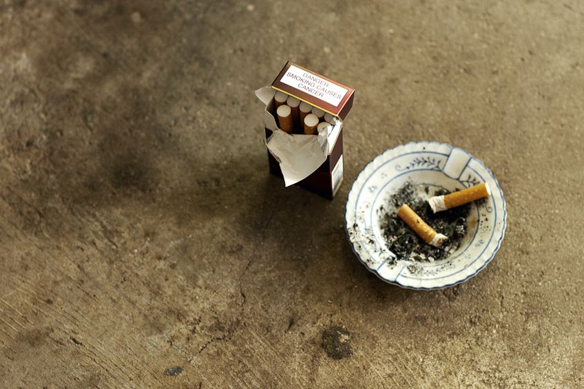
The packaging of harmful products such as cigarettes is popularly mandated by many governments around the world to be printed in the color of opaque couché.
Pantone 448 C: Opaque Couché
If you have ever wondered to yourself, as you no doubt indeed already have if you are reading this article, “what is the ugliest color in the world?”, you now have your answer. Thanks to the investment of governmental officials in the UK, whose intention it was to figure out what color receives the most holistic despisal across the board so as to enforce that all cigarettes be packaged in such a shade (done as a means through which to dissuade smokers from continuing their habits), we now have a plethora of scientific research to support the notion that Pantone 448 C takes the cake as the worst of the many ugly colors we have ever dreamed into existence.
Polls, focus groups, and a ton of psychological analyses have proven that the drab dark brown shade of Pantone 448 C (also referred to as opaque couché) boasts the greatest ability to mutilate our eyes with aesthetic displeasure. In countries such as England, Australia, and Thailand, you will find this color on the covers of most – if not all – tobacco products. Although spearheaded by interest groups in the UK, it would be an Australian institution whose research would support the idea the opaque couché delivers the worst possible response from human observers.
In 2012, the organization in question conducted a poll featuring over a thousand subjects aged between 16 to 64, the results of which determined Pantone 448 C as the least appealing color in the world.
According to the responses drafted from the participants of the survey, the color is reminiscent of death, disease, dirt, and rot – ironically all of which are some of the better-known consequences of smoking tobacco products. Initial descriptions of the shade defined it as an “olive green”. This definition, however, displeased the old-headed lobbyists of Australia’s parliament, who gave stern objection to the namesake. After this, the shade was reclassified to its current name. The UK is now fast on the heels of Australia’s revelations, having in recent years updated the policies surrounding the packaging of tobacco products and introducing legislation that bans any sort of labeling being visible on the exterior and enforcing the use of Pantone 448 C as the primary color. Alongside this, roughly 60% of all tobacco products sold in the UK will now also come with health warnings labeled clearly on the outside packaging.
| Ugly Shade | Color Hex Code | CMYK Color Code (%) | RGB Color Code | Ugly Color |
| Opaque Couché | #4a412a | 0, 12, 43, 71 | 74, 65, 42 |
This has more recently inspired many governments across the world to remove any sort of aesthetically pleasing labeling or advertising from the packaging of tobacco products. Most of the countries now involved in smearing the image of cigarette branding have also implemented the use of Pantone 448 C as the primary color of tobacco product packages. Even the World Health Organization has gotten in on the action, encouraging the rest of the world to follow suit, going so far as to fund further studies on how different colors can be implemented on tobacco product packaging to achieve the same effect. If we refer to another study conducted in 2013, we see that children, teenagers, and young adults all tend to prefer using tobacco products that are branded colorfully or with appealing aesthetics in mind over products packaged with the drab dark brown now used by the UK and Australia.
According to another Australian study, the use of ugly colors on the packaging of cigarettes tends to imply to consumers that the products are of low quality, which further dissuades them from purchasing these items.
However, another study conducted on the consumer response to Australia’s implementation of brand removal and the use of undesirable packaging colors has increased interest in unregulated or illegal tobacco trade and products. The UK government’s idea of covering their smoking products in disgusting colors does indeed do well to increase the ick factor of tobacco use but the United States of America may soon implement a substantially more heinous means of deterring smokers from their vices. Contemporary research and analyses of focus groups have indicated that attaching photographs and imagery that picture some of the many adverse and lethal effects on the body caused by smoking has its merits in discouraging the continued use of tobacco products and in dissuading non-smokers from picking up the habit.
You may be surprised to hear that the US government has put forward regulations to add graphic imagery to their domestic tobacco products as far back as 2009. So, why do American tobacco products still not have warning images on them yet? Well, you have Big Tobacco to thank for that. Lobbyists from the US tobacco industry have used their immense access to wealth and jurisdictional influence to get the federal appeals court to issue a lengthy postponement on the basis that there is not enough scientific evidence available yet to corroborate the idea that it would disincentivize smokers from sparking up. However, the most contemporary data available to the US court may indeed be enough to turn the favor away from tobacco lobbyists. Alas, only time will truly tell.
More Ugly Colors
As revolting as Pantone 448C is, it is in no way the only color to have garnered the admonition of millions of people across the globe. Whether it be due to their innate aesthetically displeasing appearance or simply due to overuse, there are plenty of other colors in the spectrum that are considered to be pejorative. Here are a few of these colors, as well as the reasons why they receive so much hate.
Lime Green
Moving away from discussions around ugly colors that pertain to smoking, let us talk about lime green. According to polls, a majority percentage of people seem to find the shade of neon lime green to be an affront to their eye sockets. This is especially true when it comes to clothing. It is a color that was most popular during the abhorrent Y2K era of fashion and it seemed to be making a comeback last summer – much to the chagrin of anyone with a sensible palette for wardrobe aesthetics. Neon lime green is, by the accounts of designers and consumers alike, one of the worst-looking shades of green. It does, however, sometimes have its place in fashion when deftly paired with blacks but the popularity of it being paired with whites has been on the rise in the last few years, which has the heads of fashionistas spinning across the globe.
Nevertheless, people blessed with a medium skin tone may be able to get away with it in some instances. But if you have a complexion pale enough to rival that of the moon, you are in no luck.
Trust us on this one; nobody wants to see you in a color that makes you look reminiscent of a chevron sign. Outside of fashion, however, the shade does have its place in many circumstances and even boasts some redeemable semiotic connotations. For example, lime green is closely associated with nature, energy, confidence, vigor, inspiration, and vitality. That being said, we would be doing you a disservice were we not to let you know that it also bears an association with some particularly nasty aspects of physiological issues such as decay and the gross mucus produced from chest infections.
| Shade | Color Hex Code | CMYK Color Code (%) | RGB Color Code | Color |
| Neon Lime Green | #39ff14 | 78, 0, 92, 0 | 57, 255, 20 |
Mustard Yellow
Depending on your personal tastes and sense of fashion, you might be confused as to why this color has made its way into this article. Just please do not shoot the messenger as we only serve to speak for the people. For many, this seemingly harmless shade of yellow is far too reminiscent of a departed era of fashion. The shade had its heyday all the way back in the 1940s and even had a resurgence in the 1990s.
For many, it is simply too archaic and perhaps even a bit too bold to have its place in the modern era of fashion and design.
But much like life itself, the tenure of mustard yellow appears to be cyclical since it has already started to reappear in contemporary design. If we look towards the color psychology surrounding this shade, we may indeed find our answers as to why, though, because some of its key connotations include creativity as well as diversity. One negative aspect of this color’s connotations, however, is the association it bears to the color of pimples we no doubt all experienced during our adolescence.

| Shade | Color Hex Code | CMYK Color Code (%) | RGB Color Code | Color |
| Mustard Yellow | #EAAA00 | 0,29,100,1 | 234,170,0 |
Bright Magenta
This is a color that bears a keen resemblance to hot pink so it does not take much effort to understand why the jury might be divided between loving and hating it. Gratitude, joy, fulfillment, cheer, and pleasure are all closely associated with this color. However, for the more mature audience, this color may come across as reminiscent of the naivety of youth. This is no doubt in part a result of its popularity and commonality among kids’ toys.
Growing older comes with a fair bit of refinement of one’s tastes, which is probably why adults tend to despise this persistently bright shade of purple.
Shades such as this may have at some point brought us glee but they tend to appear superficial and cheap as we mature into adulthood. Children who were once enamored by their toy dolls dressed in bright magenta clothing may grow into adults that find the color too sickly sweet and juvenile to appeal to their mature sentiments.
| Shade | Color Hex Code | CMYK Color Code (%) | RGB Color Code | Color |
| Bright Magenta | #FF00CD | 0, 100, 20, 0 | 255, 0, 205 |
Light Olive
Much like the fruit after which it derives its namesake, light olive is a shade that tends to divide a room. Some love it while others cannot stand the sight of it. This is a shame given that its semiotic connotations convey positive ideas such as matriarchal power, sincerity, empathy, and harmony. With this in mind, it makes it difficult to understand exactly why the shade receives so much… shade?
This is because, much like any other color in our visible spectrum, it is not without its negative connotations as well.
Polls and research pertaining to the color psychology behind this shade indicate to us that light olive tends to remind many observers of some rather nasty physiological issues. These include nausea, stomach aches, and infections. For some others, the shade is far too reminiscent of the drab color schemes of the 1970s where olive green and brown shades were used to a nauseating extent – a stark contrast from the famous vibrancy of the 60s baby boomer era of fashion and design.
| Shade | Color Hex Code | CMYK Color Code (%) | RGB Color Code | Color |
| Light Olive | #BDBC70 | 0, 1, 41, 6 | 189, 188, 112 |
Dark Gray
The color gray and all of its pertaining hues and shades tend to receive a lot of disapproval across the board. However, the shade of dark gray in particular seems to get the most hate. This is most likely on account of how drab, dull, and lifeless it looks. Some say that this color is host to the absence of creativity and variety, something that could even be substantiated by its repetitive hex code. We can think of many other reasons why people tend to dislike this shade so much, such as the fact that it bears the color of cloudy skies on a rainy day or that it reminds us of itchy and constricting school uniforms. It is the color of the office blocks and cubicles where imagination and inspiration go to die. One might even go so far as to describe the color as Orwellian. It is natural for us humans to cherish life and vitality. This color, however, celebrates neither.
Our minds may not be able to comprehend what the absence of color looks like, but we are pretty sure that this color comes close to it. It is both endless and uncaring in its uniformity.
That being said, this dull gray is not all doom and gloom, saved only by how evenly positioned it is between the colors white and black. With this comes semiotic connotations of neutrality and balance. In terms of its color psychology, its unbiased tone actually assists in barring distractions and allowing one to remain focused on a task. It is for these reasons that the color is popularly implemented in businesses and institutions of learning. This is, however, antithetical to most peoples’ definition of art. Creative thinkers tend to explore other colors more so than gray, if not ignoring the latter altogether. Art represents escapism and a means through which to find an outlet that transports us beyond the mundane aspects of life on this orbital rock.
| Shade | Color Hex Code | CMYK Color Code (%) | RGB Color Code | Color |
| Dark Gray | #A9A9A9 | 57, 46, 40, 25 | 66, 66, 66 |
Rust
Here we have another example of a color with relatively harmless aesthetic qualities that we tend to shun solely because of the semiotic associations we attribute to it. Starting with the name itself, what is stirred up are thoughts of ruin, dilapidation, and decay, which can then be linked to further ideas of the absence of maintenance, preservation, and care. Rust reminds us of finality and how we ourselves are impermanent beings.
No matter how well an engine runs the first time it sparks, and no matter how well it is made, it too will one day cease to fire. Ozymandias, anyone?
But maybe we are being a bit too harsh on rust. After all, nothing lasts forever and rust keenly reminds us of this fact. Not even the sun itself will live infinitely. Many of the stars in the night sky have burned out for eons before their light could travel so far as to bless us with the magnificence of their glow. Rust reminds us of the impermanence of life, and perhaps this is something we should learn to appreciate so that we cherish what time we are lucky enough to spend on this earth.

| Shade | Color Hex Code | CMYK Color Code (%) | RGB Color Code | Color |
| Rust | #b7410e | 183, 65, 14 | 0, 64, 92, 28 |
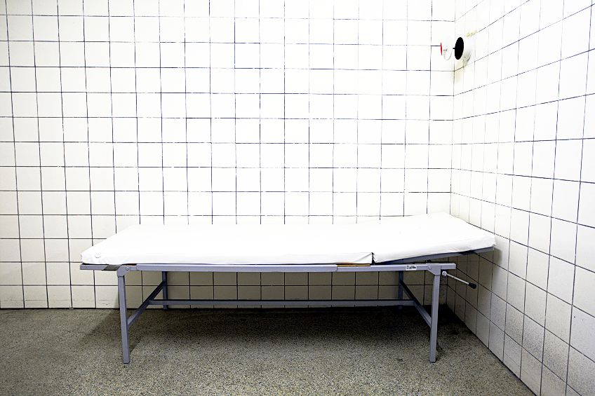
White
You may again find yourself wondering why a color as unsuspecting and credulous as white might have found itself on a list of the world’s most disliked colors. However, it is unpopular for similar reasons as gray. For many, white represents the true absence of color. and by association, white comes to represent the absence of life itself. In fashion, perhaps a good reason why people do not like the color white has to do with how difficult it is to keep clean, especially when at a social gathering.
Given that it is the color to represent purity and cleanliness, a single drop, spill, or smear of dirt could be enough to render its aesthetic qualities null and void.
Its inability to hide blemishes, however, is exactly why white is the preferred color of hospital bedding and clothing since it most clearly shows us where the mess is – which can be incredibly important in spaces where hygiene and cleanliness are of the utmost importance. But this can also be construed as yet another reason to dislike the color as well. The clean and pristine attributes of white also give it an underlying connotation of empty blandness and clinical precision. The color may conjure up imagery of cleaning detergents, unpleasant hospital stays, or even the padded cells of a psych ward.
| Shade | Color Hex Code | CMYK Color Code (%) | RGB Color Code | Color |
| White | #ffffff | 255, 255, 255 | 0, 0, 0, 0 |
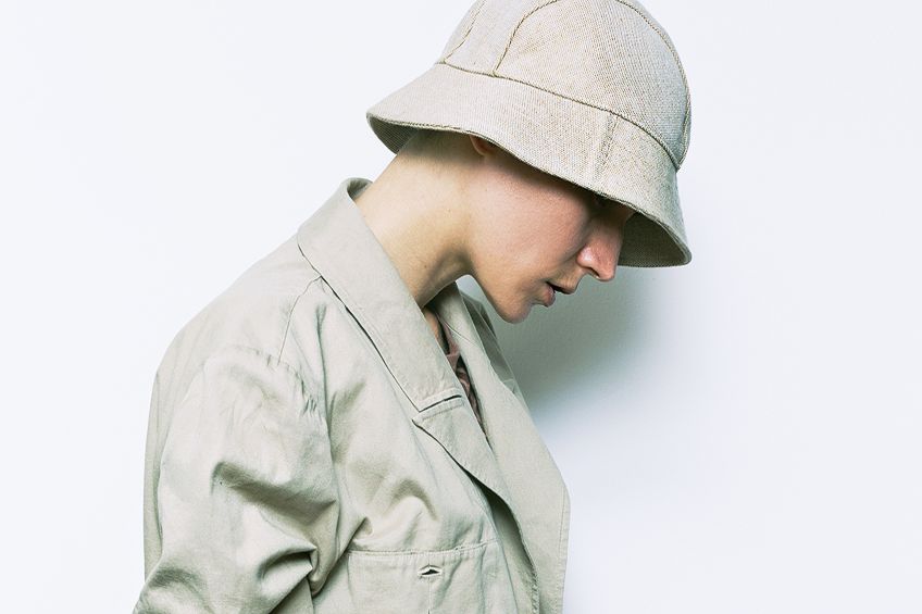
Beige
If you are not a fan of white, it typically goes without saying that you are not too fond of the color beige either. Beige is white’s less attractive cousin whose company you were meant to entertain on one award double-date, but will not stop messaging you after several desperate attempts at politely hinting towards your disinterest in pursuing a relationship with. Beige is what white looks like if you were to leave it to gather dust in the basement. As a matter of fact, white fabrics, tools, and appliances do indeed tend to discolor into this horrid shade through wear and tear over time.
Perhaps then it should come as no surprise that beige is the color of functionality; design without a thought of aesthetics in mind.
| Shade | Color Hex Code | CMYK Color Code (%) | RGB Color Code | Color |
| Beige | #f5f5dc | 245, 245, 220 | 0, 0, 10, 4 |
So, there you have it! You now know about some of the ugliest colors in the world. Hopefully, you have found this article informative and, failing that, at least a bit entertaining. We cannot deny the remarkable effect that colors can have on our moods, mindset, and emotions. Knowing what colors will bring about positive energy will assist you in attaining a myriad of benefits. Good color combinations can assist with relaxation, help inspire you, stimulate creativity, and rejuvenate your mindset. The wrong set of colors, however, can deplete you, leaving you tired, drawing you towards depression, and rendering you more irritable – hence the importance of knowing a little bit more about the ugliest colors in the world. Keep in mind, however, that the colors we have covered in this article have only been deemed “ugly” by a relatively small sample group compared to the number of humans on this planet. At the end of the day, whether we like a color or not is a purely subjective matter.
Frequently Asked Questions
What Is the Ugliest Color in the World?
The color that takes the cake as the ugliest known to man is called Pantone 448 C, also typically referred to as opaque couché. This greenish shade of drab dark brown is so despicable, in fact, that both the United Kingdom and Australia have infamously begun using it as the mandated color in which all tobacco products must be packaged, so as to discourage the use of these products by their citizens. The idea behind the decision is based on the teachings of color psychology, and plays on the semiotic connotations of decay, sickness, and filth that come with this color.
What Are the Ugliest Colors in the World?
Although any decision regarding whether or not a color is ugly should be an entirely subjective issue determined by each and every individual, there is nevertheless enough poll research and psychological analyses to indicate to us that certain colors are far less popular in terms of their aesthetics than others. Included in this list of ugly colors are opaque couché, rust, light olive, lime green (neon), mustard yellow, beige, and white.

Larissa Meyer is a 32-year-old mother from Michigan and creative spirit since childhood. Her passion for painting and drawing has led her to an education as an illustrator and a career as a freelance graphic designer. She has a Bachelor of Fine Arts in Illustration and a degree in Graphic Design. Larissa is a talented artist who is able to master a wide range of styles and techniques to bring her artistic vision to life. Her greatest passion is currently fluid painting and epoxy resin art. Larissa’s love for art and her knowledge and experience in illustration make her the perfect Creative Director for our fluid-painting.com team. She is the creative head of our team and shares her passion and knowledge with our community through articles and tutorials.
As a mother of a 2-year-old daughter, Larissa also understands the importance of fostering creativity in early childhood. She uses her experience and knowledge to help other parents inspire their children and develop their artistic skills as well.
Learn more about Larissa Meyer and about us.