Pastel Colors – Find the Beauty in a Pastel Color Palette
This post may contain affiliate links. We may earn a commission from purchases made through them, at no additional cost to you.
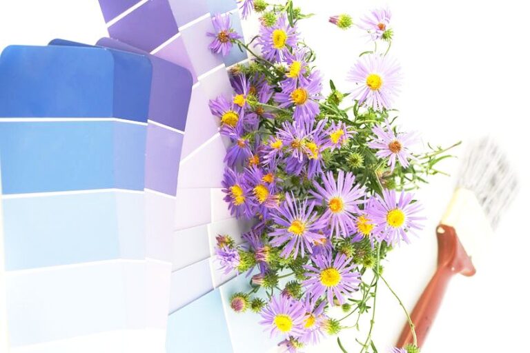
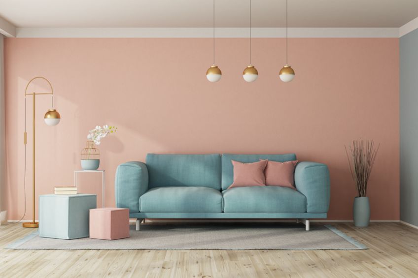
There are an array of colors from bright reds to somber purples but in recent years, pastel colors have been growing in popularity. Artists use pastel colors to soften and add depth to bold colors. Pastel colors feel more organic and natural, and a pastel color palette can inject joy and airiness into a room or artwork. In this article, we explore the different popular shades of pastel colors, their histories, as well as how to use them.
What Are Pastel Colors?
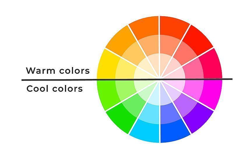
To understand what pastel colors are and how they are made it is useful to consider basic color theory. Colors are grouped into primary, secondary, and tertiary hues and all of these colors have various tones, shades, and tints. Primary colors include blue, yellow, and red, and they can be mixed together to produce green, orange, and purple, which are secondary colors. These primary and secondary colors are then combined to form tertiary colors. The color wheel is often used to visually show the different relationships between all the different colors.
Tones of colors are the result of combining gray with a base color, whereas shades are made by adding black. Color tints are made when white is added. These tints are what we call pastels and are less saturated and therefore softer than their base colors. Pastel colors do not appear on the traditional color wheel, however, tend to appear in the center of color wheels that show tints and shades.
When we talk about saturation, we are referring to the intensity of the color. As a color moves away from the base hue toward white it decreases in saturation and once it reaches gray, that color becomes completely desaturated. Pastel colors are less saturated and more muted, making them less harsh than their more saturated base colors.
They maintain their high luminance, however, which gives them their bright look.
| Pastel Color Name | Pastel Hex Code | RGB Pastel Color Code | CMYK Pastel Color Code (%) | Pastel Color Shade |
| Pastel Green | #77DD77 | 119, 221, 119 | 46, 0, 46, 13 | |
| Pastel Pink | #F8C8DC | 248, 200, 220 | 0, 19, 11, 3 | |
| Pastel Orange | #FAC898 | 250, 200, 152 | 0, 20, 39, 2 | |
| Pastel Yellow | #FDFD96 | 253, 253, 150 | 0, 0, 41, 1 | |
| Pastel Blue | #A7C7E7 | 167, 199, 231 | 28, 14, 0, 9 | |
| Pastel Purple | #C3B1E1 | 195, 177, 225 | 13, 21, 0, 12 |
History, Meaning, and Psychology of Pastel Colors
All colors can impact us subconsciously in different ways. Warm colors such as reds and oranges remind you of flames and energize you, while cool colors such as greens and blues conjure images of nature and water and are soothing. Pastels are not as vibrant as these primary hues, which gives them a softer and calmer feel compared to their pure counterparts.
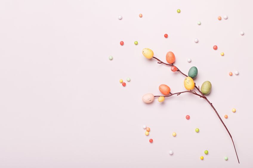
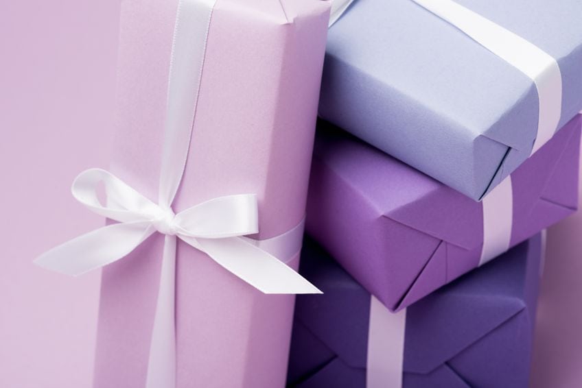
Pastel colors are associated with a range of emotions and symbolisms such as love, affection, joy, romance, calmness, peace, and satisfaction. These delicate colors are pretty and sweet and because of this, they are often used in ice cream shops, bakeries, baby products, and even perfume. Pastel colors lighten and balance bolder and darker color schemes making them feel more soothing and less imposing.
Pastels first became popular in 18th century France and became well-known as the preferred color palette of Marie-Antoinette. In the early 21st century, pastel hues were considered pre-teen colors and were primarily used in toy marketing and clothing for young girls. Today, pastels are still used for marketing women’s products, however, they are increasingly being used in both male and unisex marketing campaigns
More recently the candy minimal movement has sparked a renewed love for pastel colors. Instagram users used photography to capture unique and interesting images of pastel and neon subjects.
Popular Pastel Colors
As you can see pastel colors have a history almost as vibrant as the colors themselves. There have been many popular pastel colors across the ages, each with its own unique attributes. We have created a list of some of these pastel colors that have influenced many different aesthetics and art movements.
Blush
Blush is the color of beauty, affection, and empathy. It is a pale red created by adding white to it, which softens the passion of the pure red hue. Blush is great to use in low-energy rooms and has a stress-relieving effect if paired with other soft colors.
The ancient Egyptians combined red ochre and fat to create a paste that was similar in color to blush and was used on the cheeks to mimic blushing and give the wearer a healthy and youthful appearance.
| Pastel Color Name | Pastel Hex Code | RGB Pastel Color Code | CMYK Pastel Color Code (%) | Pastel Color Shade |
| Blush | #BC544B | 188, 84, 75 | 0, 55, 60, 26 |
Baby Pink and Baby Blue
Baby pink is a tint of bright red and symbolizes kindness, compassion, and nurturing. This pastel pink color, along with baby blue, evokes memories of childhood and innocence. This is because baby pink was originally used to symbolize baby girls just as baby blue is meant to be baby boys, however, today these colors have become more unisex in their usage. Baby blue was also the favorite color of Marie-Antoinette in the 18th century and there are many painted portraits of her donning the delicate color.
| Pastel Color Name | Pastel Hex Code | RGB Pastel Color Code | CMYK Pastel Color Code (%) | Pastel Color Shade |
| Baby Pink | #F4C2C2 | 244, 194, 194 | 0, 20, 20, 4 | |
| Baby Blue | #89CFF0 | 137, 207, 204 | 43, 14, 0, 6 |
Pastel Peach
Peach is another playful pastel color that is very popular. Peach is invigorating and gives feelings of vitality and youthfulness. The peach color is also important in Chinese cultural symbolism and represents immortality from the Taoist legend of the Peach Tree of Immortality said to bloom once every 3000 years.
Peach pairs well with electric blue or other blue pastel colors as it highlights the vibrancy of the blue and the more subtle effects of peach.
| Pastel Color Name | Pastel Hex Code | RGB Pastel Color Code | CMYK Pastel Color Code (%) | Pastel Color Shade |
| Peach | #FC9483 | 252, 147, 131 | 0, 42, 48, 1 |
Rejuvenating Pastel Colors
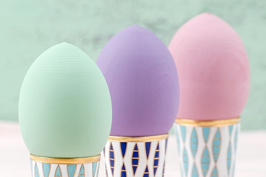
Yellow reminds us of sunshine and daffodils, uplifting and encouraging us. Pastel yellow makes you sense this optimism but its more subtle hue also creates feelings of balance, joyousness, and newness. Mint green is another pastel color associated with renewal and birth. This green pastel color has the fresh light feeling of springtime and has a soothing effect that sparks creativity. Mint green pastel was recognized as a color in Europe in the early 18th century during the Art Deco era and was popularly combined with black to create lots of contrast.
| Pastel Color Name | Pastel Hex Code | RGB Pastel Color Code | CMYK Pastel Color Code (%) | Pastel Color Shade |
| Pastel Yellow | #FDFD96 | 253, 253, 150 | 0, 0, 41, 1 | |
| Mint Green | #CFFFE5 | 207, 255, 229 | 19, 0, 10, 0 |
Popular Blue Pastel Colors
Sky blue looks similar to baby blue; however, this pastel light blue has a slightly greenish undertone as opposed to baby blue’s more purplish undertone. You can see this difference when comparing the pastel hex codes of the two colors as baby blue has more red, giving it the purple undertone. Sky blue has many symbolisms attached to it including dreams, hope, imagination, loyalty, and trust. Sky blue resembles a clear daytime sky and is also the predominant color of the Argentine flag and the uniform color for many of their national teams.
Steel blue is another popular blue pastel color. This is a grayish-blue pastel color that resembles blue steel that has undergone a process called bluing which protects it from rust. Steel blue was first recognized as a color in the 17th century and is associated with feelings of strength, tranquility, and mystery.
| Pastel Color Name | Pastel Hex Code | RGB Pastel Color Code | CMYK Pastel Color Code (%) | Pastel Color Shade |
| Sky Blue | #87CEEB | 135, 207, 235 | 43, 12, 0, 8 | |
| Steel Blue | #8A9BB8 | 138, 155, 184 | 25, 16, 0, 28 |
Light Pastel Purples
Lilac is one of the most well-known purple pastel colors. First used in the 18th century, this color was named after the lilac flower and has come to symbolize innocence, new romance, youth, and spirituality. This light pastel purple evokes feelings of tranquility and pairs well with pale and pastel yellows.Lavender is another pastel that was named after a flower. Just like the flower, lavender has a soothing and relaxing effect and is often associated with self-care, relaxation, and meditation. Lavender symbolizes silence, devotion, serenity, and grace and was popular amongst nobility in the 18th and 19th centuries.
| Pastel Color Name | Pastel Hex Code | RGB Pastel Color Code | CMYK Pastel Color Code (%) | Pastel Color Shade |
| Lilac | #C8A2C8 | 200, 162, 200 | 0, 19, 0, 22 | |
| Lavender | #B57EDC | 181, 126, 220 | 18, 43, 0, 14 |
How Pastel Colors Are Made
Using color theory, you can see that you can make solid pastel colors by adding white to the pure hues found on the color wheel. For example, if you were to add white to red, you would create the pastel color baby pink, which is a tint of red. Adding black or gray to a color will not create a pastel color but change it to a pale color instead.
These pale colors tend to be duller than pastel colors as the pigment black reduces some of their luminance.
A Look at Pastel Color Codes
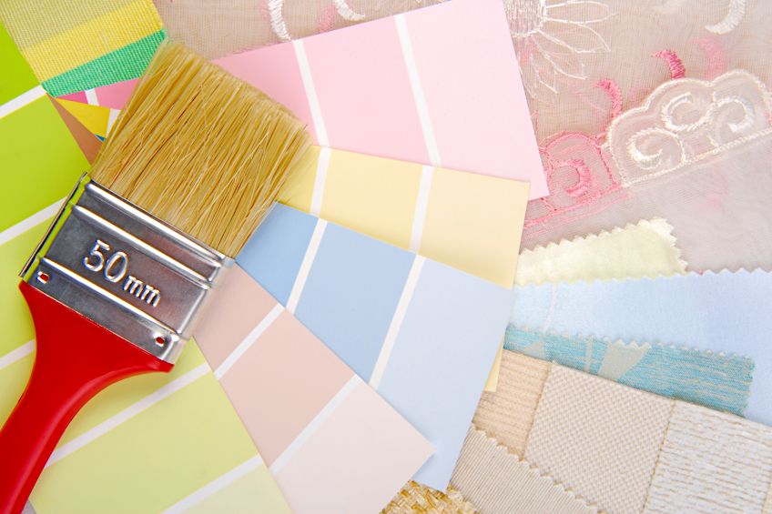
All colors have unique color codes attached to them and pastels are no different. Color codes are useful not only to find the specific shade you are looking for amongst an infinite array, but also tell you about the different hues used to make the color. Color codes are also beneficial in digital art and design as you can transfer the same shade across multiple projects or iterations. The most popular color codes are the CMYK color code, the RGB color code, and the hex color code. Both the RGB and hex color codes are based on the RGB color model and indicate how much red, blue, and green are in the color respectively. The CMYK color codes are based on the model of the same name and show the proportion of cyan, magenta, and yellow within a color.
Making a Pastel Color Palette
With all these different pastel colors it can be difficult to know how to combine them into something that is not dull and sterile but rather soft and aesthetically pleasing. Color theory and the color wheel can help us choose pastel colors that work together from the infinite array of colors available. This can allow you to develop different pastel color palettes that are impactful, and balanced, and create different effects and feelings. We have created a few examples of pastel color schemes that can help you develop your own solid pastel color scheme that you can use in your home and art.
While there are many ways to construct a color palette the easiest way is to use popular color schemes. Complementary, triadic, analogous, and monochromatic are four of the most popular color schemes. All these color schemes offer different levels of contrast and balance while remaining visually interesting.
Complementary Pastel Color Palette
A complementary color scheme is made by incorporating two colors that lie across from each other on the color wheel into a color palette. In our color scheme, the two orange and blue pastel colors are complementary to each other and create the feeling of being at the beach in the summer sun. Complementary color schemes have brilliant contrast; however, this color palette is made using all pastel colors which keep it soft and give it a natural feel.
| Pastel Color Name | Pastel Hex Code | RGB Pastel Color Code | CMYK Pastel Color Code (%) | Pastel Color Shade |
| Electric Blue | #59CBE8 | 89, 203, 232 | 62, 13, 0, 9 | |
| Sky blue | #87CEEB | 135, 207, 235 | 43, 12, 0, 8 | |
| Peach | #FC9483 | 252, 147, 131 | 0, 42, 48, 1 | |
| Sand | #E0B68B | 224, 182, 139 | 0, 19, 38, 12 | |
| Pastel Yellow | # FDFD96 | 253, 253, 150 | 0, 0, 41, 1 |
Triadic Pastel Color Palette
If you are looking for a color palette that retains the high contrast of the complementary color scheme but is easier to balance, then you should consider a triadic color scheme. The hues in a triadic color scheme are evenly spaced on the color chart and so are more balanced. The two pastel reds, creamy yellow, and pastel light blue all create a bold pastel color palette.
Using small quantities of the light green pastel is great for creating additional contrast or visual interest.
| Pastel Color Name | Pastel Hex Code | RGB Pastel Color Code | CMYK Pastel Color Code (%) | Pastel Color Shade |
| Blush | #BC544B | 188, 84, 75 | 0, 55, 60, 26 | |
| Contessa | #EAC7C7 | 234, 199, 199 | 0, 15, 15, 8 | |
| Light Steel Blue | #A0C3D2 | 160, 195, 210 | 24, 7, 0, 18 | |
| Tea Green | #B5D5C5 | 181, 213, 197 | 15, 0, 8, 16 | |
| Cream | #F7F5EB | 247, 245, 235 | 0, 1, 5, 3 |
Monochromatic Pastel Color Palette
Different tints and tones of a single hue are used in a monochromatic color scheme and combine together to create a palette with soft contrast. This color palette uses a monochromatic color scheme with different tints and shades of pinkish purple. The addition of a dark shade of purple to the light pastel pink color creates good contrast and visual interest in an otherwise monotonous color palette. The use of neutrals helps balance the palette and prevents it from feeling dull and flat.
| Pastel Color Name | Pastel Hex Code | RGB Pastel Color Code | CMYK Pastel Color Code (%) | Pastel Color Shade |
| Little Princess | #F8EDE3 | 248, 237, 277 | 0, 4, 8, 3 | |
| Latte | #DFD3C3 | 223, 211, 195 | 0, 5, 13, 13 | |
| Clay | #D0B8A8 | 208, 184, 168 | 0, 12, 19, 18 | |
| Baby pink | #F4C2C2 | 244, 194, 194 | 0, 20, 20, 4 | |
| Grape | #85586F | 133, 88, 111 | 0, 34, 17, 48 |
Analogous Pastel Color Palette
An analogous color scheme offers a happy medium between a complementary color scheme and a monochromatic one. This color scheme uses three or four colors next to one another to produce a color palette with softer contrast than a complementary color scheme but more visual interest than a monochromatic one. Our color palette uses deep blues and purple to create the feeling of a beautiful sunset. This color palette showcases the flexibility of pastel colors as they can work with both other pastel hues as well as more saturated colors such as midnight blue.
| Pastel Color Name | Pastel Hex Code | RGB Pastel Color Code | CMYK Pastel Color Code (%) | Pastel Color Shade |
| Midnight Blue | #212685 | 33, 38, 133 | 75, 71, 0, 48 | |
| Blue Heather | #6867AC | 104, 103, 172 | 40, 40, 0, 33 | |
| Plum | #A267AC | 162, 103, 172 | 6, 40, 0, 33 | |
| Lavender | #B57EDC | 181, 126, 220 | 18, 43, 0, 14 | |
| Lilac | #C8A2C8 | 200, 162, 200 | 0, 19, 0, 22 |
When using these color schemes, whether in art or your home, it is useful to remember a few color-balancing rules. The main rule to ensure color balance is the 60:30:10 rule. Choose one or two central colors and use them in 60 percent of your piece.
A secondary or complementary color then makes up the other 30 percent and the remaining accent colors are used in the last 10 percent to highlight certain features.
Pastel Colors in Art
There are many famous paintings that make use of pastel colors in their color palette. One of the most well-known of these is A Sunday Afternoon on the Island of La Grande Jatte by Georges Seurat (1886). This painting was done using the pointillist painting technique and showcases how pastel colors pop when used alongside deeper colors and create lots of contrast and depth. Edgar Degas’s Dancers at the Barre (1905) is another example of pastels in art. The artists used soft blue pastels alongside a complementary fiery orange to create lots of visual interest while giving the dancers a soft delicate feeling.
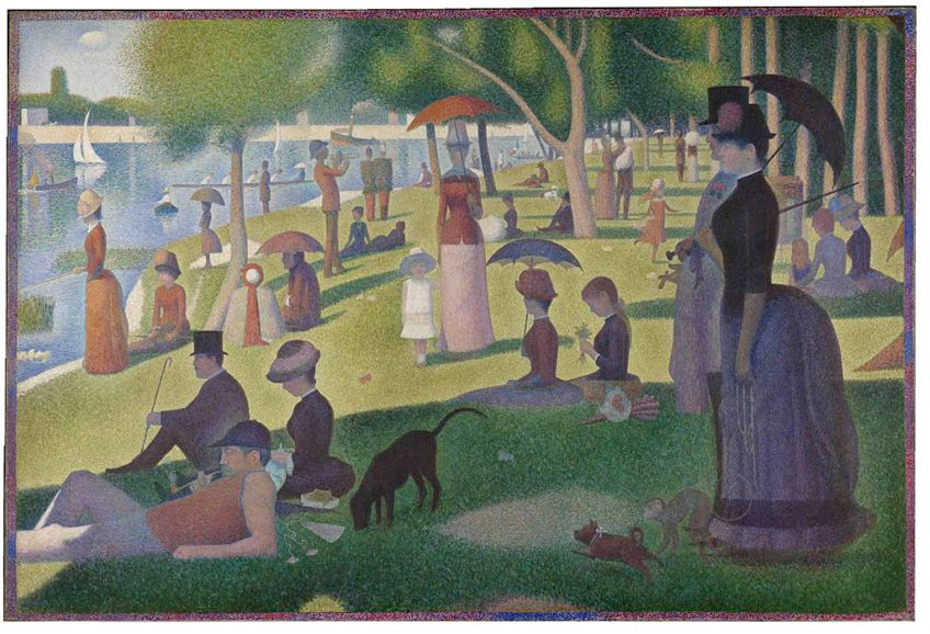 A Sunday Afternoon on the Island of La Grande Jatte (1886) by Georges Seurat; Georges Seurat, Public domain, via Wikimedia Commons
Famous traditional Indian painter Raja Ravi Varma has painted many beautiful and rich paintings. His painting Looking in the Mirror (n.d.) uses blush, pink, purple, and blue pastel hues to give the painting a soft, dreamy, and intimate atmosphere. His Serenity No. 1 and Her Serenity No.2 (2021) are a set of paintings by artist Elena Prenner that uses predominantly pastel colors to highlight the beauty of the human form. The artist uses earth tones and neutrals to add contrast and visual interest to the piece, which prevents it from feeling flat and grounds its otherwise airy feel.
Pastel colors have an enlightening effect, while their softness maintains a versatility other bright and saturated colors lack. Their versatility also extends to the varied meaning and effects different pastels invoke, and they can be a clever and welcome addition to any color palette. We hope this has proven insightful and inspired your own use of pastels in your projects!
Frequently Asked Questions
What Are Pastel Colors?
Pastel colors are tints of other colors and are made by adding white to a pure color. Pastels are light and bright in appearance, and are much softer and less saturated compared to the base color that was used to create them. Pastels of warm colors such as red have a cooler color temperature than the original hue, as adding white has a cooling effect. If gray or black is added to a pastel, it is no longer a pastel color and becomes a pale color instead.
What Are Popular Pastel Colors?
There are many pastel colors available and some of the most well-known colors include blush, baby pink and blue, mint green, pastel yellow, steel blue, millennial pink, peach, lilac, and lavender. Neon pastels are another range of pastel colors, which are tints of neon colors such as cyan. These have become very trendy in recent times and even sparked a resurgence of pastel color popularity on social media. Many of these colors have been used throughout history from famous artworks to fashion design, and even in advertising.
How to Use Pastel Colors in a Color Scheme?
Pastel colors work great in complementary color schemes, where a soothing lavender can be paired with a vibrant yellow to create lots of contrast. Pastel colors can also be used in monochromatic color schemes, where three or four different tones of color are used. Using deeper colors such as burgundy or midnight blue alongside pastels makes them feel more vibrant and avoids that sterile look. At the other end of the spectrum, pastel colors also work well with neon colors. Neon colors are extremely bright colors with high levels of luminosity. Pastel colors soften the harsh look of these fluorescent hues and provide some subtle contrast. When constructing your pastel color scheme, it is important to pick one or two central hues and use them in 60 percent of your art. Other colors can then be used as accent colors in 30 percent of the work, while the last 10 percent consist of a highlighting color.

Larissa Meyer is a 32-year-old mother from Michigan and creative spirit since childhood. Her passion for painting and drawing has led her to an education as an illustrator and a career as a freelance graphic designer. She has a Bachelor of Fine Arts in Illustration and a degree in Graphic Design. Larissa is a talented artist who is able to master a wide range of styles and techniques to bring her artistic vision to life. Her greatest passion is currently fluid painting and epoxy resin art. As a mom of two kids, Larissa also understands the importance of fostering creativity in early childhood. She uses her experience and knowledge to help other parents inspire their children and develop their artistic skills as well.
Learn all about Larissa Meyer and Fluid Painting.