Secondary Colors – A Guide to This Group of Colors
This post may contain affiliate links. We may earn a small commission from purchases made through them, at no additional cost to you.
Colors are not only important but rather interesting as well. We all see color in a different way, some prefer blue or purple, while others lean towards reds and yellows. In school, we were taught all about colors and learned what both primary and secondary colors are. Hopefully, most of us still remember what we learned, so we still have a basic understanding of the subject. When it comes to art, an artist will choose their colors based on which colors match the tone of their artwork. Color also has the ability to evoke emotions or responses from people, and this is why knowing what secondary colors are is so essential. Keep reading to learn all about this color group and how to use them.
Table of Contents
The Difference Between Primary and Secondary Colors
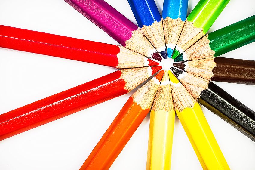
When designing or painting, we need to use primary, secondary, and even tertiary colors. Understanding what the difference between them is, is very important. A color wheel is especially helpful when learning about color groups. Read on to learn more about what secondary colors are, as well as how they differ from the other two groups.
What Are Primary Colors?
When you work with paint pigments, the primary colors are referred to as RYB and this stands for red, yellow, and blue. For those using their computers to design something, the primary colors fall within the light spectrum and are known as RGB which stands for red, green, and blue. All the secondary and tertiary colors are therefore made up by mixing and combining certain primary colors. Every color you can imagine is only in existence thanks to primary colors.
The reason an artist would use the RYB palette is that it makes for a far better association with real, physical colors.
 A designer used RGB colors on a computer because the eye’s photoreceptors pick these colors up on a screen. Both the artist and the designer are able to mix any shade or color they desire, simply by adding another primary color.
What Are Secondary Colors?
When we create art or design something, we need to understand how secondary colors are created. When painting, an artist will use pigments from the primary color group to then mix and make up their secondary colors. The additive color model is what is used when mixing up secondary color pigments on a computer – dark colors get darker when color is added, and light colors get lighter.
What Are Tertiary or Intermediate Colors?
Now that you understand both the primary and secondary colors definition, we can explain what intermediate or tertiary colors are. Tertiary colors are colors that are created by mixing and blending primary colors with secondary colors.
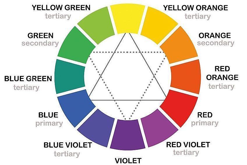
For example, some tertiary colors combinations include mixing green and yellow, blue with violet, green and blue as well as orange with red. When looking at the color wheel, you will see tertiary colors in between the primary and secondary colors.
Creating Secondary Colors
You cannot create primary colors as they are in fact, pure colors. However, you have to create secondary colors. But, how does one do this? If you are an artist using pigments, the secondary colors are orange, purple, and green. Should you be a designer working with the light spectrum, your secondary colors would be yellow, cyan, and magenta.
Every other color is therefore created and derived from these colors.
How to Create Secondary Colors Using Paint Pigments
To begin mixing up secondary colors, you will first need your three basic primary colors: red, yellow, and blue. Now, you can choose two of these primary colors, and once mixed, you will have created a secondary color.
Some color combinations include blue and yellow which will make green, red and blue which will result in purple, and red and yellow mixed together will create orange.
 When you mix your secondary colors, you need to use an equal amount of both primary colors chosen. This will then result in what we call a “pure hue”. You can alter this due by making it lighter or darker simply by adding white, black, or even gray.
Creating Secondary Colors From Light
As mentioned earlier, the primary colors differ and are known as RGB, which is red, green, and blue. Therefore, as you can see, it is quite easy to use pigments to create secondary colors. There is another way to create secondary colors using visible light.
If you do not know what visible light is, it is what you see when you look at your cell phone screen or the screen of your computer.
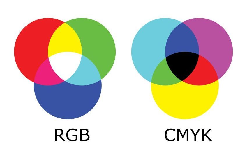 When you combine the light colors green with red, you will create yellow. You could also create magenta by mixing blue and red as well as green and blue to make cyan. These are all secondary colors created using visible light rather than paint pigment.
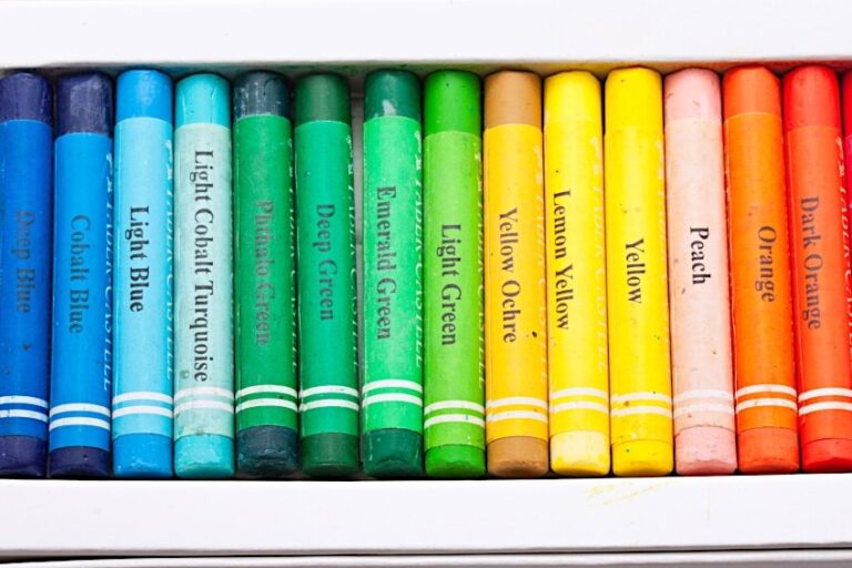
Secondary Colors Definitions and Names
As you now know, the secondary colors consist of three colors when using paint pigments, namely orange, green, and purple. By using and combining just these three colors, you will be able to make up hundreds of different shades and colors. An example of this is using the pure secondary color of green and then adding a little bit of white paint with it. This will then create a lighter green shade.
 Accordingly, mixing some black paint with your pure green would result in a darker green shade. Of course, you could do this with other colors too, giving you an endless list of potential colors to create. Keep reading to learn more about the various secondary colors and their hex codes, as well as information you may need if using them in design and print.
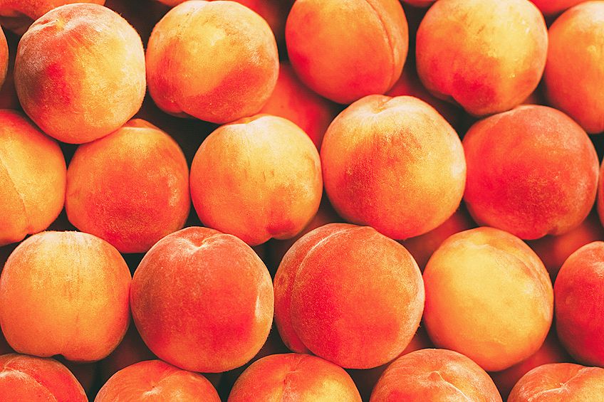
Peach
This is a fun color and quite unique. It is created by blending white, yellow, and orange. Of course, as the name suggests, it is the color of peach fruit. Using a warm orange color and bright yellow, it is then softened using a neutral white pigment.
Peach evokes feelings of joy and comfort. This soft color pairs well with blue, gold, and mint green. Should you wish to create a different hue, mixing in more yellow, orange or white will interact well.
| Shade | Hex Code | CMYK Color Code | RGB Color Code | Color |
| Peach | #ffe5b4 | 0, 10, 29, 0 | 255, 229, 180 |
Burnt Orange
Becoming an official name in 1915, burnt orange is a popular color. It has been viewed differently by various organizations throughout the years. An example of this is Auburn University, who added some blue to burnt orange. Texas University omits the blue entirely.
This shade of orange often reminds us of flames, thanks to its medium-dark color.
Burnt orange also evokes negative feelings and emotions such as selfishness, aggression, and pride. But it also evokes positive feelings of warmth and comfort, like the leaves on an Autumn tree. Gray and dark blue help bring burnt orange out even more, but it also looks good when paired with mint green or peach. Should you want to create a different hue, you can add red-orange or orange.
| Shade | Hex Code | CMYK Color Code | RGB Color Code | Color |
| Burnt Orange | #cc5500 | 0, 58, 100, 20 | 204, 85, 0 |
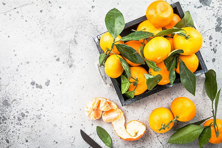
Tangerine
This is a saturated and orange hue that got its name from the tangerine fruit. Did you know that the iMac G3 Macintosh computers were named after fruits, and the tangerine was one of them! The Beatles also mention tangerine in one of their songs, “Lucy in the Sky With Diamonds”.
Just like all orange hues, this color evokes feelings of energy and youth as well as happiness.
It is often paired well with colors of sunset, such as yellow, blue, and purple. When paired with gray or cream, tangerine has a more sophisticated and elegant look. Should you wish to change the hue, you can add orange or red-orange to your tangerine color.
| Shade | Hex Code | CMYK Color Code | RGB Color Code | Color |
| Tangerine | #f28500 | 0, 45, 100, 5 | 242, 133, 0 |
Mauve
This is a pale purple, almost blueish. You can find mauve between violet and pink on the color wheel. Interestingly, the name comes from the French word Malva, and it represents the mallow flower. English chemist William Perkin discovered the color mauve in 1856 purely by mistake. Mauve then became the first mass-produced color of dye. It also revolutionized the runways and world of fashion, becoming more popular in the 1890s.
Mauve evokes feelings of romance as well as nostalgia. It goes fantastically well with the color purple as well as yellow. Should you wish to change the hue of mauve, you would use blue, violet, pink, or more purple.
| Shade | Hex Code | CMYK Color Code | RGB Color Code | Color |
| Mauve | #b784a7 | 0, 28, 9, 28 | 183, 132, 167 |
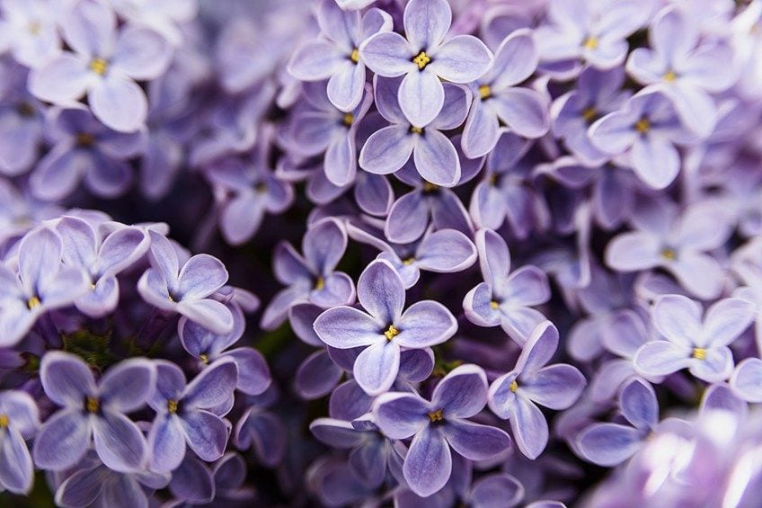
Lilac
Named back in 1775, this color was derived from the flower, which shares its name. The lilac is a flower associated with mourning. In the 1800s, British women were allowed to wear some of the color lilac towards the end of their mourning period.
Purple dyes were quite expensive before 1856, and this is why it is a color associated with royalty, wealth, and power.
Lilac is a softer purple shade created by combining blue and red. Should you want to create a pastel lilac hue, you could add some white pigment to your color. Lilac is not a cool color; it is considered to be a warm shade because it contains more red than blue. You will also find lilac on the warm end of the color wheel.
This color evokes a feeling of gracefulness and romance, while in its lighter hue it represents innocence, nostalgia, and youth. Lilac is thought to be a soothing color that pairs very nicely with gray, yellow, white, orange, olive green, and rose quartz. It mixes well with soft pinks and purples, too.
| Shade | Hex Code | CMYK Color Code | RGB Color Code | Color |
| Lilac | #b666d2 | 13, 51, 0, 18 | 182, 102, 210 |
Indigo
Situated between blue and violet on the color wheel, this color is also regarded as a spectral color, of which there are seven. Indigo is a naturally occurring color and its pigment is derived from plants. This color is also considered to be the color of higher knowledge, justice, and devotion, as well as wisdom. It is also a spiritual color.
Looking back at nature, where indigo is found, we should choose wisely when thinking of combining colors with it.
Usually, indigo goes together very nicely with yellow, red, or green. Thanks to its deep hue, yellow and orange look exceptionally good with indigo. Should you wish to alter the hue, you would use blue and violet.
| Shade | Hex Code | CMYK Color Code | RGB Color Code | Color |
| Indigo | #4b0082 | 42, 100, 0, 49 | 75, 0, 130 |
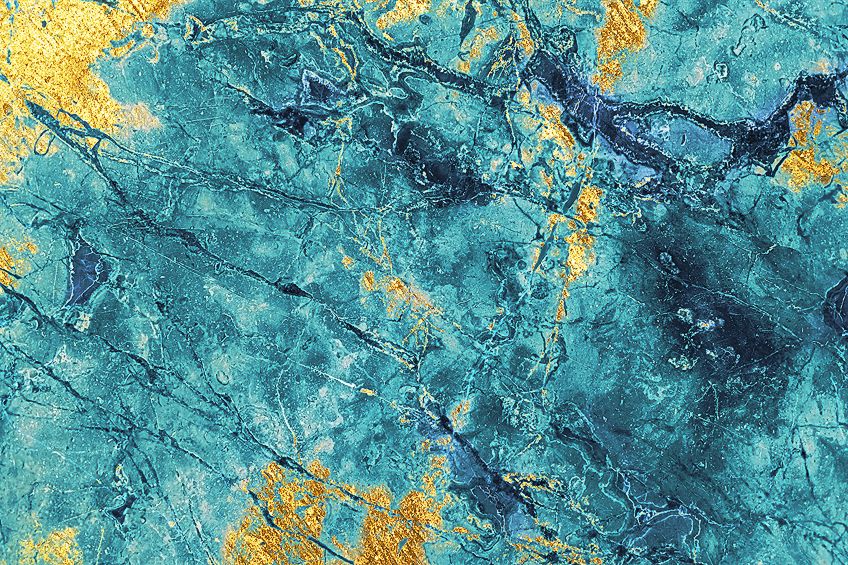
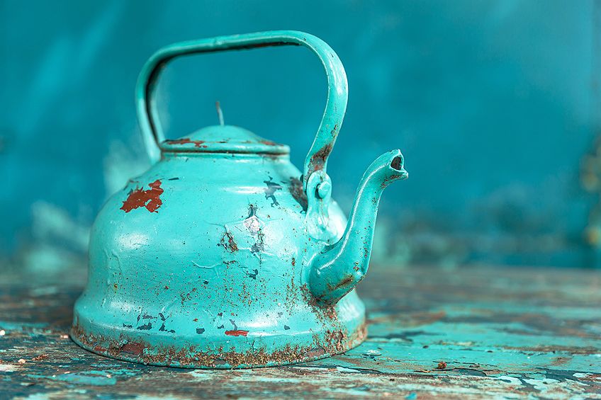
Teal
Adored by many, teal is a lovely deep blue-green color. The name comes from the color found around a birds-eye, the Teal birds. This color is revitalizing and often makes one feel like their clarity of thought is open. The monks of Tibet thought of teal as symbolic of the sky and sea, while the Egyptians saw it as a color of truth and faith.
Teal pairs beautifully with a bright white or coral pink, but it also looks lovely with other pinks, brown or navy as well as cream tones. Teal combined with metallics like silver or gold is an exceptional combination. For a change of hue, you would use blue-green, green, and blue.
| Shade | Hex Code | CMYK Color Code | RGB Color Code | Color |
| Teal | #008080 | 100, 0, 0, 50 | 0, 128, 128 |
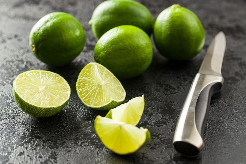
Lime Green
When looking at the color wheel, lime green is situated between yellow and yellow-green. The color lime green also works very nicely when paired with yellow or blue. Should you wish to alter the hue of lime green, you would use neon green, Kelly green, or seafoam green.
This fresh and funky color is named after the lime fruit, of course. It has a high association with nature and evokes feelings of confidence, freshness, creativity, liveliness, and high energy.
| Shade | Hex Code | CMYK Color Code | RGB Color Code | Color |
| Lime Green | #32cd32 | 76, 0, 76, 20 | 50, 205, 50 |
Turquoise
This color represents open communication and clear thought. Turquoise lends its color from the stone which naturally occurs in nature. It is a beautiful happy color bringing feelings of friendliness and stability as well as emotional balance. Turquoise is created from a light pale blue and green with a smidge of yellow and can be found between blue and green when looking at the color wheel.
Evoking feelings of tranquility and peace, turquoise is a color that pairs well with gray, deep orange, and yellow, as well as metallic silver.
You can combine turquoise with colors of a more natural hue, or with wood, since it is a color found in nature. Paired with tangerine or coral are also lovely ideas for any palette consisting of turquoise. You can change the hue of turquoise using green, blue, or yellow.
| Shade | Hex Code | CMYK Color Code | RGB Color Code | Color |
| Turquoise | #30d5c8 | 77, 0, 6, 16 | 48, 213, 200 |
Mixing Paint Using Secondary Colors
At this point, you should understand how to create secondary colors and how they are formed, which is by using equal parts of two primary colors. If you do not use equal parts of pigment you will end up creating a red-orange or a yellow-orange, for example.
You can then add more secondary colors to create a tertiary color. If you end up mixing all of your primary colors, you will end up mixing a brown shade.
One must fully understand how paint mixing works and how the paint pigments interact with one another before we can properly blend and create colors of our own. The primary colors, red, blue, and yellow each contain just one pigment as they are not yet mixed and cannot be created by combining other colors.
That said, there are many different reds, yellows, and blues in varying shades and hues which contain more than one pigment. This is because paints are created with organic pigments and chemicals. Artists often choose to blend and create colors themselves, using just primary colors to start with, rather than buying each and every color separately.
The Various Types of Secondary Color Paint
When choosing your primary colors you have many options, and these will of course cause an automatic effect to the hue of the secondary colors that you create. A purple that was created using cadmium red and cerulean blue, for example, will not be the same as a purple formed by mixing cadmium red with cobalt blue instead.
While you may often not be able to tell the subtle differences between some colors, it is still important to understand them and be aware of them. Remember that when you mix paints you should keep a record of how you obtained each color, this will be of massive assistance in the future, should you wish to reproduce that exact color again.
Warm and Cool Secondary Colors
Looking at the color wheel, you will see that warm colors appear on the left-hand side where red is, and the cool colors are on the right-hand side where blue can be found. There are however times where cool colors are actually considered to be warm colors, or cool colors are actually seen as warm. This is all dependent on how much of a certain color was used.
For example, a purple with more blue in it than red is a cool color, but a purple with more red mixed into it is warm. Make sure you understand what you are trying to achieve and remember that cool colors evoke feelings of calmness while warmer colors tend to have an energizing or happy effect.
When you are painting something, objects within your painting are painted with warm colors if they appear closer to you, while objects that are further away are painted with cool colors.
Mountains are a good example of objects that are painted with cool colors due to their distance. As mentioned above, red can be altered and changed into a cool color or the hue can be altered making it even warmer.
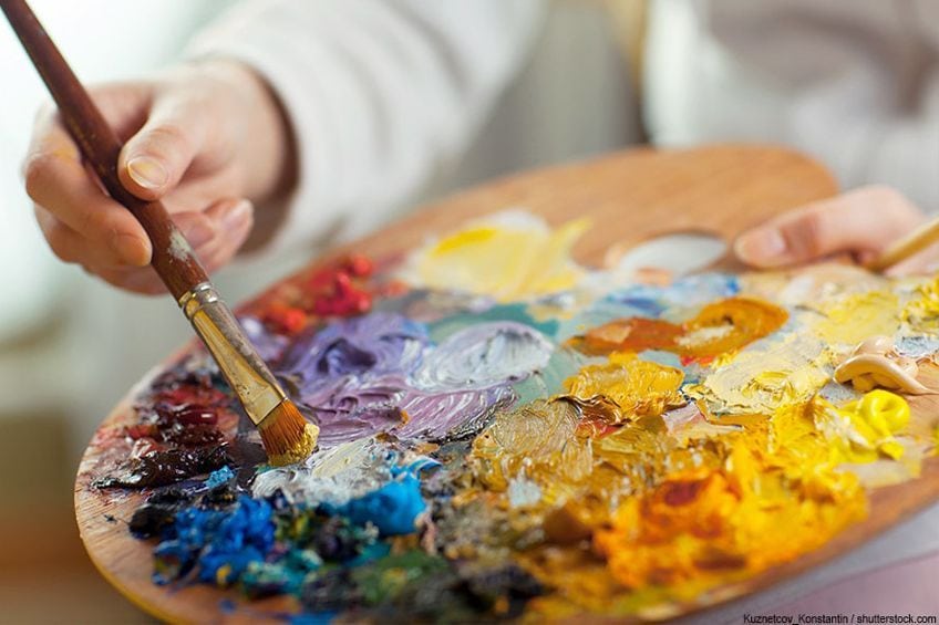
Tips for Painting With Secondary Colors
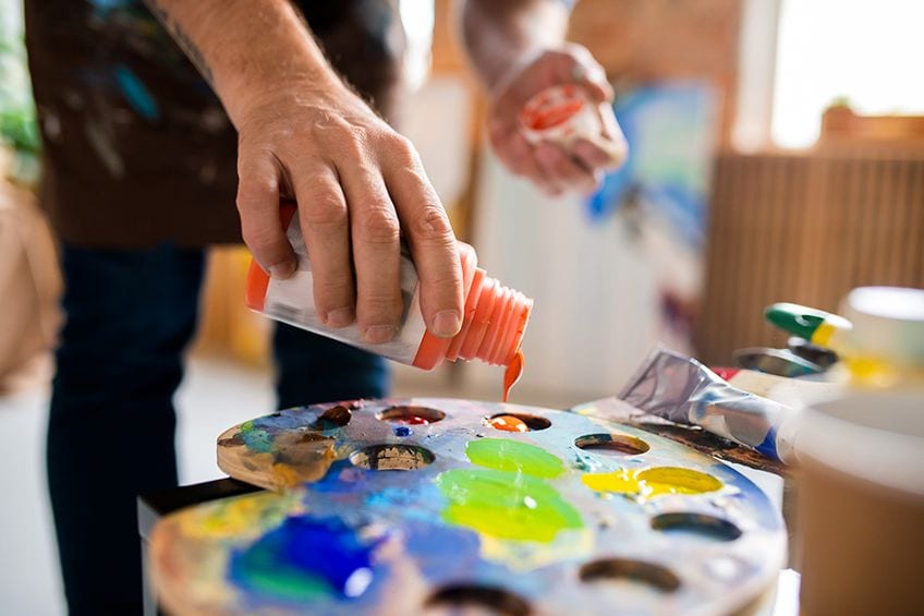
When you use secondary colors to paint with, you do not need to rush off to purchase paints in all the shades and tones you need. Secondary colors can be created simply by mixing your own using your primary colors.
You may feel that it is easier to just purchase all the secondary and tertiary colors you need rather than mixing them yourself. Whichever you prefer is absolutely fine, but it is still useful to understand how these colors were created.
You should also use at least one pure orange, one pure purple, and one pure green on your palette when mixing up your secondary colors. It is also recommended to have three cooler versions of these as well as three leaning towards warm. Another thing to remember is to use pure pigment colors as you do not want to end up with unexpected and unusable mixes.
The world of secondary colors is vast and fun, and so is mixing your own paints. So, next time you are tackling a DIY project that involves painting a wall, or when you decide what next to paint on canvas, try to allow your imagination to run wild, allowing yourself to play around with and use more color combinations as well as the perfect color scheme. When you use secondary colors, you open a door to a whole new world! Happy painting and creating!
Frequently Asked Questions
What Are Secondary Colors?
When you combine equal amounts of two primary colors, you will create a secondary color. Secondary colors include green, orange, and purple. If you look at the color wheel you will see secondary colors between the primary colors. The primary colors are red, blue, and yellow. The color wheel you should notice that if you combine blue and red you will result in purple, yellow and red will result in orange, and blue with yellow makes green. For the light colors that are visible, such as yellow, cyan, and magenta. These are called secondary colors.
Is Green a Warm or Cool Color?
The color green, like purple and blue, is considered to be a cool color. It is also a secondary color and can be found on the color wheel along with the aforementioned colors.
What Are Warm Colors?
When you think of warmth, your thoughts will naturally gravitate towards the sun, fire, and warmth. They are easily recognizable thanks to their bright and lively colors. Naturally, warm colors would be your reds, oranges, and yellows. You can create the perception of largeness within a painting by using warm colors and tones.
What Are Cool Colors?
When you think of coolness, your mind goes to colors such as blue, green, and purple. These colors are all associated with calmness, indifference, and even sadness. They remind us of winter or spring leaves and green grass. If you want to create more depth in your painting, such as with a mountain in the distance, purple, blue, and green can be used. These colors also give the perception of smallness.

Larissa Meyer is a 32-year-old mother from Michigan and creative spirit since childhood. Her passion for painting and drawing has led her to an education as an illustrator and a career as a freelance graphic designer. She has a Bachelor of Fine Arts in Illustration and a degree in Graphic Design. Larissa is a talented artist who is able to master a wide range of styles and techniques to bring her artistic vision to life. Her greatest passion is currently fluid painting and epoxy resin art. Larissa’s love for art and her knowledge and experience in illustration make her the perfect Creative Director for our fluid-painting.com team. She is the creative head of our team and shares her passion and knowledge with our community through articles and tutorials.
As a mother of a 2-year-old daughter, Larissa also understands the importance of fostering creativity in early childhood. She uses her experience and knowledge to help other parents inspire their children and develop their artistic skills as well.
Learn more about Larissa Meyer and about us.