Shades of Orange – How to Use Orange Colors
This post may contain affiliate links. We may earn a commission from purchases made through them, at no additional cost to you.
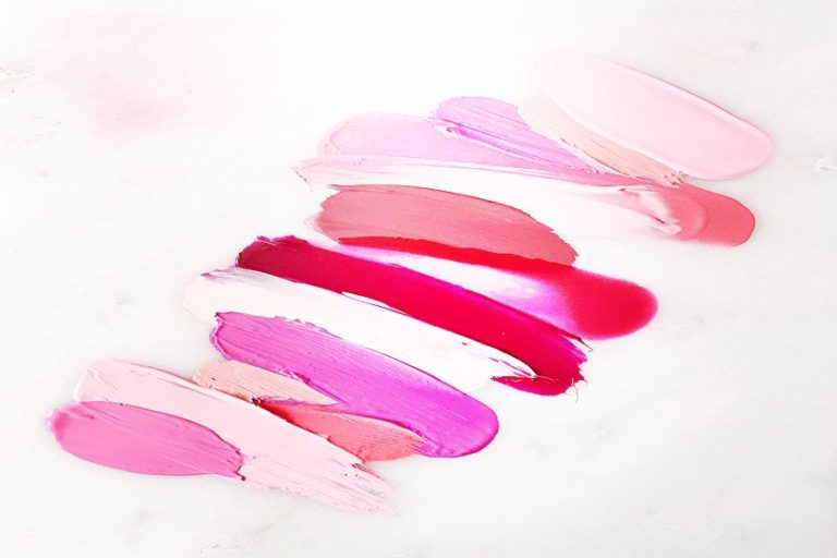
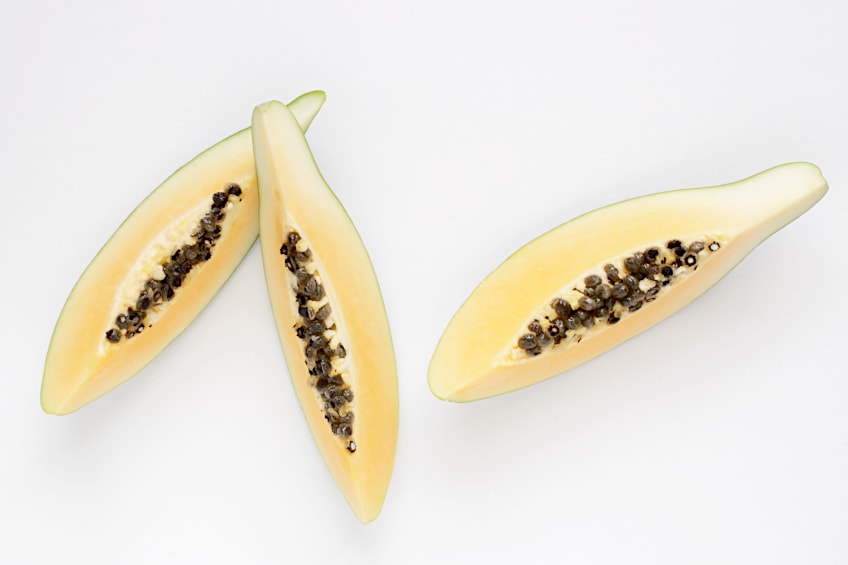
To understand the shades of orange one must think of all the orange objects in this world. From orange-yellow sunflowers, deep sunsets that embed themselves into your mind forever, orange-flavored popsicles that will quench any thirst on a hot summer’s day, and of course, amongst many more types of orange colored objects, there is the actual fruit, the orange, that the name of the color is called after. Today we will be discussing the different shades of orange you will find in the orange color palette. From bright orange colors to dull ones, we will include the complementary colors of the orange hues, and how to mix your shades for a more personalized orange palette to work with.
A Short History of the Color Orange
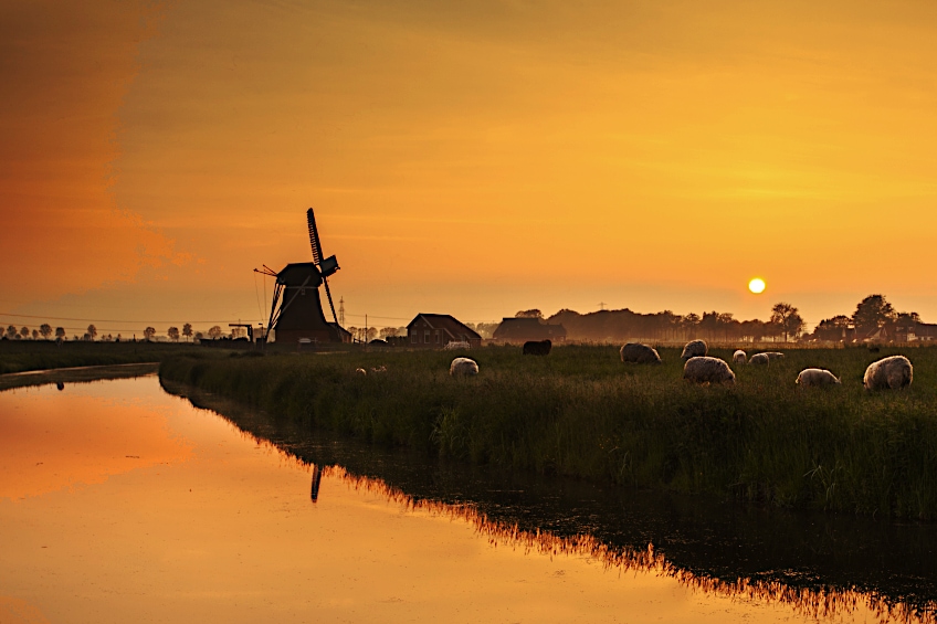
Daily, we are exposed to the color range from fruits and vegetables to certain tools that we use, to the flowers in our gardens. Even the sun is orange, so our perception of this color is incredibly significant. Likewise, we humans have relied on this color because the art world would not be the same without it. The bright orange colors are responsible for representing all that the light touches. This includes the brightness of the sun to the tiny flecks of highlights on just about any warm color object.
Ancient Romans made their orange hues from a mineral called orpiment. This was not exactly healthy because of the toxic arsenic that was found in the substance. But, what is interesting, is that it was still used medicinally by the Chinese people, so alchemists all around the world started experimenting with it in this way.
In 1502, Margaret Tudor, who was the Queen consort of Scotland at the time, was the first person to write the name of the color orange, according to historians. As the color orange is made up of two primary colors, the color was called red-yellow. This obviously would not go accepted for too long because people like to make things more convenient, thus, the name orange was born.
During the 1500s and the 1600s, the Netherlands added the color orange to their country’s flag. It then became a national color, just like how America’s national colors are red, white, and blue. The orange color then grew ever more popular, and as a result, the houses within the Netherlands were painted orange as a sign of a certain ranking in society. The Orange-Nassau family from whom the current royal family is descended, has become one of the most iconic aspects of the Netherlands’ history.
In the 1700s, a French scientist named Louis Vanquelin discovered a new mineral to produce the color orange. This mineral was way less harmful and was called crocoite. After this was discovered, synthetic orange colors came into production, and a whole variety of new shades were created.
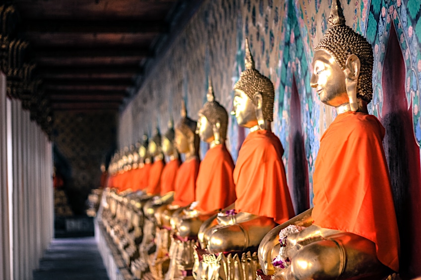
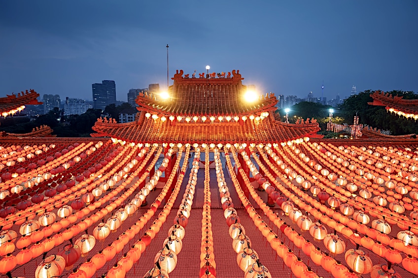
Spiritually, Buddhists used the color orange to dye their robes, and this was to represent their thirst for knowledge and the perfection they strived to be. Even the Hindu Krishna was often painted adorned in orange robes as well. Claude Monet created one of the most famous Impressionist paintings in 1872, called Impression, Sunrise. Vincent Van Gogh was a lover of the different shades of orange, and he often created his unique orange color palette by mixing his shades of orange. One of his most famous paintings was known as Still Life with Basket and Six Oranges, painted in 1888. Both of these paintings favored the many different types of orange colors.
More recently, where digital art has become ever so popular, the color orange has grown even more popular. The synthetic orange invention allowed for very bright orange colors to be created. They have become UV or neon colors that are brilliantly eye-catching. Marketing takes advantage of the brightness of this color by using it a lot within the advertisements they create.
Meaning Behind the Orange Color
There is a truly fascinating phenomenon called the psychology of colors. This is about the feeling that the color creates or the bodily influence it gives off. Here are some of the general emotions that you can experience when observing the color orange.
- Happiness or joy
- Creative thoughts and expressions
- Health for mind and body
- Fun
- Sense of freedom
- Successfulness
- Excitement and enthusiasm
- Care and compassion
- Hunger stimulant
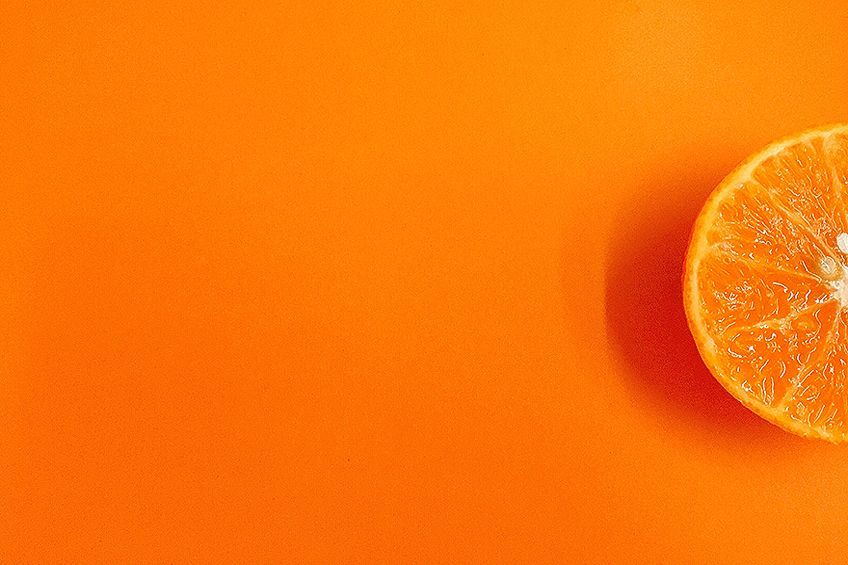
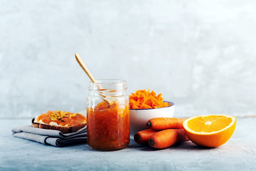
Orange is seen in the food we eat, from the actual fruit that the color was named after to root vegetables like carrots and sweet potatoes. This is not where the orange food color ends, as we also have butternut and pumpkin included in the basket. These plant-based foods obtain their color by absorbing the pigment through photosynthesis, and they become the color orange. Cheddar and gouda cheese have also been dyed to be orange, but this is more synthetic. Trees also use the same photosynthesis process when the season changes and the leaves go from green to orange.
There are even names that mean orange – so this color seems to be everywhere!
Red and yellow are the two primary colors that you mix to create the color orange. The intensity of the red is lightened by the color yellow, and this helps to turn the energy the color brings from slightly aggressive red to a more happy and excited orange energy. Bright orange colors can represent the passionate side of life. It imbues action, or making effort with something you are excited about – or not.
Orange is often used as means of warning because it is so bright and eye-catching. This makes it a great candidate for road signs because it is bright enough to allow you to see it even at night without any street lights. Even nature will utilize orange as a warning, embellishing the most poisonous of insects and amphibians with the brightest shade of orange.

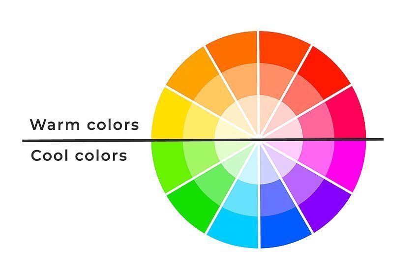
Various Shades of Orange
As with every color on the color wheel, there are many different shades of orange that will create the orange palette that you work with. In terms of the visible spectrum, the color orange is seen at 585 and 620 wavelength readings. It is known as a secondary color in the color wheel because it is created by mixing red and yellow, the two of the three primary colors. Eight different shades can also have different temperature biases, from warm and cool. These can vary in tone and the value of the color can also change.
Types of Orange Color
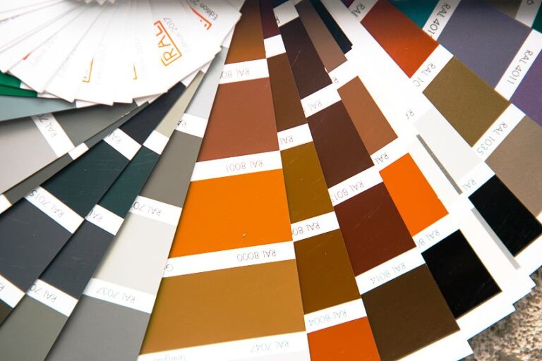
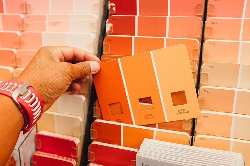
It can be quite tricky to know exactly what color you are referencing, or what your boss in your marketing firm is asking you to use. Many of us have our perceptions of what the colors look like and what they are called. One person might see one shade of orange and call it a certain name, and another person might think that the orange color name was for a completely different shade. To avoid a lot of frustration, and to get into the good books with your boss, you might want to start using the HEX codes, or the CMYK or RGB codes to reference the exact color you need to use. This way there will be far less confusion.
Some shades of orange have even been officially given the same name as the item they are most used for. Of course, this can make it even more difficult for you to know which shade it actually is! The table that follows will show you what we mean, take for example “safety orange” and “aerospace orange”.
| Orange Shade | Orange Hex Code | CMYK Orange Color Code | RGB Orange Color Code | Orange Color |
| Orange: Color Wheel | #ff8000 | 0, 50, 100, 0 | 255, 128, 0 | |
| Web Color Orange | #ffa500 | 0, 35, 100, 0 | 255, 165, 0 | |
| Safety Orange | #ff7900 | 0, 53, 100, 0 | 255, 121, 0 | |
| International Orange: Aerospace | #ff4f00 | 0, 69, 100, 0 | 255, 79, 0 | |
| International Orange: Golden Gate Bridge | #f04a00 | 0, 69, 100, 6 | 240, 74, 0 | |
| Pantone Orange | #ff5800 | 0, 65, 100, 0 | 255, 88, 0 | |
| Crayola Orange | #ff7538 | 0, 54, 78, 0 | 255, 117, 56 |
Tangerine
Just like the color orange is named accordingly with the fruit in mind, the color tangerine is also named after the fruit, tangerine. Both of these fruits are a part of the citrus family, and they are both bright shades of orange. This color is used to represent youthful attitudes and energetic behaviors. You can use this color to add some vibrant texture and accents to bring out the painting or the advert you are creating.
| Orange Shade | Orange Hex Code | CMYK Orange Color Code | RGB Orange Color Code | Orange Color |
| Tangerine | #f78702 | 0, 45, 99, 3 | 247, 135, 2 |
Papaya Whip
When you think of papaya fruit, do you feel all tropical on the inside? We do! This color is the true resemblance to the flesh of papaya. You can create this color by mixing a little brown color into your orange, and the depth of the papaya color will depend on the amount of brown you add in. Marketers use this color to bring out homey feelings, but also a craving for travel. Paction blue, with a HEX code of #351e6, is the perfect complementary color for the papaya color.
| Orange Shade | Orange Hex Code | CMYK Orange Color Code | RGB Orange Color Code | Orange Color |
| Papaya Whip | #ffefd5 | 0, 6, 16, 0 | 255, 239, 213 | |
| Paction Blue | #35b1e6 | 77, 23, 0, 10 | 53, 177, 230 |
Carrot Orange and Pumpkin Orange
If you are looking for a color that imbues warmth with a homey essence, these shades are likely perfect for what you are looking for. So many colors are named after fruits and vegetables, and so are these two! Carrot orange is more yellow than pumpkin orange, but both are used very often in marketing for high expression points. Halloween is often characterized by pumpkin and even carrot orange.
| Orange Shade | Orange Hex Code | CMYK Orange Color Code | RGB Orange Color Code | Orange Color |
| Carrot Orange | #ed9121 | 0, 39, 86, 7 | 237, 145, 33 | |
| Pumpkin Orange | #f5761a | 0, 52, 89, 4 | 245, 118, 26 |
Dark Orange
The name of this color is pretty blunt, but it is also very accurate. It is a typical orange color, but a bit darker than the standard orange you might find in your crayon box. The base tone of this color is magenta, and it has some cyan, yellow and black.
| Orange Shade | Orange Hex Code | CMYK Orange Color Code | RGB Orange Color Code | Orange Color |
| Dark Orange | #ff8c00 | 0, 45, 100, 0 | 255, 140, 0 |
Burnt Orange
The name of this color was first found in 1915, and it is often used in paintings of autumn scenes and firepits with a lot of warmth. There is a negative and a positive feeling felt from this color. The positive is warmth and community, and the negative is being arrogant or stubborn.
| Orange Shade | Orange Hex Code | CMYK Orange Color Code | RGB Orange Color Code | Orange Color |
| Burnt Orange | #cc5500 | 0, 58, 100, 20 | 204, 85, 0 |
Vermilion
In the early days, vermilion was made by mixing mercury sulfide, in powder form, which is otherwise referred to as cinnabar, with oil. It is believed that the deep red-orange pigment contained mercury, a poisonous metal, and that it is toxic and that many miners lost their lives when they mined this mineral. There is some good news, though, as the toxic pigment was eventually replaced by synthetic pigments such as cadmium red, which, although darker, has a similar hue. In Chinese culture, vermilion also has a large role. A shade of vermilion that was often used on Chinese lacquerware was soon known as “Chinese red”.
| Orange Shade | Orange Hex Code | CMYK Orange Color Code | RGB Orange Color Code | Orange Color |
| Vermilion | #e34234 | 0, 71, 77, 11 | 227, 66, 52 | |
| Chinese Red | #aa381e | 0, 67, 82, 33 | 170, 56, 30 |
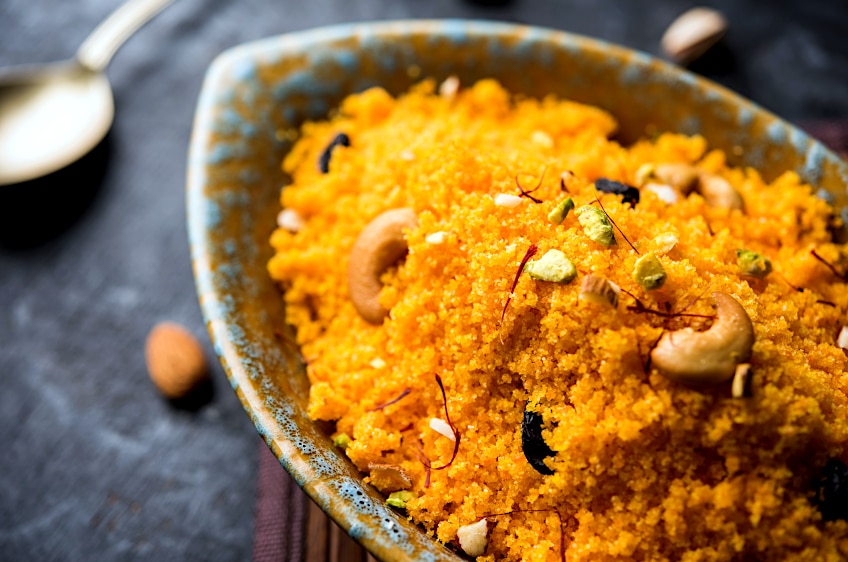
Indian Saffron
If you love cooking, you will love saffron, although your budget might not. This color is a perfect likeness of the spice, and the symbol for it is strength and bravery. It can be seen on the Indian country flag, which is fitting because the spice this color is named after, that comes from their country, has become a symbol for them as well.
| Orange Shade | Orange Hex Code | CMYK Orange Color Code | RGB Orange Color Code | Orange Color |
| Indian Saffron | #ff9933 | 0, 40, 80, 0 | 255, 153, 51 |
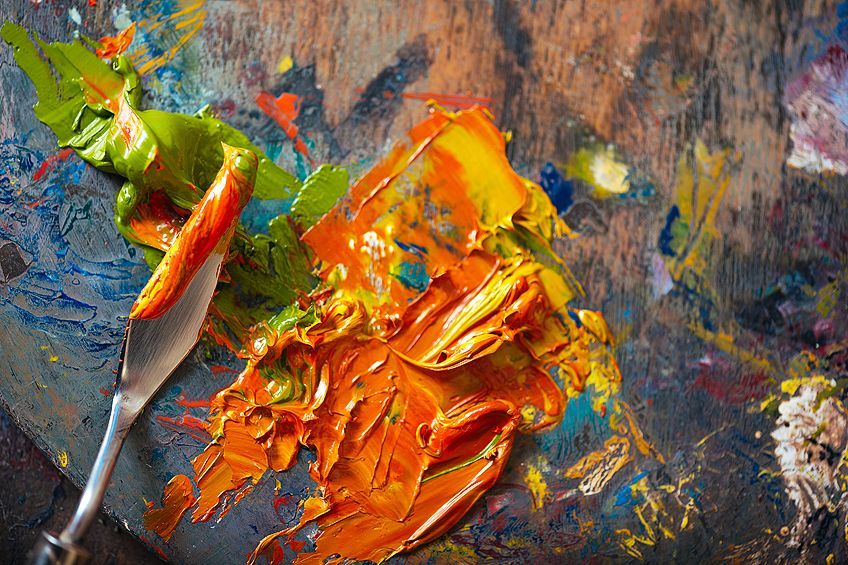
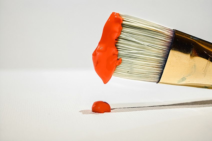
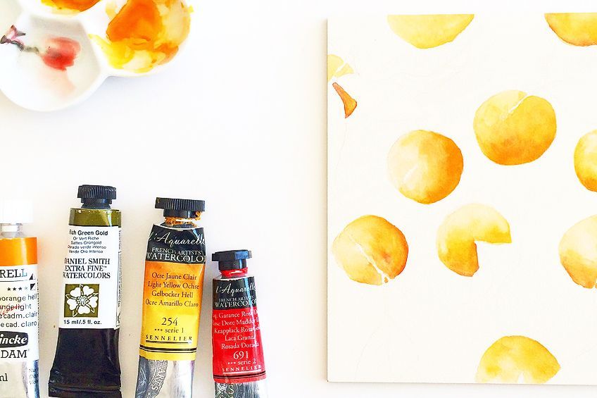
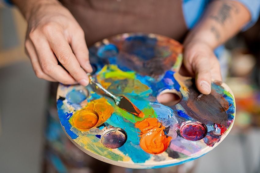
Make Your Own Orange Colors in Acrylic Paints
Finding colors online is not the hardest task in the world, and along with the information that should be available for all to see, you can recreate it for any design, whether for a website, a business card, or an infographic. Acrylic paints are fairly simple to mix, so long as you understand the different temperature biases and complimentary colors. If you know a few things about color theory, it will make mixing paint colors a lot simpler. It will help to understand even just on a basic level, the three primary colors, and the secondary colors that follow.
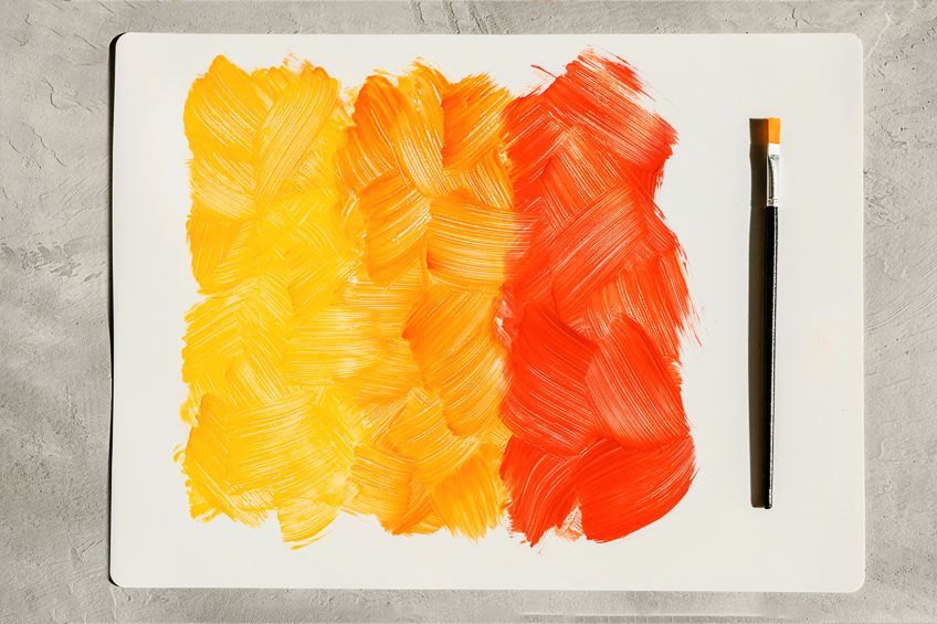
With acrylic paint, the most suitable red to use for mixing a standard orange would be a cadmium yellow, with a cadmium red. The two are of the same color family, cadmium, and you can manipulate the color bias by adding in other shades of red and yellow, or even brown.
If you have bought a palette set with all the colors, you will also find a Cadmium orange. The orange color is already there, and why would you need to create another one? This isn’t for you to be lazy. It is there to help deepen or enhance your orange palette by mixing your own unique, or specialized colors. It is a smart idea to start with understanding what pigments were used to create the other colors you wish to mix with your orange. This will make a lot of sense to you when your orange turns to a more muddy color, and you read the label of the green paint you added.
How to Create Warm and Cool Orange Colors
Various types of orange colors have either a warm color bias or a cool color bias. You can change your warm orange into a cooler orange, you can use a lemon-yellow color. This is because this shade of yellow has some green in the mix, and the green will tone the warmth of the orange into a cooler and more dull orange. If you want a warm orange color without any hints or cool, then the previously mentioned cadmium yellow and cadmium red is the best option for mixing.
Making Orange Lighter or Darker
Most colors are made darker quite easily by simply adding in a little black. Make sure the back is pure black, without any white to make it a slate gray that appears black. This will make your orange a muted orange that is not exactly appealing unless used in the background to blur the shoes in for depth. You could also darken the color by adding some of the complementary colors, and in the case of the color orange, this would be blue.
There are different shades of orange, meaning different colors will be used to darken them. If you have an orange that has some yellow in it, then a blue-violet color will work perfectly to darken it, or a blue-green can help to darken an orange that has more red. If you are working with an orange color that seems burnt, there are a series of different shades of brown that can be used to darken them. Here are a few examples of the browns to use for burnt orange.
| Orange Shade | Orange Hex Code | CMYK Orange Color Code | RGB Orange Color Code | Orange Color |
| Burnt Umber | #6e260e | 0, 65, 87, 57 | 110, 38, 14 | |
| Burnt Sienna | #e97451 | 0, 50, 65, 9 | 233, 116, 81 | |
| Dark brown | #5c4033 | 0, 30, 45, 64 | 92, 64, 51 | |
| Blue | #0000ff | 100, 100, 0, 0 | 0, 0, 255 |
The next trick is making the darker orange a lighter shade. This ability can expand your orange palette by any means. The simple method of lighting any color would be to add some white to the hue. Naturally, the shade becomes very light, or faint. But, if you want to keep some vibrancy in the color, like orange, you can add some bright yellow to lighten the color. Using a lemon yellow will brighten the color in a cooler color bias, which can be helpful for those autumn day paintings. But, if you are lightening a warmer orange, then add in more of the cadmium yellow that you originally mixed in to create the orange. This will keep the darker orange hue much lighter than if you kept the same ratio of red to yellow.
Orange Used in Design
Orange is of course a popular color for use within design, be it fashion, home decor, websites, or on flyers. Two of the more popular uses for the color are listed below.
Orange in Web Design
In terms of design, orange can be an effective color that helps to evoke certain feelings. The color orange has a wide range of associations. Therefore, you can use them to bring out feelings of autumn, summer, and tropical fruits, depending on how you arrange them. Using colors in such a way will depend entirely on what you are trying to accomplish with your artwork or marketing advert. Orange is a color that gives your design vibrancy and adds an element of fun to your design if you know how to use it accordingly, including the perfect combinations to paint the color with.

A Little Goes a Long Way
In graphic design for advertising campaigns, orange can be used as a lure for the viewer’s eyes. It can lead the eyes to when they need to look, and read, but only a small amount is necessary. If you are using too much of the orange color, no matter what type of shade, it might make the viewer feel dizzy, or overwhelmed. Most colors need contrast in order to break it up. This makes it easier on the eye and allows the intended color that needs to be seen to stand out.

If you are trying to get a message across that is important for your campaign, orange is the perfect option to use. It may not be the best color to use for the font or the text of your campaign, but it can be used as the background for the text block, or even the outline to make it bold and stand out more.
Pairing Cool Colors With Orange
When pairing orange with cool colors a little informed logic might be needed. Orange is often used as the part that creates highlights and shows where the light is touching objects. But when you pair a predominantly orange painting with a little bit of blue or green, the green becomes the highlighting point to look at.
Blue is the complementary color for the color orange, and you can use it to tone down the brightness of the orange if the right tone is used. The same could be said for the blues and greens and then adding some orange into the mix, you can bring warmth into the cool painting.
Pairing Warm Colors With Orange
Orange is already such a vibrant and warm color, that pairing it with other warm colors is not the easiest thing in the color wheel. To make this work without you feeling like you need sunglasses to look at the artwork, you will need to break the warmth up with a bit of cool, regardless of anything.
Effects With Orange
As we have mentioned, the color orange can be used to show where the highlights are on the objects you are painting, but you could also use the darker colors to represent the fire embers. In marketing, orange is often used to add warm feelings of fun and action to the designs. If you are running a food campaign, you might want to include orange in your advertisement because it has been said that the color orange can spike your hunger.
Orange Text
The funny thing about the orange color is that the color is so bright, vibrant, and extremely eye-catching, but as soon as you use it to write out some words, it is not readable. The only way for this to work is if the background of the text is much darker than the actual orange color used for the text.

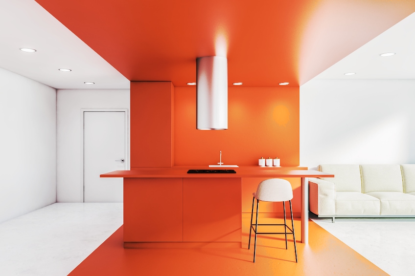
Using Orange for Home Interior Design
Any room can be energized and made to feel more comfortable and welcoming when the color palette of orange is used. The color orange is a helpful color to use in a classroom. This is because it draws creativity from the students and the teacher, and may assist in increasing the level of oxygen in your brain. To create a strong contrast when working with the orange palette, we recommended that the different shades of blue be used in combination with the color orange. As you can see, both warm and refreshing colors are used to create Summery excited and fun-filled emotions. In addition, orange and green can also be combined to create tropical landscapes and thoughts.
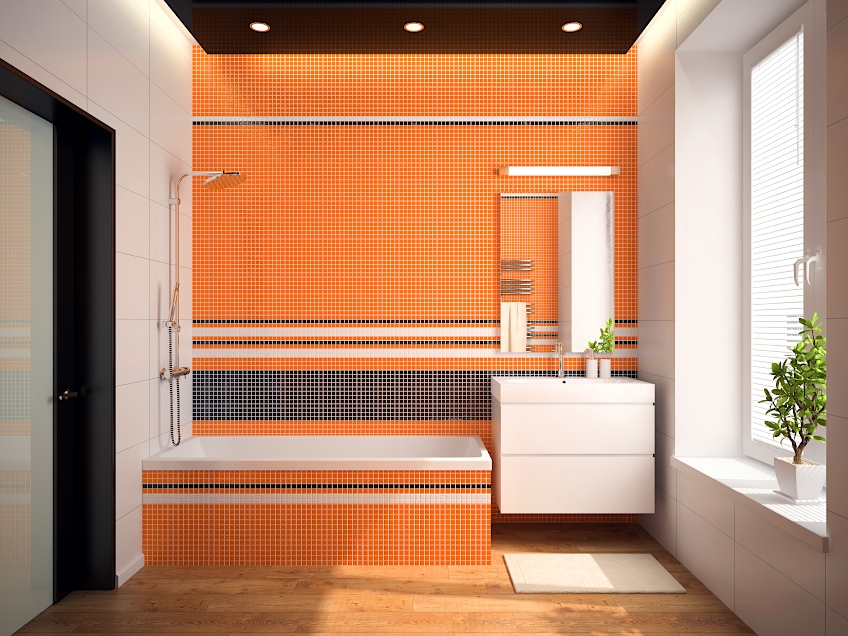
Orange Accent Walls
We have yet to meet someone who does not like an accent wall, at least somewhere in their house. These walls add some texture to the color scheme of the room you are in. Some accent walls have wallpaper patterns and some simple block color that contrasts beautifully with the predominant color in the room. A good place to add the accent wall would be the wall where your fireplace is, to highlight the focal point of the room.
Using the Warmer Shades
We are not only referring to block cod paint, many different wallpaper designs have the most interesting and mesmerizing patterns. These wallpapers could be predominantly warm orange, like a pumpkin orange with yellow-geometric patterns. This could go beautifully in your living room for an accent wall. Or the wallpaper could have a tropical flower on it, where the petals are bright orange.
Pairing Orange With Black
This color combination has been claimed by one of the biggest American holidays, Halloween! When you think of this auspicious ™ of the year, the color orange, or pumpkin orange to be specific, and black start coming out in all variations. People’s imaginations can run wild with this, but essentially the orange color is inspired by the pumpkin carvings the block is inspired by witches in black robes, at least for some of us.
Pairing Orange With a Neutral Color or White
If you do not have time to think of an amazing color combination, or if there are not enough colors to choose from, a neutral color is a good option. Of course, the latter would not be an issue for the graphic designer who designs online and can search for just about any color they wish to work with. When working with a bold orange, or a bright orange, the color taupe will be a suitable neutral combination. Taupe is brownish-gray, and you could place this combination in your kitchen or your living room.
There are different shades of orange that are quite versatile for use in web design and home décor so they can be used for pretty much anything you wish in art and design. Using orange shades effectively comes down to individual discretion, given how people can experience and perceive colors differently. However, despite personal preferences, this color is overwhelmingly warming and inviting, and can spruce up the room and energy of any room, allowing the person’s mood to be elevated.
Frequently Asked Questions
How Do I Make My Own Orange?
Cadmium orange and cadmium yellow are the two colors that are needed to make the perfect and most typical orange. The more yellow you add, the brighter your orange will appear, and the redder you add, you will end up with a much darker and deeper shade of orange.
What Is the Meaning of the Color Orange?
This color can physiologically affect you by activating hunger or encouraging the flow of oxygen into your brain. Spiritually, the color is thought to inspire pure joy and unending happiness. You will feel exhilarated and excited about life when exposed to the color orange.
What Is the Best Color to Pair with Orange?
Pairing a warm orange with another warm color should be relatively easy as orange pairs well with a variety of other colors. Neutral colors make excellent companion colors for orange. Some shades of green are also suitable matches for some orange shades. The complementary color for orange is blue, making these a great pairing.
Will Blue Suit Orange?
As blue is the complementary color for orange, it is a suitable combination to use provided that you stick to matching the color bias as well. It can be quite tricky to get the right combination for pairing a cool color with warm orange, and you might find they clash more than the match.

Larissa Meyer is a 32-year-old mother from Michigan and creative spirit since childhood. Her passion for painting and drawing has led her to an education as an illustrator and a career as a freelance graphic designer. She has a Bachelor of Fine Arts in Illustration and a degree in Graphic Design. Larissa is a talented artist who is able to master a wide range of styles and techniques to bring her artistic vision to life. Her greatest passion is currently fluid painting and epoxy resin art. As a mom of two kids, Larissa also understands the importance of fostering creativity in early childhood. She uses her experience and knowledge to help other parents inspire their children and develop their artistic skills as well.
Learn all about Larissa Meyer and Fluid Painting.