Shades of Red – Understanding the Meaning of the Color Red
This post may contain affiliate links. We may earn a commission from purchases made through them, at no additional cost to you.
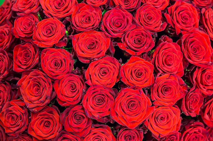
Red is one of the most prominent colors on the color wheel. Its bold energy is a directive for the eye on many artworks, whether it be an impressionist or realism masterpiece. Even graphic designers in the world of marketing are huge fans of all the shades of red because it strikes certain emotions that carry important messages to all who view them, making it a very persuasive color. Today’s tutorial is all about the different shades of red color. We will discuss in detail the various associations and symbolism of each of the red shades, so you will have a good understanding of each different type of red, from a bright red color to a dark red color. Understanding the hues of red and their meanings is not where we end the lesson, we will even include the shades of red names and their hex codes so that you will know which red color is being referenced.
The History of the Color Red
Red, being one of the primary colors, has been around since the days of our ancient ancestry. Prehistoric art like the rock paintings of cavemen all around the world was typically a red shade that had hints of brown when it dried and was preserved on the inside of caves.
This red color was created when they discovered ochre.
This is a pigment derived naturally from clay. Another red pigment they used was also naturally obtained through a mineral that we call hematite. This was often used in ceremonies where people would paint their bodies in preparation for war, or summoning fertility.
When cavemen progressed through to civilizations like the ancient Egyptians, or the Mayans, they continued to use shades of red during their ceremonies. It was used to represent a celebratory time or event because, for them, it represented good health, as well as victory in battle.
Men would paint their bodies, and the women would use the hues of red to tint their cheeks for a deeper blush or deepen the red of their lips. The Roman Empire, which was around the same time, used red to signify their success in battle, so they made their uniforms a red color.
As time progressed, so did humanity. The color red became more of a symbol for sacrificing what is important for the betterment of yourself and our communities, as well as having the courage to accomplish all that is needed.
Because of this, it is a color that can symbolize the martyrs of the human race that have dedicated and sacrificed their lives for their beliefs. Red has also been used for the robes of the Catholic Church Cardinals; for them, it represented the blood of Christ. The pigment for their robes was derived from the insect called Kermes Vermilion. These insects were replaced later on by other insects like the Mexican Cochineal insect that created the red color.
Using insects to create the red color, and other colors for that matter, became a lucrative career for many people during the 16th and 19th centuries. It was shipped from Mexico from all around the world to be used for fabrics, paints for artists, and much more.
Color is extremely important to us human beings, and the pigment for red was nearly as valuable as gold or silver was to merchants.
The price for the red pigment was particularly high. Maybe because of the high demand, maybe because it was expensive to import, but either way, it was worn typically by aristocrats, because the clothes dyed red became just as costly as the pigment.
When the Han Dynasty was running in full force, the Chinese people discovered and created a red pigment which was called “red lead”, otherwise known as “minimum”. Lead is famously known for being highly toxic, and this pigment was no different. Regardless, this was one of the first-ever synthetic pigment discoveries in the history of colors.
Because it was synthetically made, the color pigment was much more affordable, so more and more people were able to buy the fabrics dyed with it. During Medieval times, the manuscripts that were printed were often dyed with this synthetic variation of red pigment.
During the Renaissance period, the color red became something that signified your stature in society.
Typically, only the noble or gentile class would wear this color. Artists during this time would use the deep shades of red color as a lead for the eye, which brought your gaze to the area that you were meant to see.
As an example, if there was a person (or saint) that was the highlight of the painting, their clothes would typically be painted with red shades. The shades of red names for the Virgin Mary in a few paintings would have been Vermilion red. One famous artist during this time, who was particularly masterful with this shade, was Titian.
Titian, who was from Venice, was particularly fond of painting a clear glaze over the red in his paintings, and this brought the color to life even more than it already seemed to be. The red colors would glow with incandescence.
The Assumption (1516-1518) is a painting of his that is a great example of what we are talking about. Titian was not the only artist famous for their use of the red colors. Henri Matisse, from the 20th century, showcased brilliant usage of the various types of red, like in his painting called Music, painted in 1910.
In more recent history, the colors were a huge symbolism for communism. People would be wary of others who wore red because of the political state that the world was in, what with the communist empires generating at the time. It became a popular color for the flags of many countries like China.
Another synthetic pigment was created by a chemist from Germany. This synthetic pigment made a dye that was much longer-lasting, and maintained its vibrancy, unlike the Madder plant dye. What is more, is that it was much more affordable than the less durable dye.
Psychology Behind Red Colors
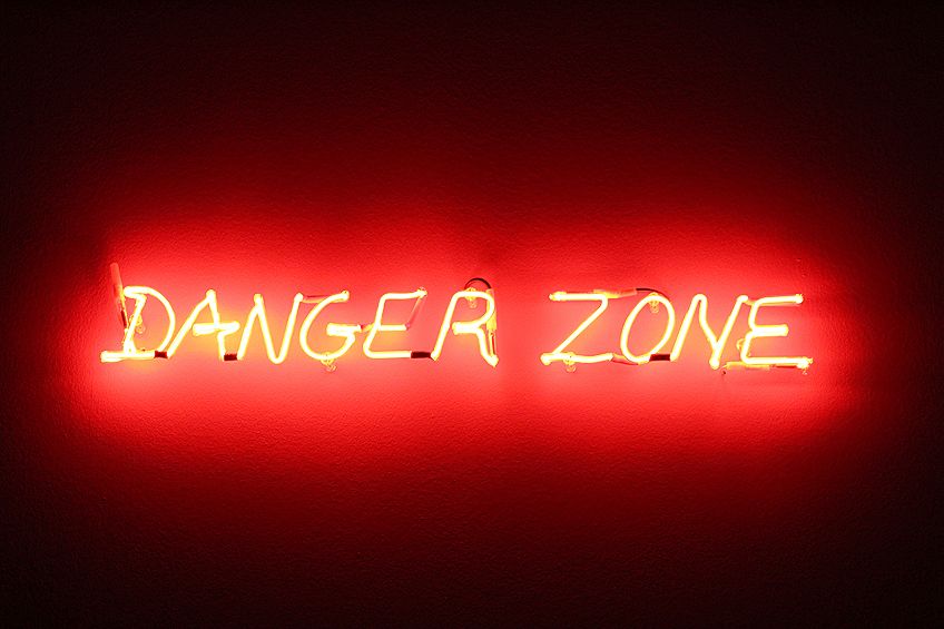
During historic times, the color red was used to signify something dangerous, so it was painted red as an alert. In nature, insects are similarly colored, and typically the poisonous ones that you must watch out for, are a bright red color, or yellow or orange. This is how nature warns us of the imminent danger, and we, as humans, have adopted the same attitude.
Besides being a warning color for danger, it is also used to signify energetic activity, passionate love or anger, extreme heat, and sensual sexuality. Regardless of what you are trying to convey, it does so in a passionate manner.
The color red is typically used for more positive connotations, but it is also often used to symbolize intense anger, frustration, or even hatred. Where it passionately describes the positive emotions, it does the same for the negative ones.
If you are a history buff, you might remember something called Remembrance Day. This was a day to think back on a battle during World War I that happened in a field of poppy flowers. The folklore says that when the battle was done, red poppies popped up all over the field where the battle commenced.
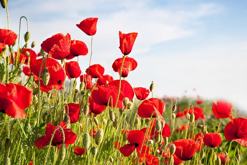
The poppy flowers were said to have been dyed by the blood of the soldiers. Since then, the red poppy flower has been a symbol that people would lay out on Remembrance Day to signify their respect for the lives lost that day.
Passion is not necessarily a positive emotion. It can be used to describe how devoted and dedicated you are to whatever you are doing or feeling. You could be passionately in love with your partner, with passionate sexual energy between the two of you. On the other hand, you could be passionately angry with your sister for borrowing your red dress without asking. Either way, the color red is the perfect symbol of whatever your passions are at the moment.
Psychologically, the color red is very attention-grabbing. Maybe this goes back to our primal stage of humanity where nature used the color to warn us of dangerous insects that threaten to poison us to death, and for this, we are preordained to recognize the color red, over and above most other colors.
For this, artists use color to lead the eye to the part they want you to look at. Using the color red as a highlight. Signposts that remind you to “watch your head” in low ceilinged rooms are often painted with red words, and billboards use the color for the lettering to be bold and prominent.

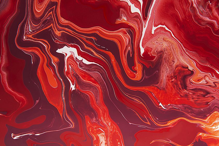
Different Shades of Red Color
The wavelength of the shades of red is from 625 and 740 nanometers, and its complementary color is the color known as violet. When it comes to the RGB (red, green, blue) scale, the color red is a primary color. But according to the CMYK (cyan, magenta, yellow, black) scale, the color is secondary.
Various Shades of Red Color
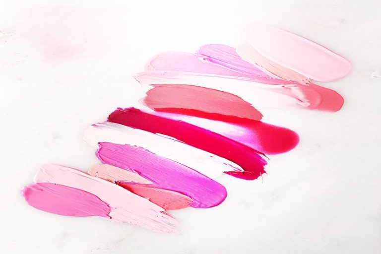
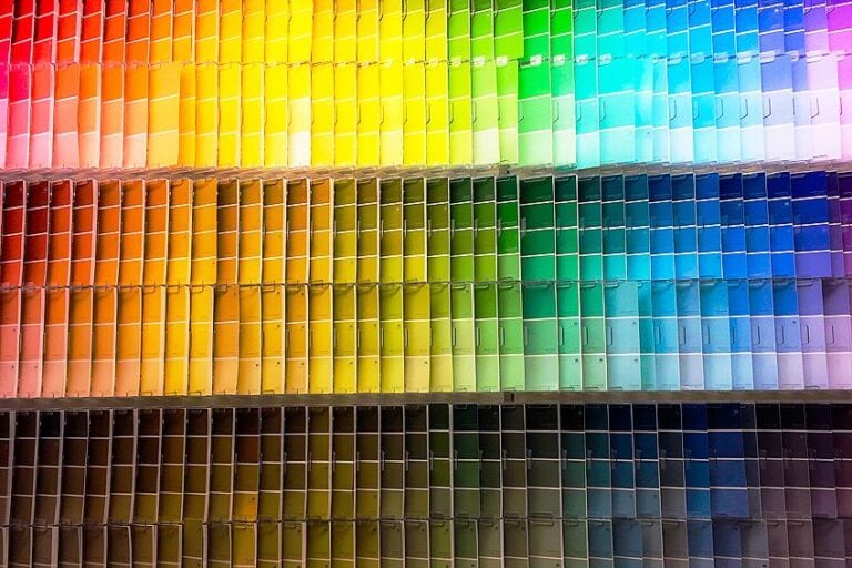
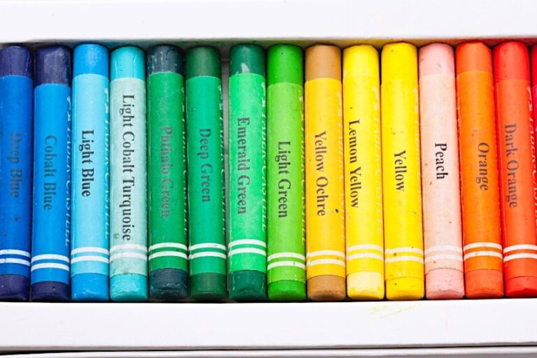
To gain a better understanding of the color red and all the variations that are included with the hues of red, we will be going through each different type of red, or some of them at least (there are a lot). We will also include the shade of red names, along with their hex codes. The hex codes are there to help you pinpoint exactly which color we are referencing.
Each person has their perceptions of color, and along our color journeys, we may have been misled into thinking that magenta is one color when it is actually another color altogether.
The first color on our list is the color called web page red. This color is bright and bold, making it a perfectly eye-catching color for the marketing district. This is a lot like the typical color used for primary red because there is little other color influencing its bias.
The colors we are going to be discussing below, are all considered a red color; however, they are all slightly different types of red. Let us have a look at a few of these before moving on to more exotic shades of red names.
The first is the webpage red, with the hex code of #ff0000. This is one of the basic additive primary colors in this color model, with the other two colors being green and blue. In the table below you will find the appropriate hex codes so you can easily look up the color online.
| Red Shade | Red Hex Code | CMYK Red Color Code | RGB Red Color Code | Red Color |
| Webpage Red | #ff0000 | 0, 100, 100, 0 | 255, 0, 0 | |
| Pigment Red | #ed1b24 | 0, 89, 85, 7 | 237, 27, 36 | |
| Crayola Red | #ee204e | 0, 87, 67, 7 | 238, 32, 78 | |
| Munsell Red | #f2003c | 0, 100, 75, 5 | 242, 0, 60 | |
| Psychological Primary Red | #c40234 | 0, 99, 73, 23 | 196, 2, 52 | |
| Pantone Red | #ed2839 | 0, 83, 76, 7 | 237, 40, 57 |
Cinnabar
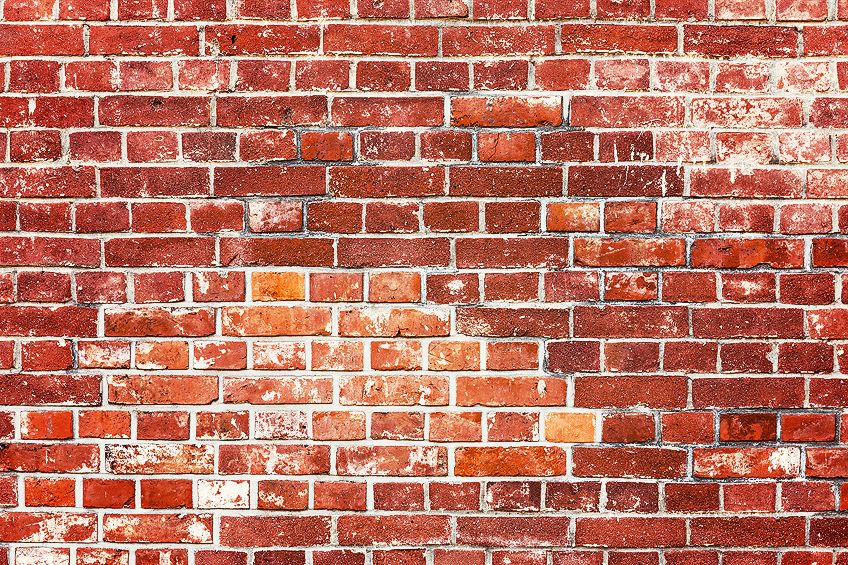
Cinnabar is a red color that is very similar to the vermilion color. It can be a bright shade of red, but also a darker shade that can be pictured when you imagine the reddish-brown color of clay bricks. The red color cinnabar is named after the pigment it is created with, which was quite the toxic pigment, being derived from mercury sulfide. Later on, technology’s improvements allowed for the less harmful discoveries of synthetic pigment.
The toxic pigment for the color cinnabar was very popular during ancient Egyptian times, as well as for the Roman Empire at the same time. This color is similar to orange, an energetic color, as well as brown, the earthy tones. It imbues both energies beautifully.
| Red Shade | Red Hex Code | CMYK Red Color Code | RGB Red Color Code | Red Color |
| Cinnabar | #e34234 | 0, 71, 77, 11 | 227, 66, 52 |
Crimson
Crimson has always been a very popular color, and when painting scenes where blood is visible, the color crimson was used often. The pigment for the crimson color was derived from insects that were a part of the Kermen species of scale insects. The synthetic version of the crimson pigment that came out later brought the name for the color, known as “Alizarin crimson.”
| Red Shade | Red Hex Code | CMYK Red Color Code | RGB Red Color Code | Red Color |
| Crimson Red | #990000 | 0, 100, 100, 40 | 153, 0, 0 | |
| Crimson | #dc143c | 0, 91, 73, 14 | 220, 20, 60 | |
| Alizarin Crimson | #e32636 | 0, 83, 76, 11 | 227, 38, 54 |
Carmine
We have spoken about the cochineal insects from Mexico that were the pigment for certain shades of red. Many red colors are pigmented with mineral-based pigment, but not this one. Carmine was used throughout history to create a red dye for fabric and manuscripts.
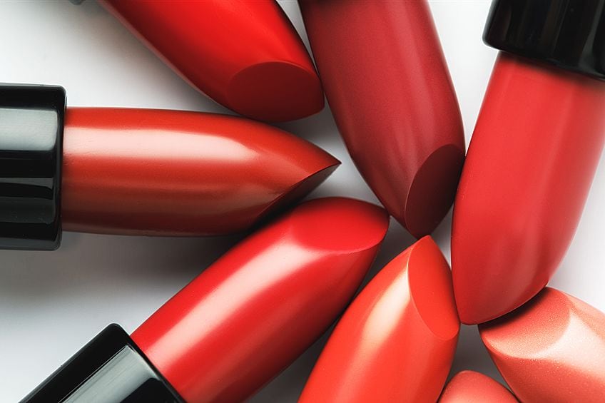
It became quite the lucrative trade for Native Mexicans, who would fear the insects to create more and more due to importation all over the world. Still to this day, the cochineal insect pigment is used for cosmetics like lipsticks and eye-shadows, as well as for red food dye.
| Red Shade | Red Hex Code | CMYK Red Color Code | RGB Red Color Code | Red Color |
| Carmine | #ff0038 | 0, 100, 78, 0 | 255, 0, 56 |
Maroon
Maroon is a beautiful dark red color. The depth of this color can easily be linked with purple because it has some dark blue hues in the mix. Often this color is confused with the color known as burgundy, but it is not as cool as burgundy, and it is much more o a deep red color. The word “maroon” is of French origin. It comes from the French word “Maroon” which translates to chestnut.
A lot of website designers like to use maroon as a background color. It might be a deep shade of red that is noticeable, but it is also a muted shade of red that is perfect for the background. They could then use white, or other light colors like beige or pale yellow for the font that goes in front of the background.
If you would like to lighten your shade of maroon, you can always add some yellow to the mix. This will bring out the brightness, without making it seem orange. Play around with the ratios until you are satisfied with the maroon color you have created.
If you are looking for a versatile color, then this is the perfect option for you. You can use this color in your paintings to color some school uniforms, or if you are painting a military scene, the color is just as perfect.
In interior design, you can use the maroon color for the background of your website or the brochures for your business. It is an earthy, yet illustrious color, so healing retreats might benefit from using this color for their flyers.
| Red Shade | Red Hex Code | CMYK Red Color Code | RGB Red Color Code | Red Color |
| Maroon | #800000 | 0, 100, 100, 50 | 128, 0, 0 |
Scarlet
Scarlett is a very popular color when it comes to marketing. In ancient times, the color scarlet was used during ceremonies for sacrifice. Many religions used this color to signify some symbolism, and a lot of the holy people would wear the color in their robes. This was apparent with the catholic cardinals and the monks of Buddhism.
Besides its religious affiliation, this color is associated with feelings of joy and courage. It is a highly passionate color, as most reds are, but this one is particularly passionate over and above the other red colors. It is used in some homes in combination with beige or sand colors.
| Red Shade | Red Hex Code | CMYK Red Color Code | RGB Red Color Code | Red Color |
| Scarlet | #ff2400 | 0, 86, 100, 0 | 255, 36, 0 |
Burgundy
Burgundy is similar to a purple color, but it is redder in reality. It is often described as a red-brown color so that people get an idea of the deep red hue that is burgundy. The name is of French origin, like Maroon, and it is derived from the burgundy wine that was so popular around the world.
When it comes to the psychological associations of the color burgundy, it is thought to represent great power, dedicated ambition, and wealth. Some great color combinations for the color burgundy would be turquoise or golden yellow.
| Red Shade | Red Hex Code | CMYK Red Color Code | RGB Red Color Code | Red Color |
| Burgundy | #800020 | 0, 100, 75, 50 | 128, 0, 32 |
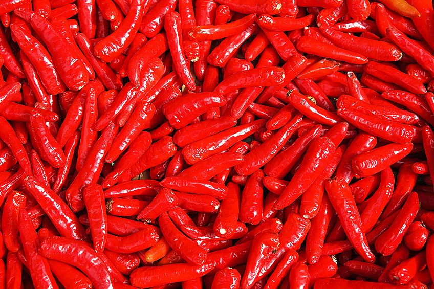
Chili Pepper Red
The red-hot chili peppers are the perfect fruit to name this color after because the color is exactly as bright and vibrant as the hottest red chili in the world. In 2007, the color chili pepper red was officially named the color of the year, and since then, it has remained a popular choice for cosmetics like lipstick shades.
| Red Shade | Red Hex Code | CMYK Red Color Code | RGB Red Color Code | Red Color |
| Chili Pepper Red | #e32227 | 0, 85, 83, 11 | 227, 34, 39 |
Acrylic Red Hues
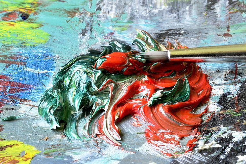
It is quite necessary to become familiar with the principles of color theory to be able to create different shades of red paint. By taking a closer look at the color wheel and studying the relationship between the various colors and how they all cooperate, you will get a better understanding of how to create the various colors, as well as match them with other colors that make beautiful combinations, rather than contrasting clashes.
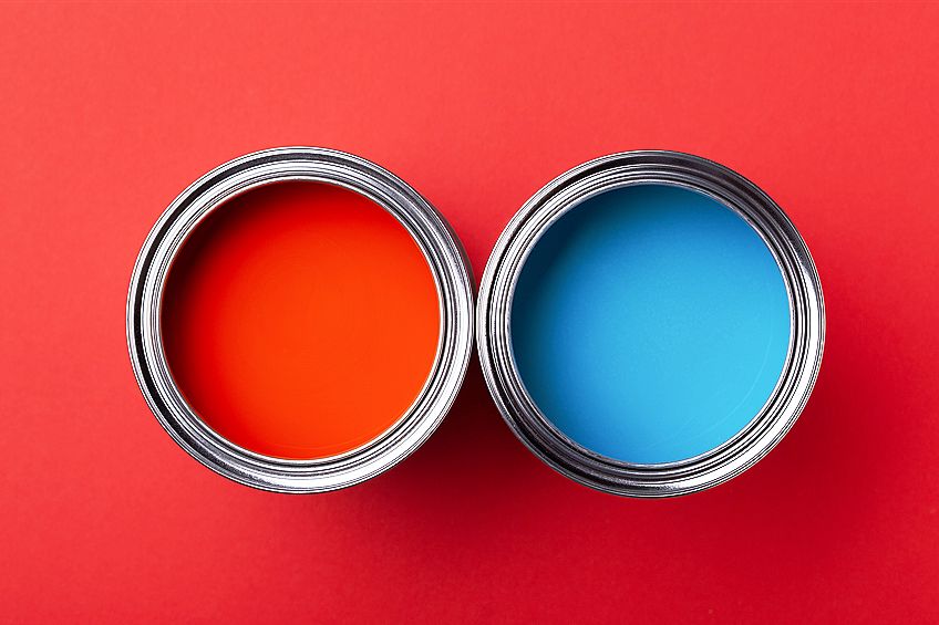
When it comes to acrylic paint and the primary color red, the complementary color for this hue is green.
You will find this by seeing which color is sitting opposite the red color on the color wheel. Red is also the color on the warm side of the color wheel. This means it imbues warmth, just as a fire does. You can make a red shade into a cooler red by adding some blue to the mix. This will result in colors like burgundy or crimson.
Warm Red Shades
If you want a warm red shade, here is an example. Cadmium red is the most well-known and popular warm red color that is without any influence of blue. When you are mixing your specific shade of red, you have the freedom to create a warm color red, but also a cool shade of red.
All you need to do is play around with the ratio.
Be wary of adding any other colors to the mix because you might create a muddied red color by adding too many clashing colors. Be advised that some colors are already mixed with these colors that will clash with red, so first make sure you know what you are mixing with.
Cooler Red Shades
Red shades that are cooler are made oppositely. If you are working with a darker shade of red, and you want to make it a cool color bias, add in some ultramarine blue. If you are working with a lighter shade of red that you want to make cool, add in some cerulean blue.
Making Muted Red Colors
Muted colors are the shades that are not as bright, and they are the ideal colors to use in the background of your paintings and graphic designs. When making a muted red color, you need to add in some green color.
This will make a muddy red color, which is what you are going for. If you want a more personalized muted green to suit the specific shade of red that you are working with, you can revert to the color wheel to make sure you are mixing in the right shade of green.
Every shade will have its specific complementary color (red’s complementary color is green) so not every shade of green will be the complementary color for each different type of red.
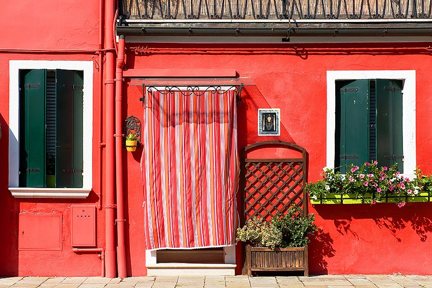
Website Design and Business Use of Red
Red has positive connotations as well as negative ones. This means that for whatever your website means, the accompanying colors will help determine the conveyed message. If you want a design for your business logo that is of positive connotations, like motivation, excitement, or confident energies, then the red you use should be a bright and bold shade, and you can accompany that color with white, beige, yellow, and other vibrant colors.
If you are working on a design for your business cards that needs to feel more somber or “negative”, then we recommend using a cooler shade of red and combining that shade with a dark shade of blue and a neutral tone.
It is always advised, regardless of the intent and design, to use only a smidgen of red.
It is a phenomenally bright shade, no matter how muted, and it can often feel overwhelming for viewers if there is too much color for your eyes to absorb. Combine the color with a muted shade of green and a light beige shade, and you have a beautiful combination of colors.
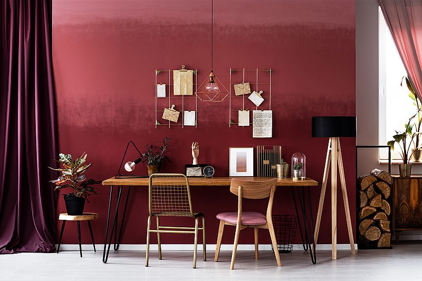
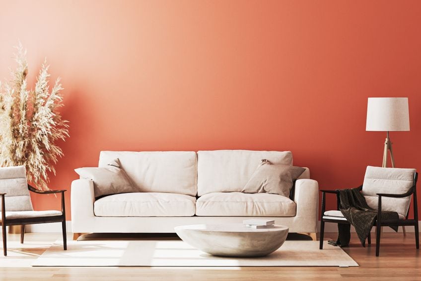
Interior Design and Red
It is never a good idea to paint an entire room in red color, the intensity of the color is far too much, and you might find yourself avoiding the room subconsciously. Most professional interior designers will recommend using red as the accent color.
The accent wall of any room should be the smallest, and the rest of the decor of the room is centered around the accent wall.
Other colors that can be paired with red for an interior design purpose could be sand color, beiges, and maybe even a neutral green color. Before you slather on any paint, let us take a look at some important factors to remember when selecting the paint for your room.
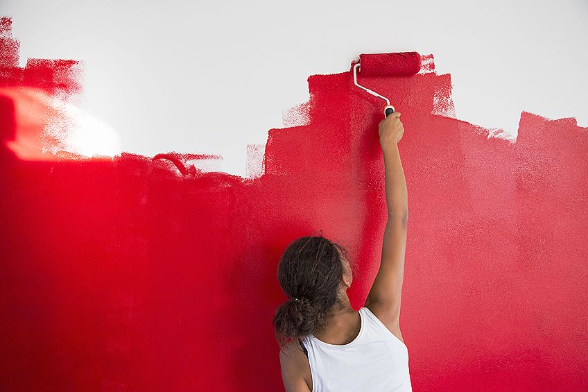
Selecting a Red Color Paint
It is a difficult task to choose the right color paint for any room. Often the pictures on the swatches are not accurate because the color dries to be a different shade entirely. We recommend buying samples of your top three or four selections that you cannot decide between. Paint a small section on each different wall and wait for it to dry. That way you can look at each wall, and get a better idea of what it looks like when it is dry.
Deciding What Room to Paint Red
A bedroom is usually painted with softer colors, and red might be too much for the people sleeping in it. Every color influences our emotions, so it is significant to select correctly. As we have mentioned, red can be used, but it should be an accent wall, and not painted over every wall in the room. A living room will also look and feel good with a red theme throughout.
Applying a Primer or Base Coat
You might have assumed that because red is so bright and vibrant that there would be no need for a primer to maintain the color vibrancy of the red. That may be so, however, you will need to paint a few coats before the paint is a thick and even coat of red, without any of the white wall showing through the paint from underneath. A primer will help the paint to be more even when painted, and this means fewer coats will be needed.
Shades of Red Combinations
It can be a lot of fun to explore all the color combinations and see which ones you prefer. To make things a little easier if you feel impatiently keen to start working with your red color, here are a few of the most popular color combinations for the various red shades.
- The darker shade of red combined with gold or navy blue
- Any shade of red with its specific complementary color
- Red combined with a neutral brown color, and white
- Various hues of blue with accent red colors
- Red color combined with teal
- Red combined with various shades of gray and white
- The typical black, white, and red. The black can be swapped out for blue
The various shades of red are gloriously passionate in whatever energy they give out. Whether it be a message to convey anger or a message of energy and passionate love. We hope this tutorial shed some light on each different type of red, whether it was a bright red color or a dark red color. Each of the shades of red is equally important, and at least now you know why.
Frequently Asked Questions
Is There a Name for a Dark Red Color?
Red is a vast color of many shades and names. A name for a dark red color might be like a maroon color, but an even darker shade of red is called Carmine red.
What Shade Is Purple?
Whether purple is considered as one of the hues of red or one of the shades of blue is entirely dependent on where it is situated on the color wheel. Purple is the product of mixing red and blue together, but if you add redder, the purple shade will be more of a red color, but if you add more blue in the mixing process, the purple shade will be more of a blue color.
Why Is Red Sometimes Considered Undesirable?
If you think of the bull, it is typically shown to get aggressive when it seems the color red. Whether that is a myth or fact, we all know that red is often used to depict anger. So, besides being the color of the passion of energetic excitement, it can have negative connotations. A marketer for an anger management class or seminar might use red within their presentation to show anger, without having to be angry whilst teaching.
Can You Mix Two Colors to Create Red?
Red is one of the primary colors. That means that it is the base color that helps to create all other colors on the color wheel, besides the other two primary colors, blue and yellow. If you are working with colors like Magenta, you could make it more of a red color by adding in some yellow.

Larissa Meyer is a 32-year-old mother from Michigan and creative spirit since childhood. Her passion for painting and drawing has led her to an education as an illustrator and a career as a freelance graphic designer. She has a Bachelor of Fine Arts in Illustration and a degree in Graphic Design. Larissa is a talented artist who is able to master a wide range of styles and techniques to bring her artistic vision to life. Her greatest passion is currently fluid painting and epoxy resin art. As a mom of two kids, Larissa also understands the importance of fostering creativity in early childhood. She uses her experience and knowledge to help other parents inspire their children and develop their artistic skills as well.
Learn all about Larissa Meyer and Fluid Painting.