Shades of Pink – The History and Use of the Color Pink
This post may contain affiliate links. We may earn a commission from purchases made through them, at no additional cost to you.
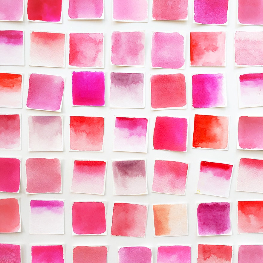
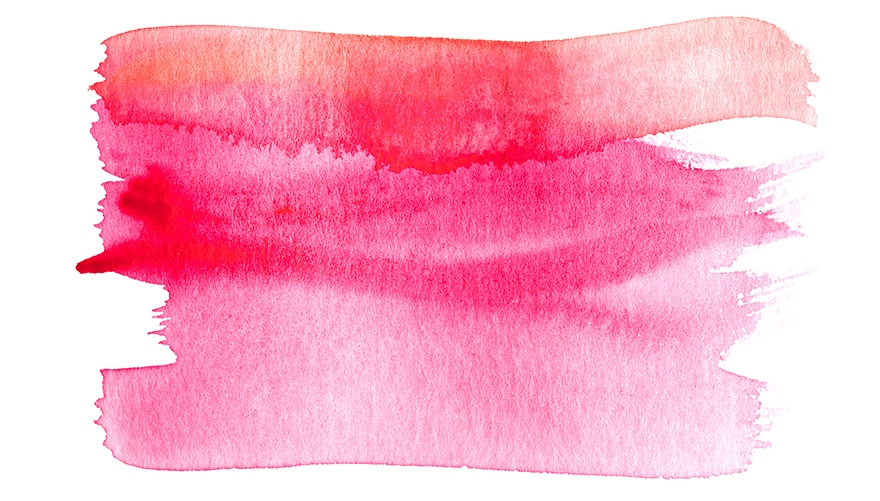
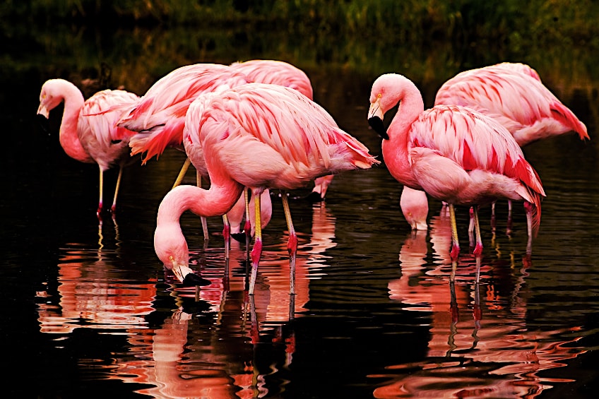
Pink is one of the most heartwarming colors on the colors wheel. Being loved by many, from brides to newborn babies, it is a color that is often used for a variety of different purposes. The pink colors are so versatile! You could be painting a soft sunset, with blue and baby pink color cotton candy skies, or a cerise hot pink color dress with flowing fabric, blowing in the wind, adorned by a beautiful ballerina. This tutorial is all about the different shades of pink. We will be talking all about the pink color palette, and the various shades of pink names. So if you are wanting to learn about the different shades of pink from light pink to dark pink shades, keep reading because you are on the right page.
The History of Pink
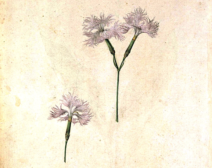
Pink has a long history, with many perspectives and meanings formed over the many years by the various cultures of our world. Pink has not always been connected with femininity, which is relatively new in terms of our world’s history and how vast it is. The pink color was given to a flower with the same name, Dianthus Plumarius, which is also known as garden pink, wild pink, or common pink, and it graced the artworld’s presence in the 17th century.
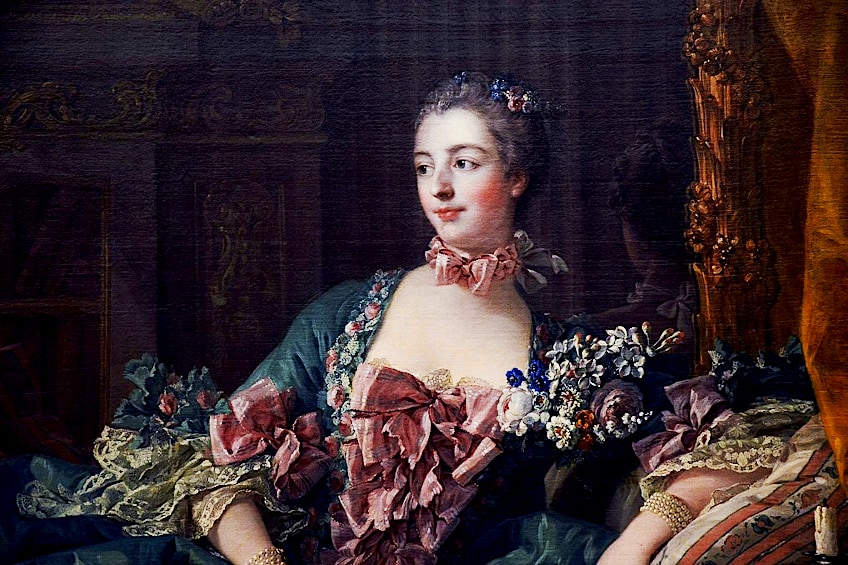
During the Renaissance, shades of pink from a light pink color to a hot pink color in all their variations for several different subject matters. It was a popular color in religious art because the warmth of pink expressed the supposed care of the god represented. During these times, certain shades of light pink represented social rank or status. Madame Pompadour, who was the mistress of King Louis XV, was particularly fond of a particular shade of pink that was eventually named Rose Pompadour after her.
Interestingly, pink was initially regarded as a predominantly masculine color because it is a mixture of red (the military color of war) and white, so technically it was a lighter red color. During the 19th century, connotations with pink changed, and became associated with girls only. The different shades of pink did not matter because they were all part of the pink color palette. From lingerie to fabulous ball gowns, the various baby pink colors and hot pink colors were enthralling to all ladies. Yet again, pink has made a comeback for both genders, and both men and women now wear pink without any negative association.
Meanings Associated with Pink
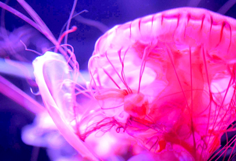
Every single color has its significance and can influence emotions. Pink is connected with feminine energy, romance, tranquility, gentle compassion, and kindness, as we have already learned. The many tones of pink take the strength of red and soften it by adding white. This is why pink is strongly associated with the ability to soothe aggressive behavior and angry or bitter mood swings. The most tranquil color variants are pale or light pink, whilst the brighter pink tones have the opposite effect and are more exciting.
One shade of pink is named is, “drunk tank pink” and it has become well known for its use on the walls of prison cells, because of its calming energy. It can dampen anyone’s aggressive mood and instill a sense of serenity.
Is the psychology of colors a familiar concept to you? Well, this is the mental state that colors can influence, like how light shades of pink can make one feel calm and at peace, or deep pinks can make you feel romantic or passionate. Creativity is inspired by the pink color palette, and there is a world of ideas waiting for the artist or graphic designer.
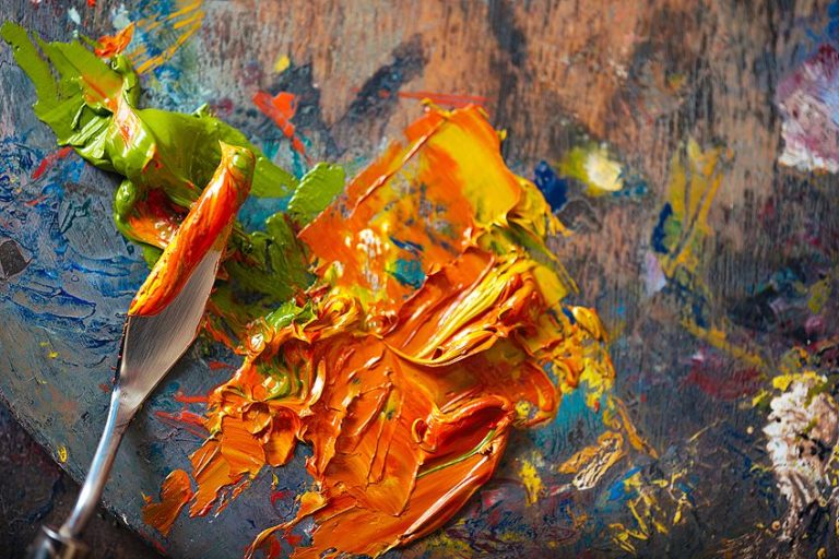
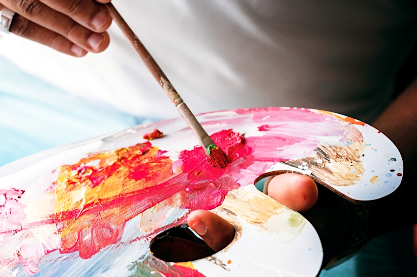
Creating Shades of Pink
When you start mixing your paints, a good place to start would be to decant a quantity of each color you are going to use to get your shade of pink onto your palette. Scrape some red to the side, and then a small amount of the white towards it and mix it well. It is a good idea to add a small amount of white each time to have more control over the shade because a small amount of white can make a big difference to your shade.
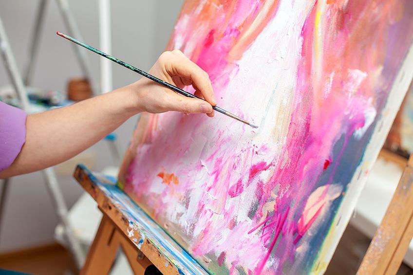
If you want to mute your pink color, you can add in a complementary color that you find on the color wheel, or you can darken it by adding some more red or even purple.
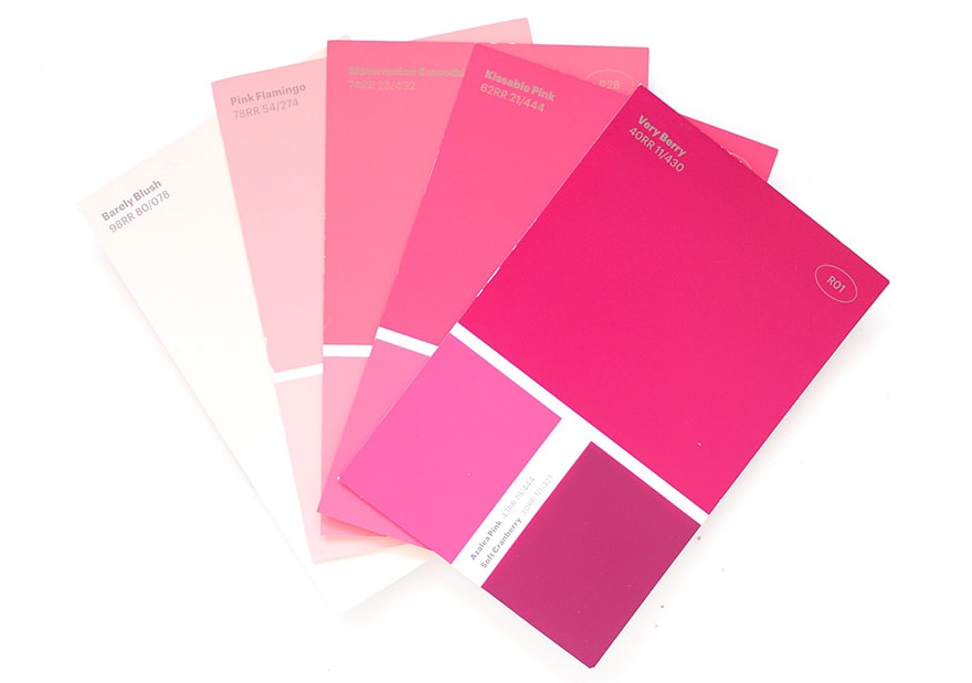
Various Shades of Pink
The nuances of pink can be used in every aspect of your life, from your office space, graphic design and marketing, interior design, and almost every fashion statement. The various shades of pink play a part in the world we live in and they each possess a certain meaning to the beholder.
Color Theory
The name pink describes a vast range of colors in many different shades from warm color bias, to a cold color bias. When you want to create a cooler pink color, you should use a red shade that is bluer, and if you want a warmer pink color, a red with more orange or yellow will do. The colors cadmium and scarlet red are examples of warmer reds, and these will create pink tones that are similar to the fruit peaches or the typical pink coral color. If you want a magenta pink, you could try mixing in vermilion red, or alizarin red.
Because white is also used to create pink shades, the type of white that is used when creating pink shades can play the same role that the color red does. In addition to titanium white, you have the option of zinc white which is more translucent, while the titanium white is more opaque. When it comes down to it, choosing the right red and adding small amounts of white will be the deciding factor of what pink color you create.
When you are using pink in the background of your painting, it is best to use darker, dull, and cooler pink hues. Then the brighter and lighter pink shades are in the foreground. This helps to create depth. When toning the more vibrant shades of pink down, one must mix in one of the complementary colors from the color wheel. These are the colors that lie opposite from the color pink.
The darker pink color can also be created by trying to add more of the same color red that you used for the pink color to create an even darker pink. In addition, if you want an even darker pink shade, you may want to consider adding in a little bit of purple to your recipe, or more white for a much lighter pink.
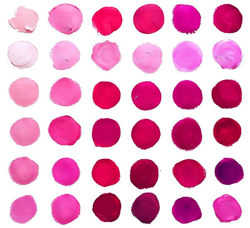
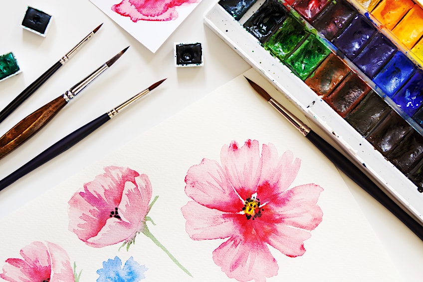
Names of Different Shades of Pink
We all know that the names that colors are bestowed with are not usually a signifier of their true color, often having bizarre or unexpected names. All of the different shades of pink are, in reality, a light version of red, and each color of pink can be made either physically by mixing mediums, or digitally on your graphic designing applications and devices. The digital method of mixing colors is known as RGB, (meaning red, green, blue), and the printing method is known as CMYK, (meaning cyan, magenta, yellow, black.)
We are going to touch base on a few shades of pink names so that you can familiarize yourself with the different shades of pink. It is always fun to be able to name colors by heart, so keep reading for some riveting general knowledge of the names of some popular pink shades.
Fuchsia
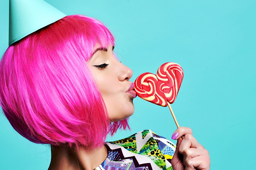
This color is only slightly warm, but mostly cool having a tinge of purple to the mix. It is similar to lilacs, but it is more pink than purple. The color is named after a plant that a German botanist named Leonhard Fuchs discovered. Fuchsia is sometimes referred to as hot pink or vivid pink. Using this color too much can have an effect that is too much for the brain to handle for long periods of time. It works well when paired with darker or cooler tones. Some say the color fuchsia represents confidence, growth, and happiness.
| Color Shade | Hex Code | CMYK Code | RGB Code | Pink Color |
| Fuchsia | #c154c1 | 0, 56, 0, 24 | 193, 84, 193 |
Carnation
The first time this color was named officially was in 1535, so this color has been around a long time with a name to call it by. Again, this color is named after the flower by the same name, and the color is not far off indifferent. This color imbues elegance in society and facilitates a feeling of gratitude. Wedding planners love this color because it can easily be used to theme up both a bridal shower and the wedding in one.
| Color Shade | Hex Code | CMYK Code | RGB Code | Pink Color |
| Carnation | #ffa6c9 | 0, 35, 21, 0 | 255, 166, 201 |
Magenta
The color magenta can be found in the midpoint between the shades of blue and red. It is quite bright in appearance, with the undertone of a light purple. It is said that the color represents harmonious emotions and inner peace, as well as evoking a sense of spiritual energy. Colors of this type can help to inspire compassion and are thought of as cheerful colors. Magenta, not to be confused with fuchsia as it often is, has a more bluish tinge than fuchsia, which has a more purplish tinge. The best way to determine the color when you are planning an artwork or a certain advertising campaign is to go by the RGB code.
| Color Shade | Hex Code | CMYK Code | RGB Code | Pink Color |
| Magenta | #ff00ff | 0, 100, 0, 0 | 255, 0, 255 |
Hot Pink Color
Hot pink has been a hot choice in various fashion fads and bold statements throughout history. This pink is not your typical ink that gives off a feeling of serenity that could calm any storm, it is a bright and vibrant color that is full of life. It is noticeable, and this is why graphic designers like it so much. This color embodies youth, or even a rebellious nature, being popular in the punk rock phase. You can pair this color pink with black, or yellow, or even some of the different shades of cyan.
| Color Shade | Hex Code | CMYK Code | RGB Code | Pink Color |
| Hot Pink Color | #ff69b4 | 0, 59, 29, 0 | 255, 105, 180 |
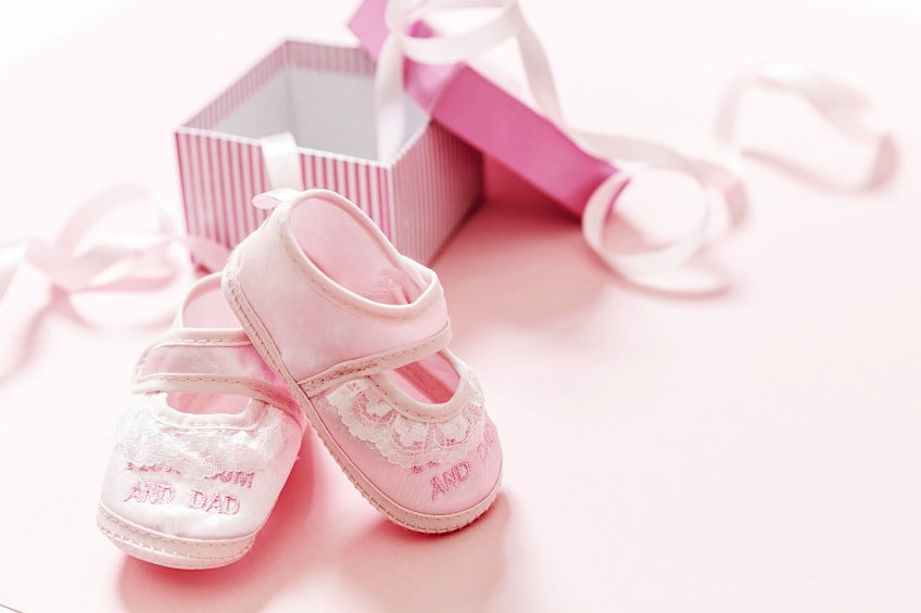
Baby Pink Color
Baby pink is a color used to characterize dainty or delicate subject matters. This light shade of pink was established with its name around 1928, which makes sense because the color pink was not associated with girls only until the late 19th century, as we mentioned before. These days the baby pink color will commonly be found in baby’s rooms or a young child’s bedroom.
| Color Shade | Hex Code | CMYK Code | RGB Code | Pink Color |
| Baby Pink Color | #f4c2c2 | 0, 20, 20, 4 | 244, 194, 194 |
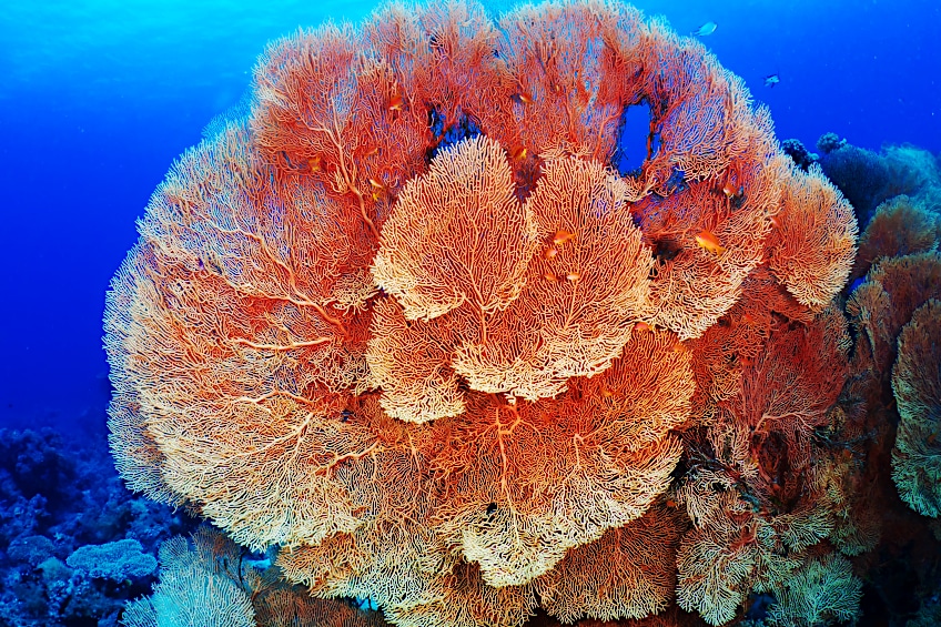
Coral
Have you ever gone snorkeling? Do not worry if you have not had the pleasure, because this color is sure to make you feel like you have swum for hours above the coral reefs anywhere in the world. This color is named after the most common color of coral, a peachy pink color that has a little more yellow in the mix. This color can surely set you on a tropical buzz in no time. If you are looking for great combinations for coral pink, they would be Tiffany blue or white.
As with all colors, there are sometimes very similar colors that have a slight color bias difference but are still considered to be a coral color. If you are looking for a coral color that is similar to the color of the living coral in the ocean, the reddish purples are the colors you need to mix into your formula of colors. Whatever coral shade you choose, this will influence how you pair it with complementary colors. Deeper shades of blue and green go especially well with teal, while the brighter shades pair exceptionally well with tiffany blue, and aqua blue.
| Color Shade | Hex Code | CMYK Code | RGB Code | Pink Color |
| Coral | #f88379 | 0, 47, 51, 3 | 248, 131, 121 |
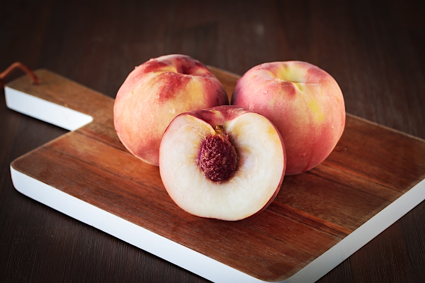
Peach
You might imagine that this color was named after the juicy fruit, the peach. And there you would have imagined correctly because this color resembles the delicate pink of the soft and juicy flesh of ripe peach fruit. It gives off a sense of joy to whoever views it, as well as comforting their senses. Spring and all things bright and beautiful are represented by this color. If you are an event coordinator planning advertisements for your next summer party, you will use this color a lot.
This color will brighten up any mood, so feel free to use it whenever you feel you need a bit of sprucing up. If you are expecting a little girl to join your family soon, you might even use this color for the ways in their nursery. In interior design, this color is suitable for bathrooms and any small room, or even your reading nook.
| Color Shade | Hex Code | CMYK Code | RGB Code | Pink Color |
| Peach | #fad1af | 0, 16, 30, 2 | 250, 209, 175 |
Light Pink Color
Since there are so many different shades of pink, the light pink color represented below is slightly darker than the pale pink color. If you want a more invigorating feeling in your artwork or design, use a darker shade, but both these two light and pale pink colors are calming in nature. A great combination with these colors would be neutral grays, and this would be fitting for a bedroom or even a playroom.
| Color Shade | Hex Code | CMYK Code | RGB Code | Pink Color |
| Light Pink Color | #ffb6c1 | 0, 29, 24, 0 | 255, 182, 193 | |
| Pale Pink | #fadadd | 0, 13, 12, 2 | 250, 218, 221 |
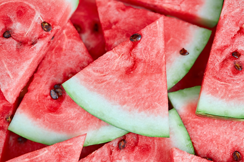
Watermelon
This color has a hint of pastel in it, even though it is so similar to the bright pink inside a watermelon. Invigorating and lively, this vibrant pink is just the thing to brighten any day, so it is often used to represent summertime and happy vibes. This color is magnificent on its lonesome, but paired with neutral mist gray or a Sahara will be a great match. It is also a color that works well with all shades of pink, making it a monochromatic color.
| Color Shade | Hex Code | CMYK Code | RGB Code | Pink Color |
| Watermelon | #ff6b6d | 0, 58, 57, 0 | 255, 107, 109 |
Rose Pink
Roses are also full of a variety of colors, and also a variety of different pink shades. This color was named accordingly after the purple-pink roses, and its name was first recorded in the late 1700s. This color is a cool pink that is mixed with a red that has a little more blue in the mix, but not enough to make the red a purple. This color would pair well with a dark navy blue, or a pale gray.
| Color Shade | Hex Code | CMYK Code | RGB Code | Pink Color |
| Rose Pink | #ff66cc | 0, 60, 20, 0 | 255, 102, 204 |
More Amazing Shades of Pink
Pink is a color that comes in many shades, and some of them have the most unique names. Some people might have an idea that a certain color has a certain name when they are wrong, so the best way to identify colors accurately is by using the HEX code, or CMYK and RGB codes. Here is a table that tells you some more shades of pink and their specific codes.
| Color Shade | Hex Code | CMYK Code | RGB Code | Pink Color |
| Cotton Candy | #ffbcd9 | 0, 26, 15, 0 | 255, 188, 217 | |
| Bubblegum Pink | #f58092 | 0, 48, 40, 4 | 245, 128, 146 | |
| Baker-Miller Pink | #ff91af | 0, 43, 31, 0 | 255, 145, 175 | |
| Flamingo | #fda4ba | 0, 35, 26, 1 | 253, 164, 186 | |
| Pink Lace | #ffddf4 | 0, 13, 4, 0 | 255, 221, 244 | |
| Cherry Blossom Pink | #ffb7c5 | 0, 28, 23, 0 | 255, 183, 197 |
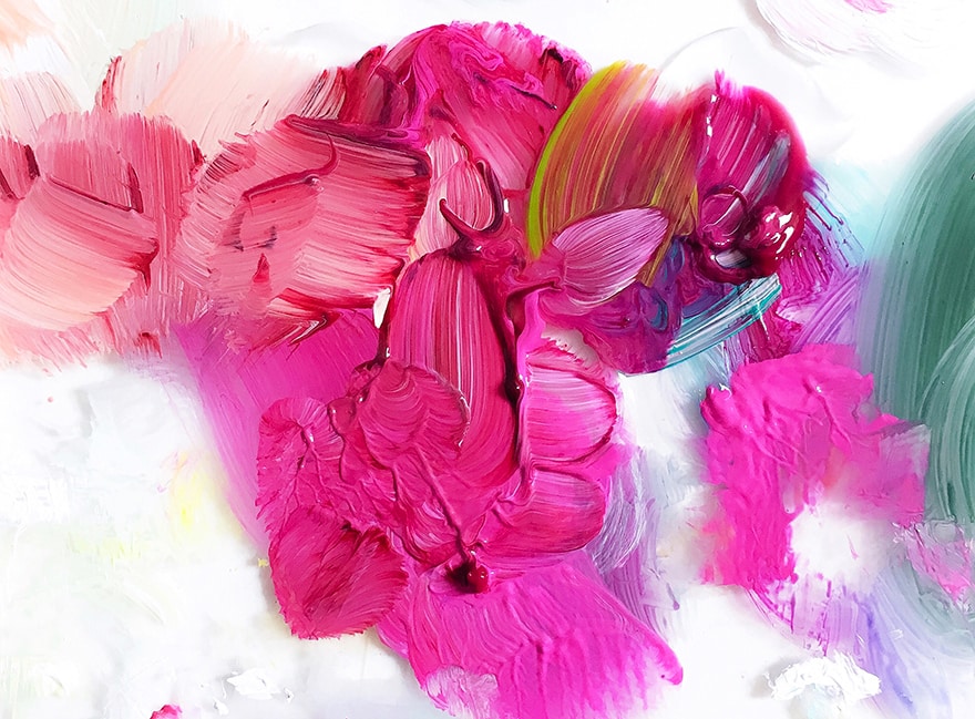
Mixing Pink Shades with Acrylic Paint
Now that you are equipped with the knowledge of some of the existing shades of pink, the time has come to learn how to mix your shades of pink for a more specific color to fit your design or your artwork. This next section will teach you the perfect colors that can make some seriously stunning pink shades, and with a little experimentation, you will master this hue in no time.
Choosing which Red Paint to Use
The shade of red that you select will determine what shade of pink you get when you combine them. Colors such as cadmium red are popular and will produce an orangey-pink color, whereas scarlet red will produce a more lively pink color like cerise pink. For you to find the pink color you’re looking for, you’ll need to try out a few colors and see what works for your artwork. Here are a few examples to give you a head start.
- Alizarin Crimson will make a pink shade that is deep and cool because of the purple tinge the red already has
- Quinacridone red will make a much brighter pink than most reds. This pink will be closer to a hot pink color than anything else.
- Naphthol red will make a pink that is almost clear in color, yet its vibrancy is still apparent
- Earth red tones will make a neutral dusty pink
Choosing Your White Paint
Just like the red color being a massive influence over the shade of pink you achieve when mixing, specific shades of white will also have just as much of an impact. Titanium is an opaque shade of white and it is a common choice by professional artists to use when mixing your pink shades. Zinc white is not typically recommended as a great choice of white shades to use when trying to mix your perfect pink shade.
If you are painting with watercolor paints, you can add some white to your red to make pink, but you can also simply add extra water to the mix, and this will lighten the shade by making your paint more transparent.
Decorating with Pink Shades
Pink is a versatile color that is great for a variety of themes. We have listed a few examples of pink combinations that are popular in decor for a variety of themes.

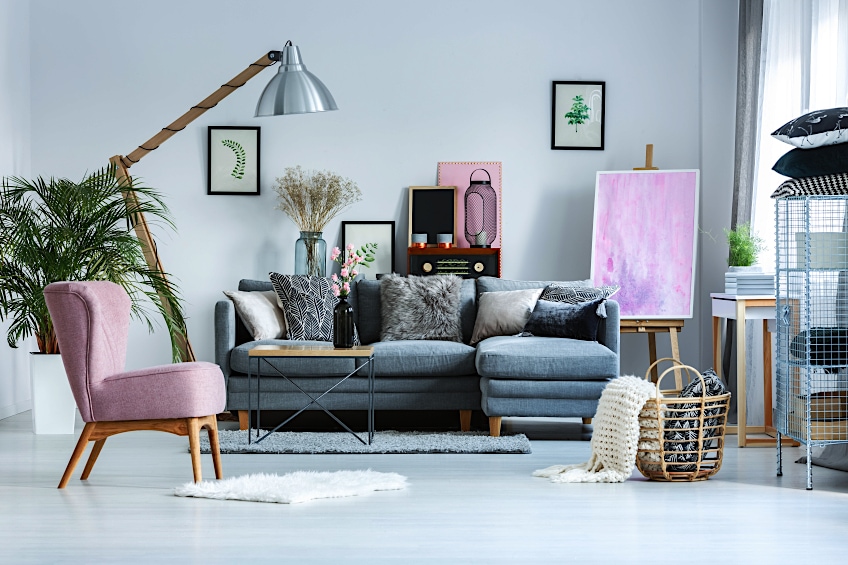
Gray and Pink
If you are looking for a sophisticated or elegant feel, this combination of gray and pink is a perfect option. This combination is best done with a light pink shade and then a fair amount of gray.
Green and Pink
Green and pink are popular color combinations, particularly in pastel shades. A great shade of green is sage green. This combination gives a feeling of serenity and calmness.
Blue and Pink
Blue and pink give soft energy, and it is a combination that is perfect for a bedroom setting because of the soothing feeling they provide. You could mix a lighter shade of pink with a darker navy blue for a slightly more vibrant feel, or a pastel combination of pink and blue for the opposite effect.
White and Pink
This is probably the most popular color combination and has been used often by professional artists and graphic designers for a long time. There is no limit to what you can use this combination for, so have fun with your designs.
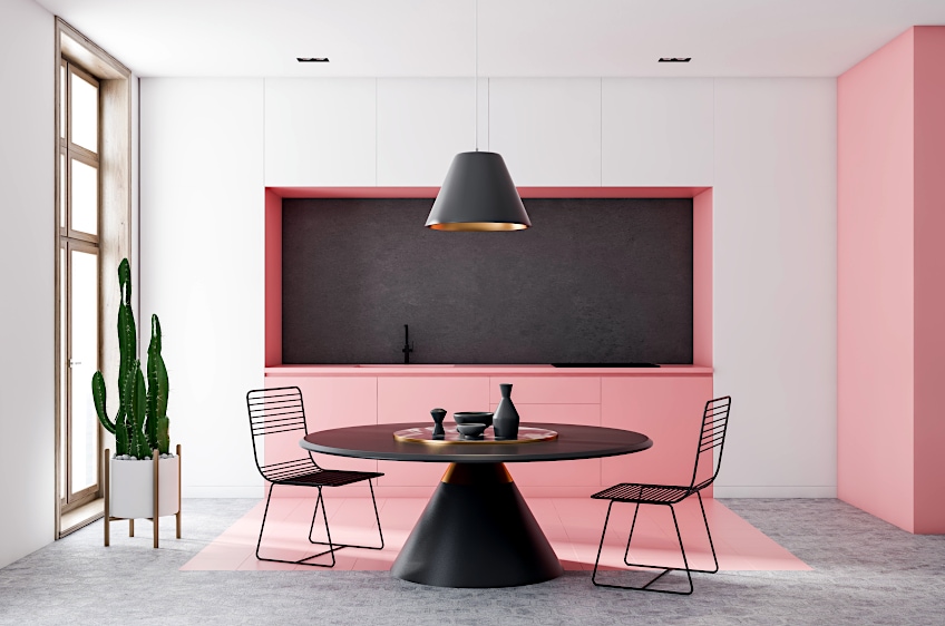
Black and Pink
The punk rock scene has been a big supporter of the combination of pink and white, yet it also has an elegant or sophisticated feel. It makes a perfect combination for party decor or interior design. If you have a predominantly pink room, you can add in some black detailing, like an accent wall
Fashionable Pink Shades
The fashion and design industry, as well as home decor and design, is constantly developing new trends in every season. Color trends that have been quite popular in the past include colors such as millennial pink and Pantone rose quartz. In the past few years, millennial pink has gained a lot of popularity due to it being thought of as one of the most suited shades of pink for social media like Instagram. It should be noted that trends are constantly growing.
Design in marketing and interior decorating has taken on a holistic feel, and this has also affected the colors and their colors. One of the most popular colors of the season is a neutral dusty pink, which gives off a natural feel of a pink et in nature. Bubblegum pink is a color that is worn by many in a variety of ways, such as clothing as well as accessories. Generally, pink is regarded as a versatile color and works beautifully for all skin tones. This color has become quite a phenomenon across the globe and is shared amongst cultures. The trendiness of pink will never fade, it is the old faithful.
As you have learned, pink is a color used by many, loved by many, and is almost everywhere! Whether you are a new lover of the color and want to paint a feature wall in your home in a lovely soft shade, or just want to learn more about this adored color, we hope that our article has provided you with everything you needed to know.
Frequently Asked Questions
How Do You Mix a Pink Color?
When creating pink, you must mix a certain shade of red, with a certain shade of white. The color red you choose will influence the shade of pink you create. If you want a lighter shade, you must add in more white, and if you want a darker color you must add more of the red color.
What Does Pink Represent?
Pink is often used to represent feelings of calmness, serenity, happiness, maternal love, compassion, and nurturing energy. In color, psychology pink is used to soothe a bad temper, and lift the mood of a room.
How is a Light Pink Color Made?
The shade of red will determine the shade of pink that you create, but the shade of white will also be just as influential. The more white you add will lighten your pink shade even more, but the brightness will be affected by mixing in some yellow.
How to Make a Hot Pink Color?
To create a hot pink color, you must mix in a red color that has a certain amount of blue that does not quite make it perfect, but still a red, with your white.
What Colors Go Well with Pink?
If you are looking for a great combination for pink, you can always use white, because that is the old faithful pink combination that never fails to impress. Green and pink are also great colors that complement each other nicely, along with Light pink and pale yellow, or black and pink, or a muted orange and dusty pink.

Larissa Meyer is a 32-year-old mother from Michigan and creative spirit since childhood. Her passion for painting and drawing has led her to an education as an illustrator and a career as a freelance graphic designer. She has a Bachelor of Fine Arts in Illustration and a degree in Graphic Design. Larissa is a talented artist who is able to master a wide range of styles and techniques to bring her artistic vision to life. Her greatest passion is currently fluid painting and epoxy resin art. As a mom of two kids, Larissa also understands the importance of fostering creativity in early childhood. She uses her experience and knowledge to help other parents inspire their children and develop their artistic skills as well.
Learn all about Larissa Meyer and Fluid Painting.