What Colors Make Blue? – A Guide on How to Make Blue Paint
This post may contain affiliate links. We may earn a commission from purchases made through them, at no additional cost to you.
A recent survey taken all over the world discovered that blue is the most popular color in at least 10 countries, with a 1/3 of those in Britain saying that blue was their favorite color of all. In addition to being so popular, blue is also an essential color in painting. Blue is everywhere we look – in lakes, the ocean, sky, flowers, advertising, and more. So, what two colors make blue? Whether you’re a beginner or professional, working as an artist, graphic designer, or simply just love colors, we have put together an in-depth article that discusses all of the possibilities in creating and painting with the color blue.
What Is the Meaning Behind the Color Blue?
Many people in the world love blue. Different shades of blue can elicit different emotions and different reactions, as colors naturally carry an emotional imprint. Although it depends on the particular shade, blue can have a large set of meanings and associations, including loneliness, misery, relaxation, trust, and expansiveness. The different shades of blue not only mean different things, but they also vary according to the cultural circumstances in which they are being viewed. For instance, people from Iran see blue as a color of mourning, while most Western cultures have blue at their weddings and other joyous occasions.
We’re going to take a more detailed look at some more of the positive and negative associations with blue.
Royalty, Calm, and Trust
A classic association for blue is the feeling of peace and tranquility. Throughout most of human existence, people have been thinking of very relaxed and peaceful mental states when they see shades of blue. Many scientific studies have confirmed that human beings’ brains often associate blue with relaxation. Simply looking at a cooler shade of blue can get the brain to give off endorphins that encourage relaxation as well as rest. Blue hues have also been proven to slow the metabolism and appetite.
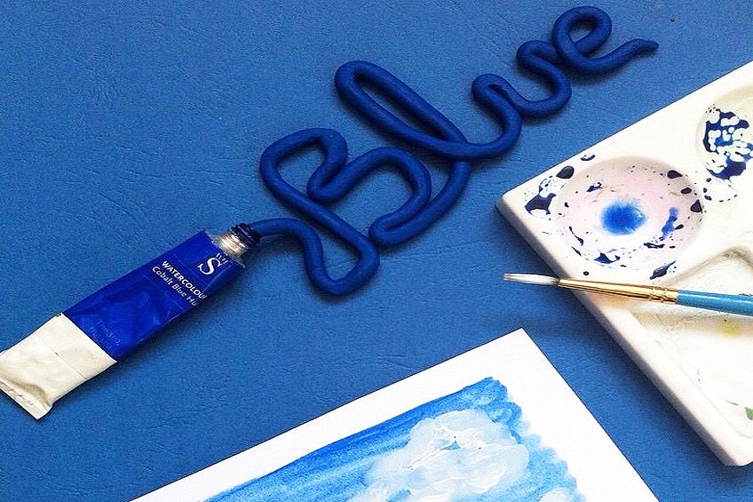
More strong and positive feelings that have been tied to blue hues are those of balance and self-expression. Trust, confidence, and significance can be communicated by deeper shades of blue. Blue has for a long period been a part of royalty, which started because the early blue pigments like cerulean were so expensive. “Blue blood” led to the darker shades worn by the royals to show power, stability, unity, trust, and intelligence. This has carried over into the corporate world with blue suits.
Emptiness, Sadness, and Loneliness
Blue can also be used to express sad and negative emotions. Some shades of blue can hint at melancholy, and this “feeling blue” has been passed down culturally through many generations. Loneliness and depression are also seen through darker and cooler shades of blue, with the English language often having phrases that connect these emotions to this color.
Even after pregnancy, postnatal depression is called the “baby blues”, and if you are feeling bad about Monday after your wonderful weekend is over, you could experience a “blue Monday”. In music, the blues came about from the struggles of Black Americans in throwing off the chains of slavery.
Now that we have discussed many of the associations of blue, we can move on to working out what colors make blue, and how to makee blue paint in a variety of different shades.
Two Ways to Perceive Color Theory
The most popular way for artists to mix different colors is by using color theory. The basic form of color theory has three primary shades, three secondary colors, and a set of tertiary hues. If we were to use this color theory foundation to create blue, we could only create certain shades of blue. This is because blue is one of the primary colors, and when we stick to the color theory, blue cannot be mixed by using other shades.
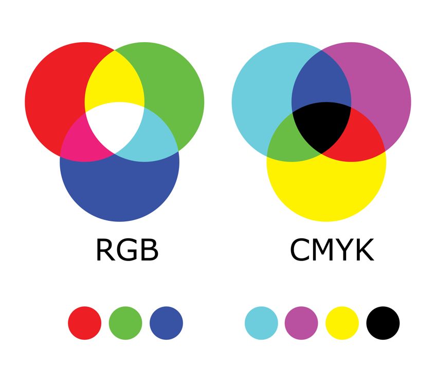
Another way to create color is to use the yellow, cyan, magenta, and black (CMYK) model used by printers. By mixing various percentages of these four foundation colors, we can make up blue. Let us begin by looking at how to make blue by using the principles of basic color theory. Later, we will cover how to mix this shade with CMYK colors.
How to Make Blue Using Basic Color Theory
Color bias is the most important thing to be aware of when creating different shades of blue by using traditional color theory. The fundamentals of the color wheel show us the basics of understanding color bias. The color wheel has the shades of blue, red, and yellow as the primary colors. A secondary color is made by mixing two primary shades. For instance, you can make up orange by mixing yellow and red. We don’t usually mix all three primary colors because it creates a slightly brown, muddy color.
Color temperature is another important part of the color wheel. Temperature speaks to the coolness or warmth of your colors, with red as the warmest shade and blue as the coolest.
The way a color leans towards red or blue is called the color bias. For instance, a light green hue will have blue as a primary shade, and will therefore appear cooler due to the fact that it lies closer towards blue. Bright orange is the opposite, having red as one of its primary hues, thus making it a warmer shade.
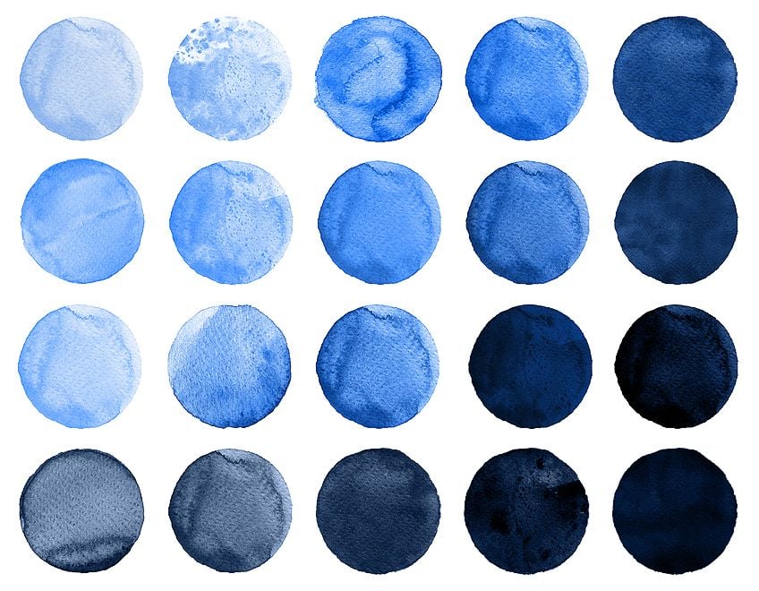
The temperature of color doesn’t only concern secondary hues, however, as different shades of blue can be warm or cool, depending on their color bias. You can figure out the temperature bias of a blue shade by determining whether it is closer to the color purple or to green.
So, what color does blue and green make? Greener shades have a small bit of yellow, while purple is warmer because it has more red in it. In the following sections, we are going to explain to you how to mix blue paint shades that are warm, cool, light, dark, or muted with many different base colors.
We recommend writing down and recording these methods for creating the colors we talk about so that you can easily recall them when you need to.
What Colors Make Blue Cooler?
The long and short of it all is that you can make blue cooler by adding a touch of green. The specific shade of green that you use will create your final blue shade. The best two green hues for creating cooler blues are Veronese green and cadmium green. A bright and cool green, Veronese green is great for creating cool blue shades. It leans towards light blue and is already a cool hue. When combining Veronese green with ultramarine blue, you will get a slightly darker and very cool blue shade. Alternatively, you can create a light and vivid cool blue by combining Veronese green with cobalt blue.
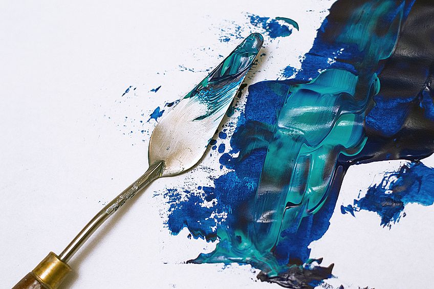
With a bit of red in it, cadmium green is a bit warmer than Veronese green. Adding ultramarine blue to cadmium green will get you a slightly muted and cool shade of blue. Since both ultramarine blue and cadmium green have a bit of red in them, you will have used a mixture of all three primary hues, making your final shade a little bit muddier. Mixing cobalt blue and cadmium green will bring you a lighter and brighter form of blue hue.
What Colors Make Blue Warmer?
Two of the primary colors you can mix with blue to create a warmer shade are alizarin crimson or burnt sienna. Depending on the blue hue you have used, the effect of these combinations will be different. To create a warmer hue of blue, we would recommend starting with a color that is already a lot warmer.
For instance, you can mix ultramarine blue (which has a warmer tone) and cobalt blue (which has a bit of a cooler tone). With a very warm tone, alizarin crimson is a slightly purple hue of red, meaning that it already contains a bit of blue.
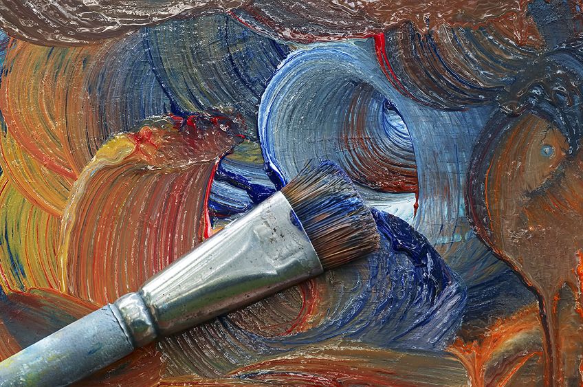
When mixing a tone that leans more toward orange, it is important to note that since the tone will likely contain some yellow, mixing blue into it would make it muddier.
When mixing alizarin crimson with ultramarine blue, a very dark and somewhat purple shade of blue will be created as a result. For a more lively and equally warm blue, you could combine alizarin crimson with cobalt blue. Burnt sienna is a much darker and warmer shade of red than alizarin crimson, so when you combine it with ultramarine blue, you will get a much darker and warmer blue hue.
What Colors Make Light Blue?
After covering how to make blue darker and warmer, we will now get into what colors make light blue. Adding some white is the easiest and most popular way to make lighter shades of blue. The mix of white and ultramarine blue will create a wonderful bright shade of cornflower blue, as adding white lifts the warm undertones. Mixing cobalt blue with a bit of white will result in a much more vivid light blue.
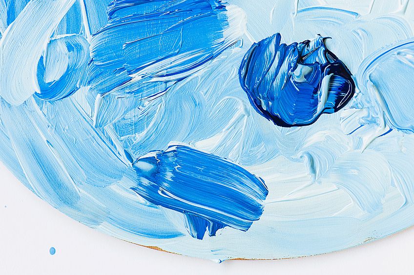
A less common way to lighten a blue hue is to mix in a bit of light green or yellow. What color does green and blue make? A lighter shade of blue. When using this method, you will notice that as well as lightening your shade of blue, you will also be making it slightly cooler.
The method that you choose to use should depend on what outcome you want.
What Colors Make Dark Blue?
Now that we know what colors make light blue, we can move on to what colors make dark blue. There were only a couple of good options in terms of how to make blue lighter, but there are three good options for creating dark blue. The color that you want could be a warm dark blue, a cool dark blue, or a muted version of blue, each of which will require different colors to create. So, what colors make dark blue?
A very effective way to mix a darker shade of blue is to mix in a bit of dioxazine purple. Adding this dark purple shade to ultramarine blue will bring about a dark and very rich blue. Dioxazine purple has red pigments in it, so if you mix it with cobalt blue it will result in a more muted dark blue.
Another color that is great for creating darker blue hues with either cobalt blue or ultramarine blue is burnt umber. It has a good deal of red in it, so will make up an almost brown and more muted dark blue hue. If you would like to use a very dark blue, then burnt umber is one of your best options.
The last and final option you could use to create a dark blue hue is by mixing a bit of phthalo green and some alizarin crimson to your blue color. By adding these two, you create the same effect as adding burnt umber to your shade and will also get a very dark blue shade.
How to Make Blue Paint Muted
Bright blue shades are wonderful colors to use in paintings and are always our best option when it comes to mixing shades. Our reality is coated with so many natural and vivid colors, so in order to keep a sense of realism in our work with dimension and depth, some muted shades of our blue colors will generally be necessary. Paintings that are too bright can be considered garish, even vulgar.
Creating muted colors is an easy process – we just have to add a little bit of the used color’s complementary shade. That is, the color that is shown on the opposite side of the color wheel. For blue, the opposite or complementary color is orange.
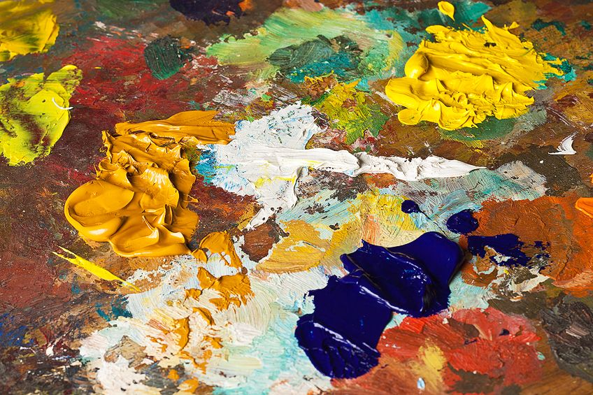
Of course, every specific shade of blue will have a specific complementary shade of orange. You will need to practice a bit until we have the exact shades that we need.
Cadmium orange is an excellent option for creating muted shades of blue as it is very bright and warm. Mixing ultramarine blue with cadmium orange will lead to a dull, very warm, and dark shade of blue. The very same cadmium orange is also an excellent choice to mute cobalt blue, making it much less bright. Blue shades can also be muted by using burnt umber, which is a darker orange shade, and will therefore make your blue darker and more muted.
How to Make Blue Using the CMYK Colors
All of our information presented up until now has used the usual simple color theory in our methods. However, another completely different method is also available. The printer method of CYMK can also be used to create colors by adding percentages of black, cyan, magenta, or yellow.
This model makes it very easy to create blue – simply mix cyan and another color to create your shade of blue. But what colors make cyan turn blue? The answer is easy in that it is magenta – we can use cyan and magenta to create a range of blue shades. The mixing ratio you use will influence your final shade of blue. This should answer your question of what two colors make blue and how to make blue paint.
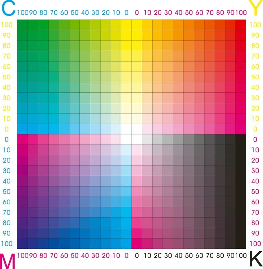
A Technical Chart of How to Make Blue
Throughout this article, we have worked out and discussed many different ways of how to make blue paint with a variety of different shades. Below, we include a table on the technical percentages for making some of the best and most popular shades of blue, what color makes blue, and how to make blue paint.
| Color | HEX Code | RBG | CYMK | Uses |
| Navy Blue | #000080 | (0,0,128) | 100%, 100%, 0%, 50% | Navy blue is a rich, dark blue color. Some emotions described by navy blue include responsibility, integrity, and authority. Navy blue can be used to bring some sophistication and class to your illustrations and paintings. |
| Denim Blue | #1560bd | (21,96,189) | (61%, 33%, 0%, 33% | Everyone has owned a pair of denim jeans in their lives. This is a very cool blue color and is also considered one of the most sought-after colors in fashionable clothing, textiles, and runway pieces. |
| Oxford Blue | #002147 | (0,33,71) | 100%, 53.5%, 0%, 72.2% | Another royal shade of blue, Oxford is also a dark and deep blue color. It has both warm and cool hues and works well when used together with lighter and brighter colors. There’s a bit of a grey tinge to it, as well as a bit of purple. It balances between a bright and dark color. |
| Egyptian Blue | #1034a6 | (16,52,166) | 90.4%, 68.7%, 0%, 34.9% | A cooler shade of blue, Egyptian blue is a royal blue that most will recognize instantly. It is a bit warmer and is found painted on many artifacts from ancient Egypt. It works exceptionally well with other bright colors like red and yellow, and even lighter pastel colors work well with this blue. |
| Columbia Blue | #9bddff | (155,221,255) | 39.2%, 13.3%, 0%, 0% | Columbia blue can be used in both the sky and the sea when you’re looking for a versatile blue. It is bright and lively – a combination made up of royal and light blue, and is great if you want a blue that is a bit brighter than Navy. |
| Azure Blue | #007FFF | (0,127,255) | 100%, 50.2%, 0%, 0% | The most used shade of blue to paint and illustrate the sky is Azure blue. This is the blue of the summer sky in high temperatures. It is both invigorating and inviting, and goes well together with greys, whites, and various lighter-colored pallets. |
| Turquoise | #40e0d0 | (64,224,208) | 71%, 0%, 7%, 12% | One of the most popular and well-known shades of blue in the world, Turquoise was named after the jewel and goes well together with almost every other color. You can find this color in the lightest part of a wave just below the white sea foam. It is a very vivid and bright shade of blue and is considered very relaxing. |
| Cobalt Blue | #0047ab | (0,71,171) | 60%, 60%, 0%, 0% | Cobalt blue is also a very well-used shade of blue. It is known as one of the bestsellers of blue color around the globe. It was given its name after the color that was used to tint porcelain for tiles and is well used in pieces by most artists, both professional and beginners alike. It is considered a warmer shade of blue, with hints of purple, and it is quite a deep blue color. It is regularly used at lower altitudes of the sky and brings about a calming emotion. |
| Baby Blue | #89CFF0 | (137,207,240) | 42.9%, 13.8%, 0%, 5.9% | The perfect pastel blue shade is Baby blue. It was first mixed and used in the 1800s and has commonly been used to color clothing for babies. It works well with other pastel shades as it is a very gentle color. It is cooler than other shades of blue, leaning more towards green than purple. |
| Cerulean Blue | #2a52be | (42,82,190) | 98%, 10%, 0%, 20% | One of the oldest hues of blue on the planet, its name comes from the pigment that was used to create the first blue paint, considered a momentous occasion for color painting. Throughout history it was an expensive color to make and was hard to find, so was often considered to be a luxury and exclusively available to the wealthy. |
| Prussian Blue | #003153 | (0,49,83) | 100%, 41%, 0%, 67.5% | Another one of the most commonly mixed shades of blue is Prussian blue. It will be found in most acrylic and oil paint sets as one of the staple shades. It is both dark and very cool and was made well-known as the color of the Prussian Army uniform during the 17th and 18thcenturies. It pairs very well with most dark colors and contrasts well with white. |
Frequently Asked Questions
What Colors Make Cyan Paint?
When the RGB system is used, you can mix green and blue in a specific combination to work out what colors make cyan. When using the CMYK printer model, cyan can be made by removing the red from grey to get the light blue color of cyan.
What Color Does Blue and Green Make?
The ratio of colors mixed will result in the tone of blue you will get. What color does blue and green make? If you only add a little bit of green to blue, you will make a cooler shade of blue. If you add a bit of blue to green, you will get a slightly cooler shade of green.
Larissa Meyer is a 32-year-old mother from Michigan and creative spirit since childhood. Her passion for painting and drawing has led her to an education as an illustrator and a career as a freelance graphic designer. She has a Bachelor of Fine Arts in Illustration and a degree in Graphic Design. Larissa is a talented artist who is able to master a wide range of styles and techniques to bring her artistic vision to life. Her greatest passion is currently fluid painting and epoxy resin art. As a mom of two kids, Larissa also understands the importance of fostering creativity in early childhood. She uses her experience and knowledge to help other parents inspire their children and develop their artistic skills as well.
Learn all about Larissa Meyer and Fluid Painting.
